AutoTrader Search Optimisation
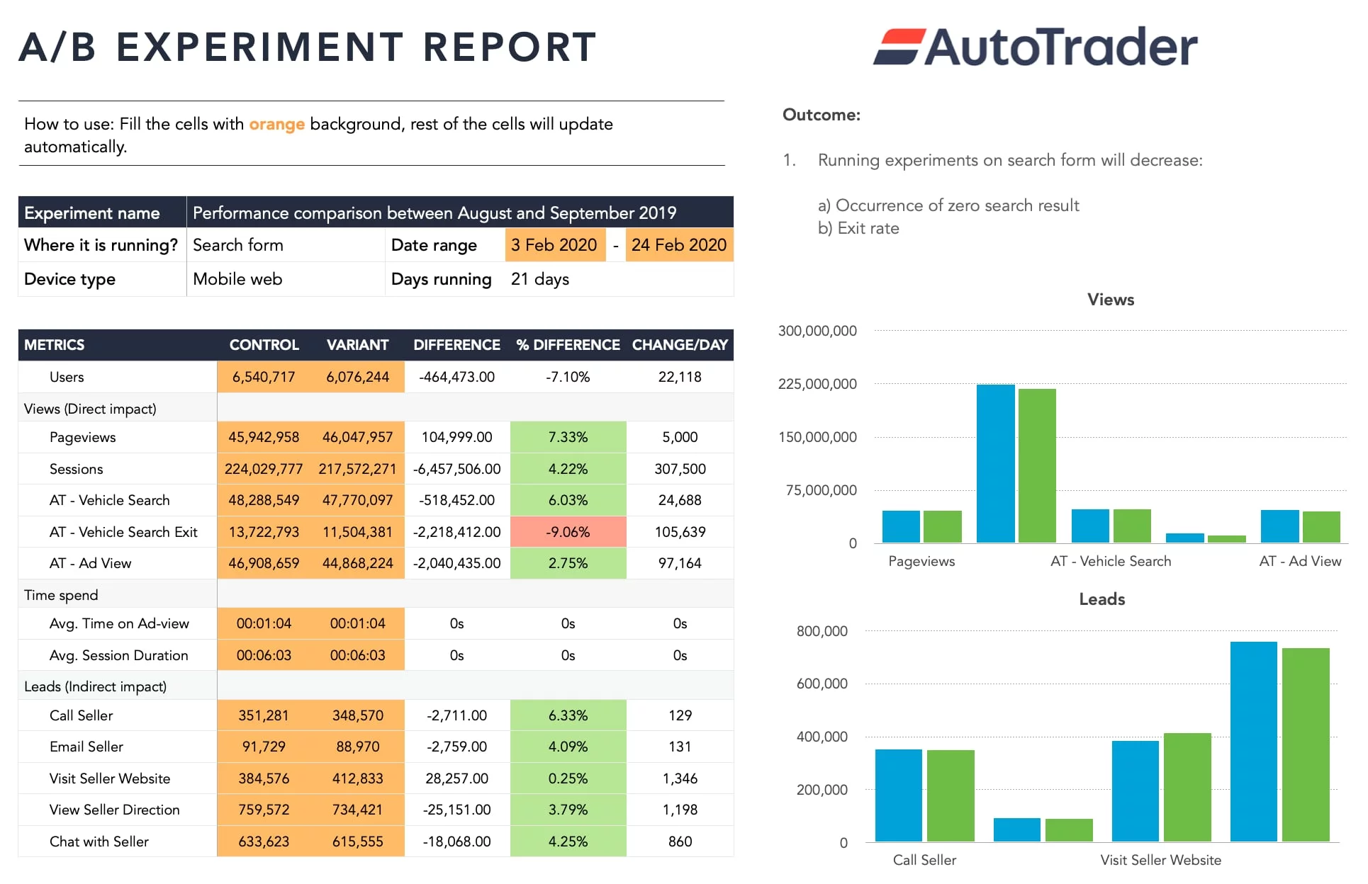
Led a complete search funnel redesign, reducing zero-result pages from 60k to 8k/hr. Reduced zero results by 86%, exit rate from 30% to 21%, increasing seller leads by a massive 6.33%.
Summary
The AutoTrader is the UK's leading and most trusted marketplace for buying and selling new and used cars. Millions of users visit AutoTrader every day to find their dream car. The vehicle search is one of the most important and frequently used features at AutoTrader, enabling users to discover new and used vehicles that match their preferences. Currently, the search experience is outdated; 30% of users exit the search listing page without engaging with a listing detail page or connecting with a seller. The business sees this as an opportunity to reassess the search function and enhance the overall user experience.
As a Principal Product Designer, I had the opportunity to lead the search project from inception to completion, starting with the discovery phase and extending to validating ideas and increasing funnel conversion. To successfully achieve the project goals, various teams came together and worked collaboratively to ensure the project's success. I contributed to multiple aspects of the project, including:
- Conducting qualitative and quantitative research to understand user needs,
- Creating screen and visual designs to deliver a seamless search experience,
- Developing and optimising new search filters alongside the engineering team,
- Leading workshops, prioritising stories, and establishing realistic goals with stakeholders,
- Testing strategies and validating design iterations through A/B testing,
- Observing and monitoring search patterns with data scientists to inform decisions.
Throughout the project, we conducted several user studies, surveys, and usability sessions with more than 1,000 participants to grasp users' needs, behaviour, emotions, and persuasion triggers. We opted for a data-informed approach and executed numerous experiments to enhance and optimise the search experience.
The data indicates that every hour, 60,000 users land on the search listing page with zero results. Initially, I explored quick fixes and displayed a message to users prompting them to adjust their search criteria if they encountered zero results on the search listing page. I implemented an experiment on 25% of users and monitored performance over a week. After a week, the results were stagnant, and the number of zero search occurrences remained the same.
I examined the entry points to the search listing page and found that most mobile users accessed it through the advanced search feature. When users interacted with the search filters, there was no feedback to inform them of the number of available results they would see on the next page. By introducing a search count on the Search CTA, we reduced the occurrence of zero results from 60,000 to 35,000 per hour, but many users continued clicking the Search CTA even when they saw a zero search count.
With user feedback and session recordings, I discovered that users found it challenging to identify which filter caused the zero results, given that there are more than 40 filters available. Locating a filter, removing it, and starting the search again was cumbersome for users. I eliminated the guesswork for users by proposing a feature to undo the last filter selection that led to zero searches and disabling the Search CTA until results were available.
Reversing the last filter significantly improved the overall search experience. The number of occurrences of zero results decreased to 8,000 per hour, the exit rate on the search results page dropped from 30% to 21%, and the number of leads to contact sellers rose by 6.33%.
discovery
The search function is one of the most utilised and critical features on AutoTrader. On average, over 10 million users utilise the search each month to find their dream cars. The search experience required several performance and design improvements; 30% of users exited the search listing page and did not visit ad pages or engage with a seller, and several filters that were available on desktop were missing on mobile. The engineering team must maintain different codebases for desktop and mobile, leading to inconsistent experiences across the website. The business and design teams see this as an opportunity to revisit search, and
- Enhance the overall search experience on the website and mobile app,
- Reduce the exit rate on the search listing page,
- Motivate users to engage with the full-page ad, and
- Foster interaction between buyer and seller.
We gained an understanding of the business needs from stakeholders to progress the project. Next, we conducted in-depth user research to understand user needs and goals.

Research
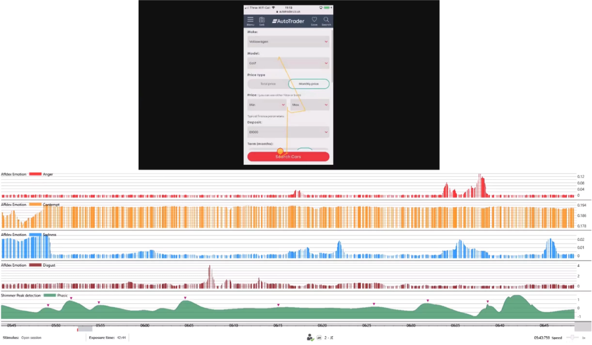
We recruited 1086 participants for the usability study on our testing platform. We asked participants who had visited AutoTrader in the past year to reflect on their most recent experience and questions about their prior search experience. In particular, we were interested in visitors' attitudes toward the search, the problems they encountered while searching for vehicles, and the reasons they used the search.
- Measuring the Search UX: We utilised an advanced algorithm to collect test data and analyse the quality of the search user experience. The algorithm calculates scores based on a rolling database of approximately 50 websites within the motoring industry. The overall score from existing users was 69%; we then examined the detailed scores for the sub-dimensions of trust, loyalty, usability, and appearance.
- Trust and loyalty: 67% of participants expressed low trust in the brand but intend to visit the website in the future to search for a vehicle, primarily because the stock availability on the website is significantly higher than that of any other site.
- Desktop vs. mobile usage: To understand which activities participants most frequently engage in when they visit motoring websites, we asked them how they accessed the site and completed the task. Searching for vehicles to purchase was the primary reason for visiting the website (79%), followed by researching vehicle information (46%) and comparing vehicles (33%). Mobile usage for the website is notably high, with at least 70% of participants having used the mobile site in the past 12 months. Participants appreciate the mobile site because it is quicker than visiting the dealership, allows for quick contact with the seller, and makes purchasing vehicles easy.
- Problems with the vehicle search: The usability study uncovered 12 distinct issues with the search process. The key problems users faced included: difficulty in searching for vehicles on mobile devices, experiencing zero search results, and cluttered search pages due to inadequate filtering options. We will examine each of these in detail below.
User Problems
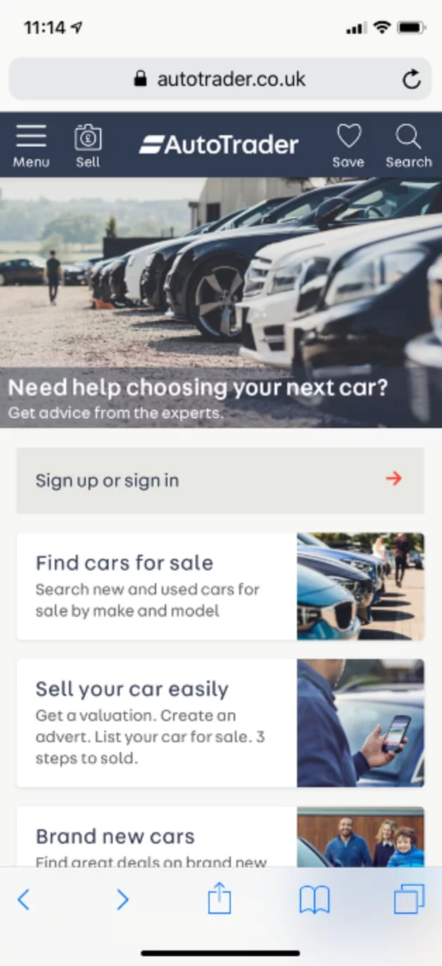
1. Non-existence of search form on mobile homepage
The search form was absent from the mobile homepage for finding cars for sale, unlike the desktop website. Because of the prominent placement of the "Sign-up / sign-in" banner, users thought they had to complete either of these actions to navigate through the website.
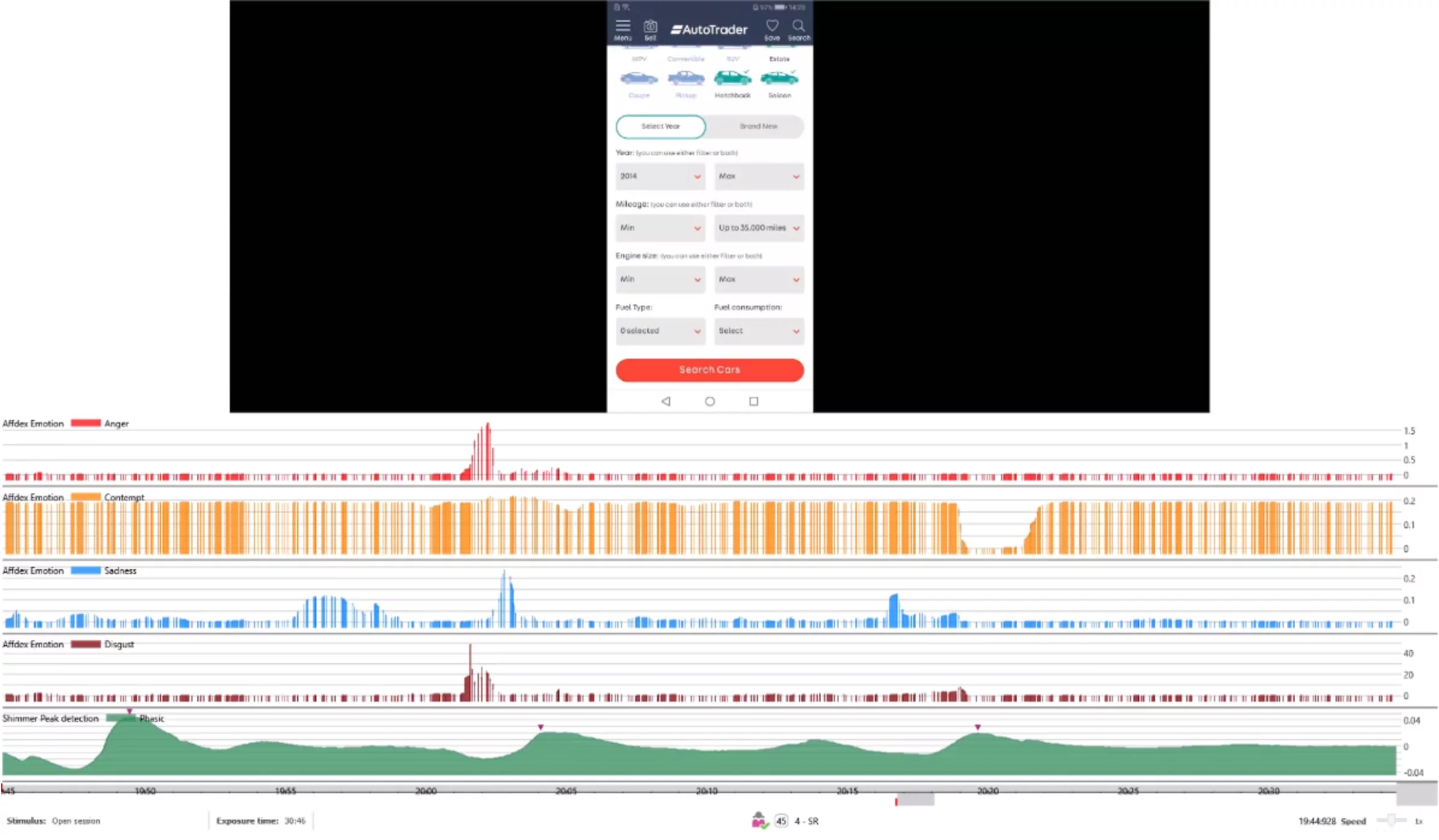
2. Confusing min and max date ranges on mobile
Participants find the mobile date selection confusing when presented as a minimum and a maximum. They cannot understand what a minimum and maximum age mean when selecting a year, and what effect using both will have.
3. Selected search filters are not prominent on mobile
Participants on mobile did not realise that a few search filters were pre-selected from their last visit. The notification for selected filters was not prominent; they pressed the Search CTA and ended up on the search listing page with zero results.
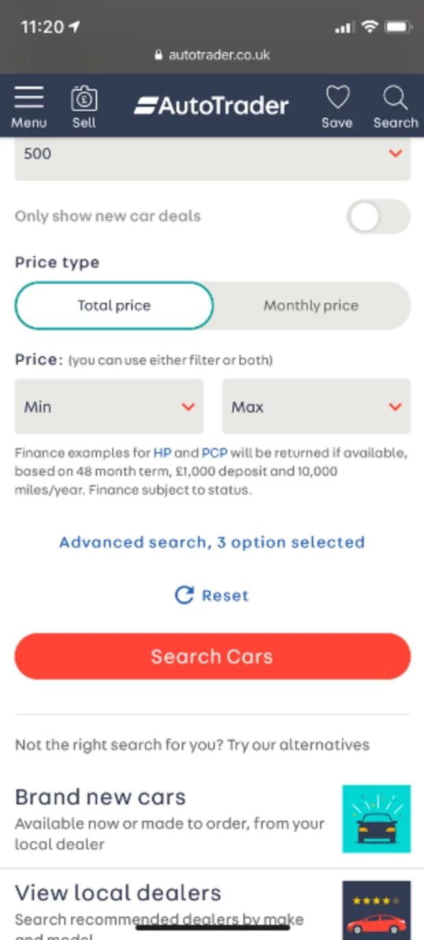
4. Advanced search filters are hard to locate on mobile
Participants find it challenging to discover the advanced search filters on mobile because they may sit below the fold and beneath the Search CTA.
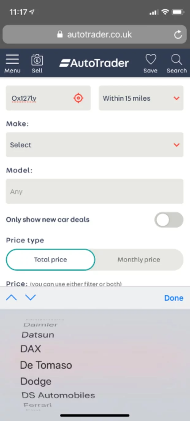
5. Difficulty selecting a car make on mobile
Participants find it challenging to choose the vehicle make, given the numerous options to scroll through using the phone's native functionality.
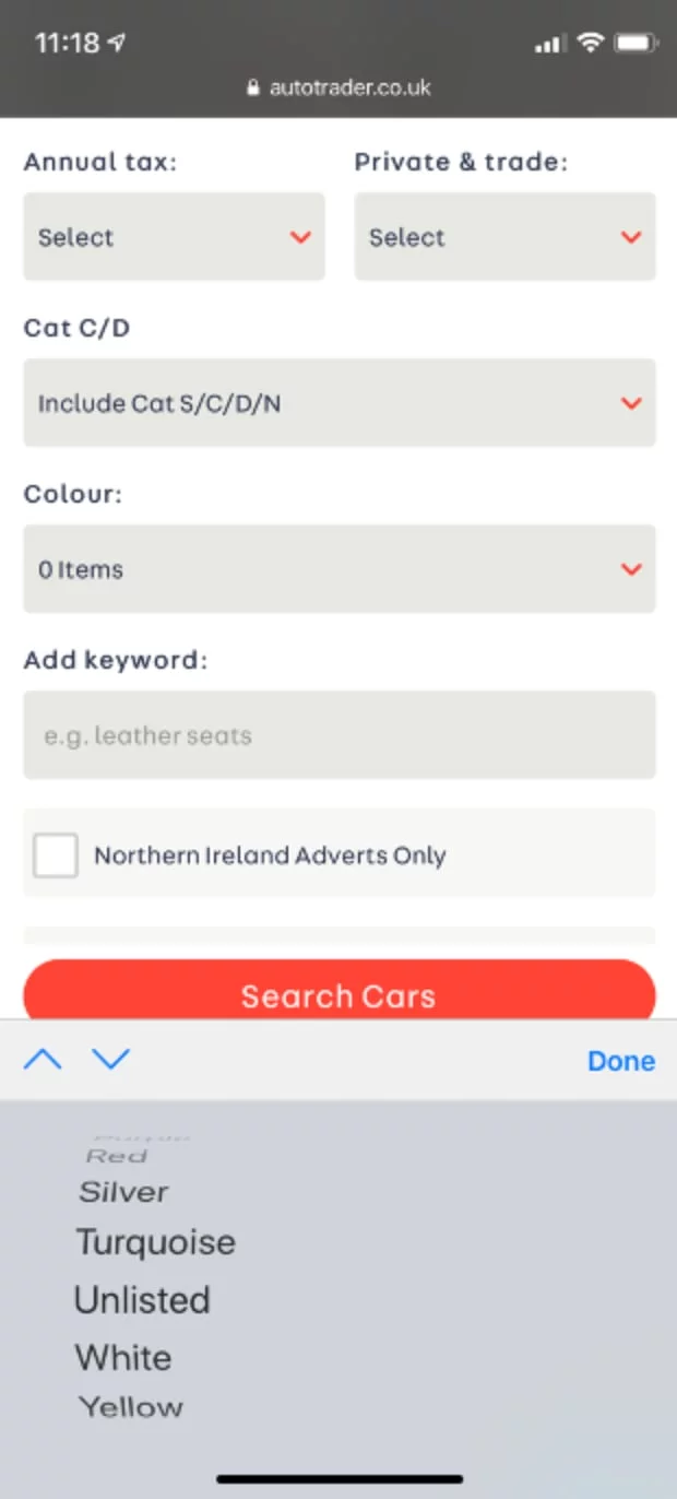
6. Colour selection on mobile is not intuitive
The colour selection on mobile is not intuitive because it is only text and is not represented by swatches.
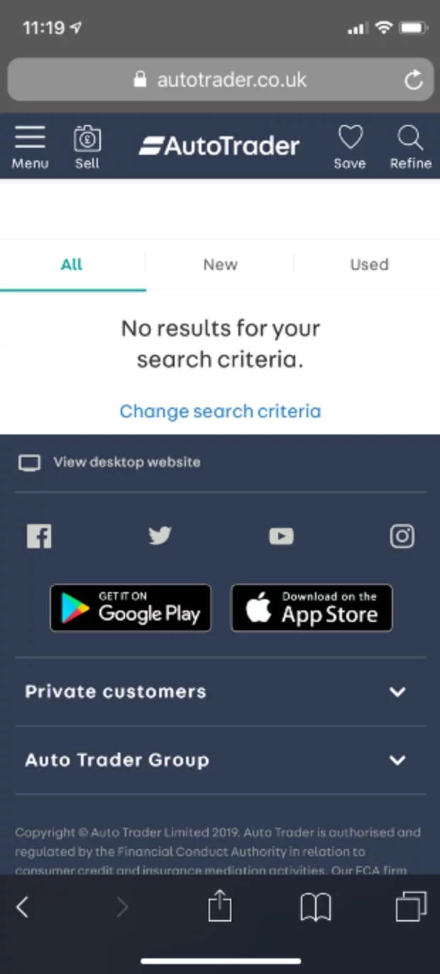
7. Zero search results on mobile
Participants arrived at the search listing page with no results, as they were unaware of the impact their current filtering option had on the number of available search results.
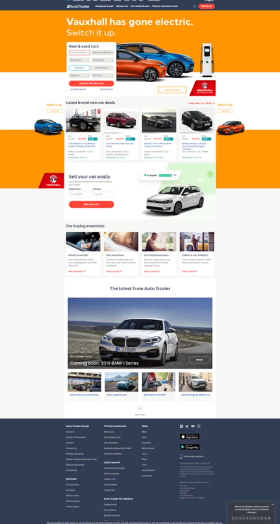
8. Distractions on the desktop homepage
Participants found the homepage to be distracting, especially the content above the fold. This content diverted their attention, preventing them from focusing on the main task, which was searching.
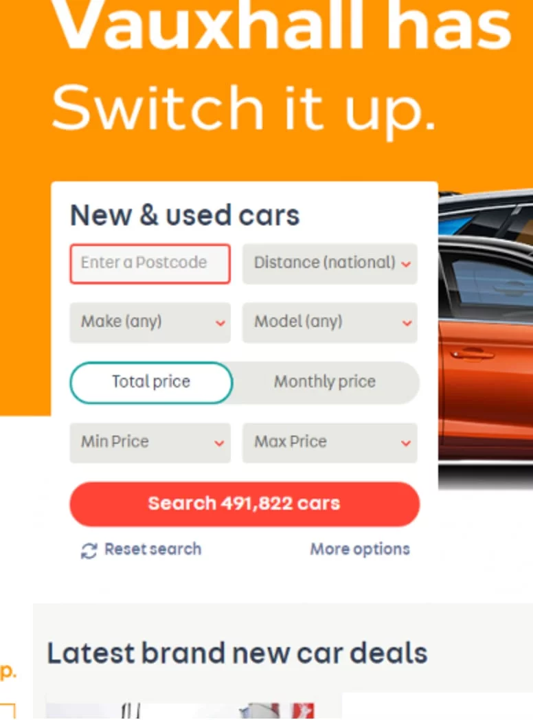
9. Postcode error on the desktop
As soon as the desktop website loads, a red border appears on the postcode field without any interaction, suggesting that there is already an error on the form.
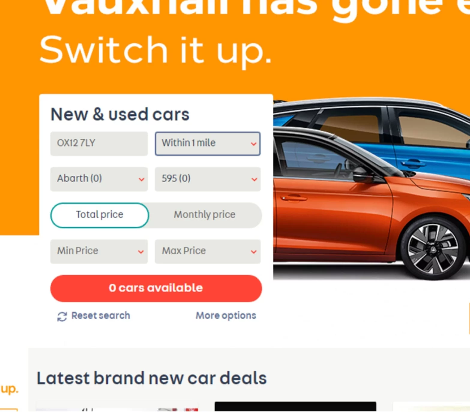
10. No results on the desktop
Participants selected options that resulted in no cars being available. They were unsure about how to obtain any results (such as increasing distance, price, or something else) on the form.
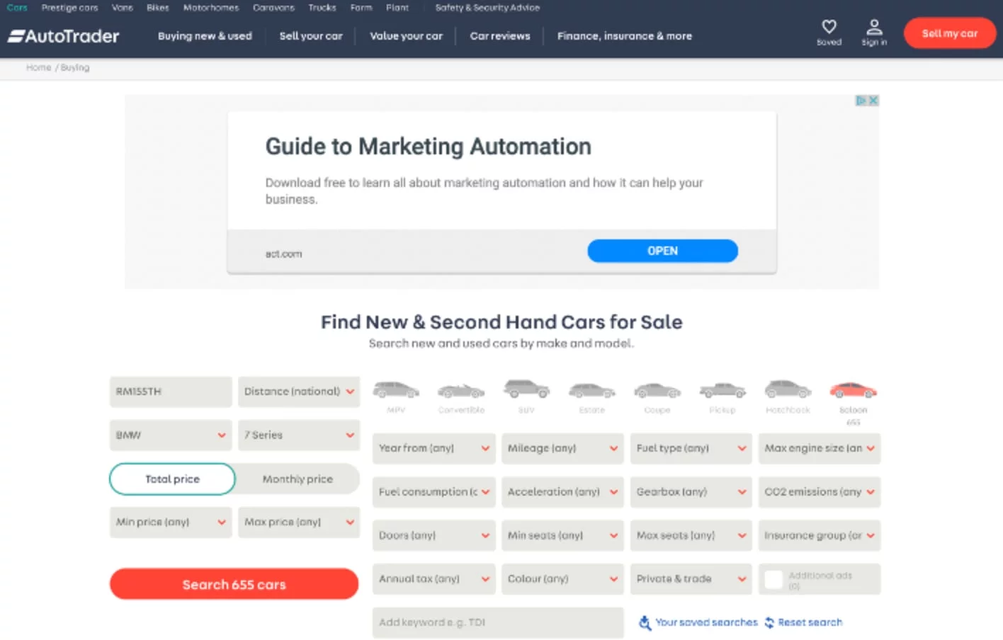
11. Poor form structure on the desktop
The structure and hierarchy of fields on the search page lacked logic; for instance, the car icons seem to function as headers, yet the fields beneath them are unrelated.
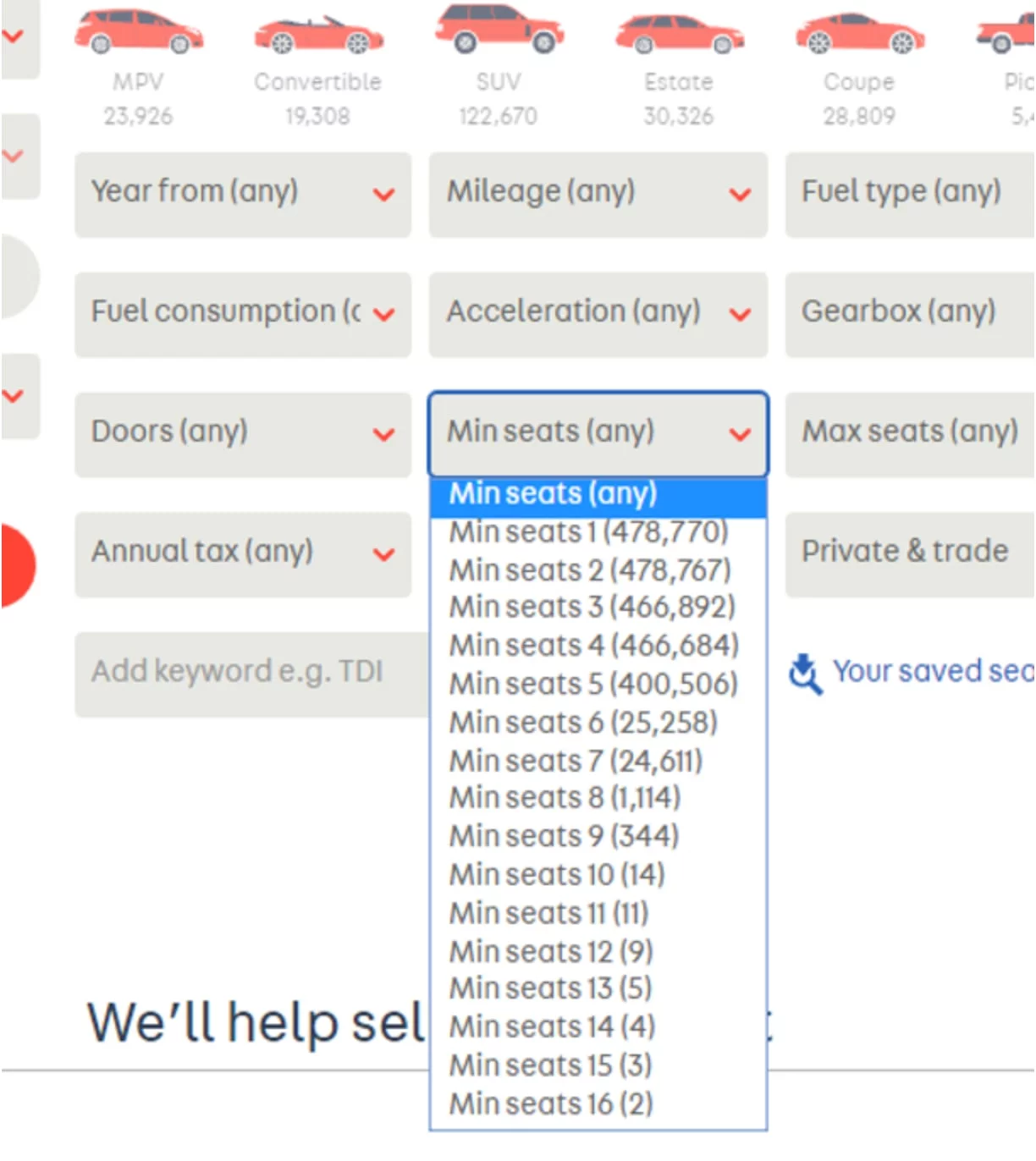
12. Duplicate wording on selected options
Participants indicated that it is unnecessary to repeat words when there are numerous dropdown options available. The list is difficult to read, especially with the number of results. This issue applies to all selections containing similar information, such as minimum seats, colour, engine size, and annual tax, among others.
Data Insights
We believe that collecting and analysing data can help expose problems, provide more information about those problems, and evaluate the effectiveness of solutions. We are exploring analytics tools to capture data that will guide us throughout the design process, enabling us to create better designs and user experiences.
The comparison of click rates between desktop and mobile highlights the differences between the two layouts. Desktop is immediate, but mobile divides choices into three options: the navigation menu, search icon, and banner.
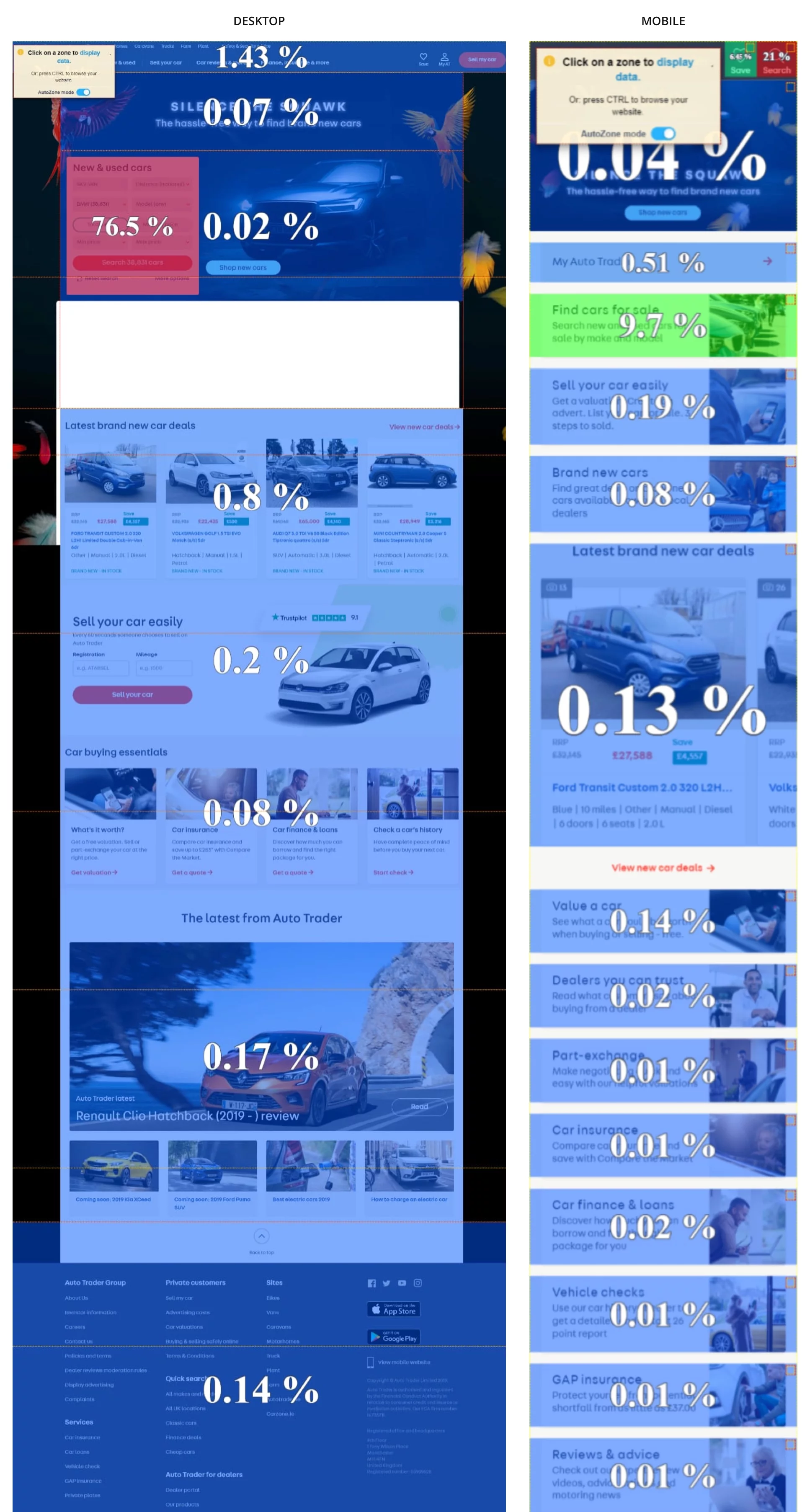
The click rate declines significantly on mobile devices when content is placed below the fold.

The desktop click rate and distribution indicate that the order of the form fields does not align with their usage. The affordance and hierarchy on this page are lacking.
Desktop search click rate
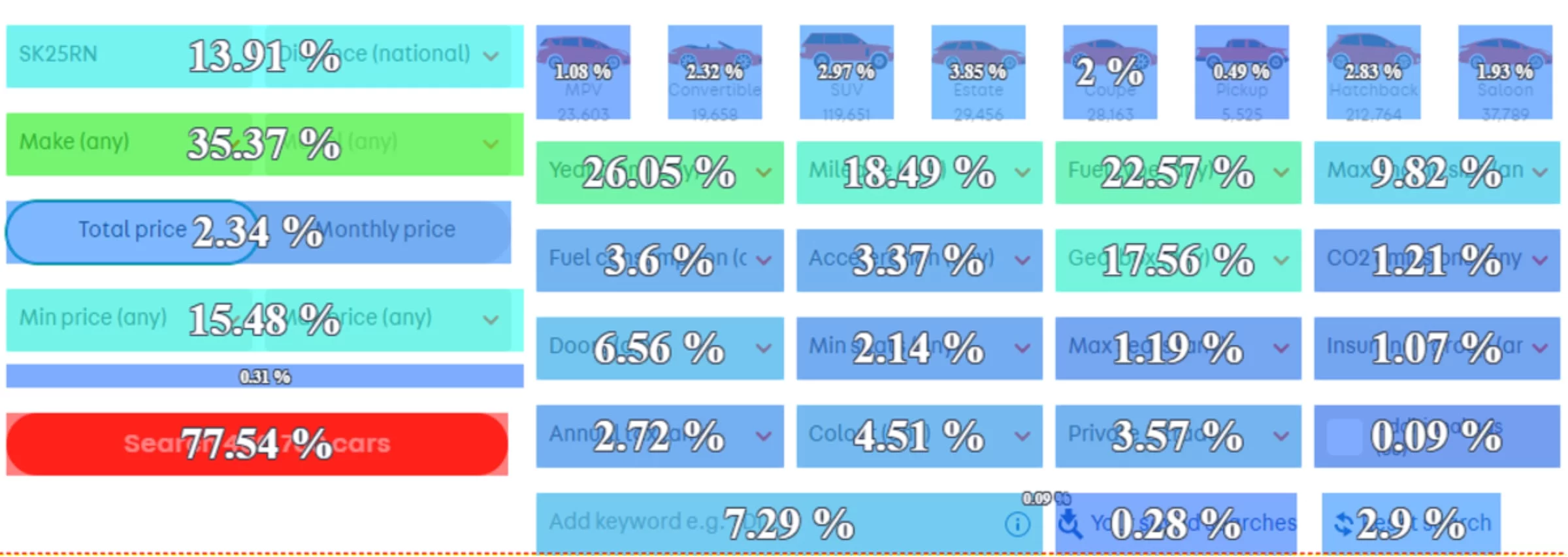
Desktop search click distribution
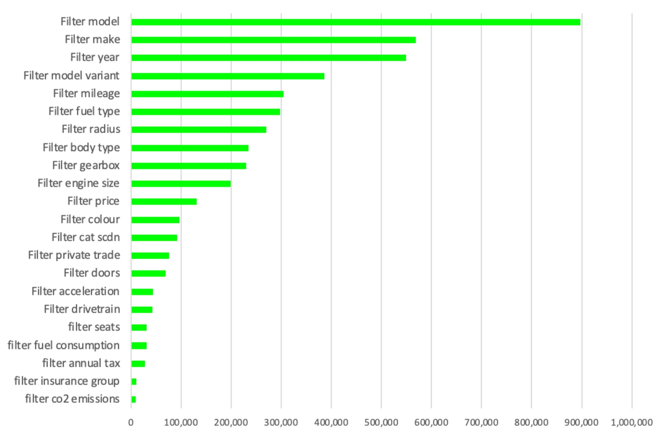
The overall volume and growth rate of users and ad views on mobile are higher than on desktop. The majority of users visit the mobile website to search for vehicles for sale and to research vehicle information.

Mobile and desktop lead

ideation
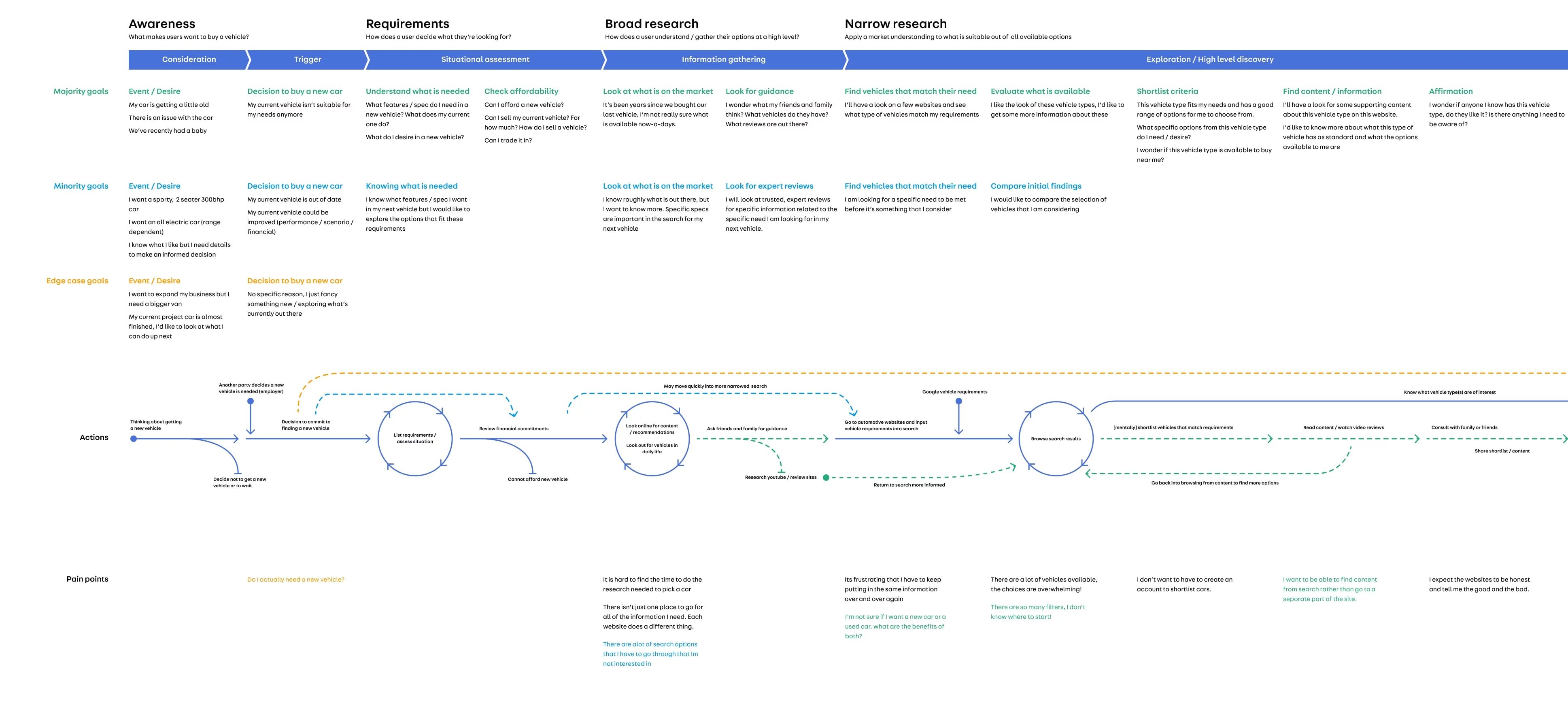
User categories
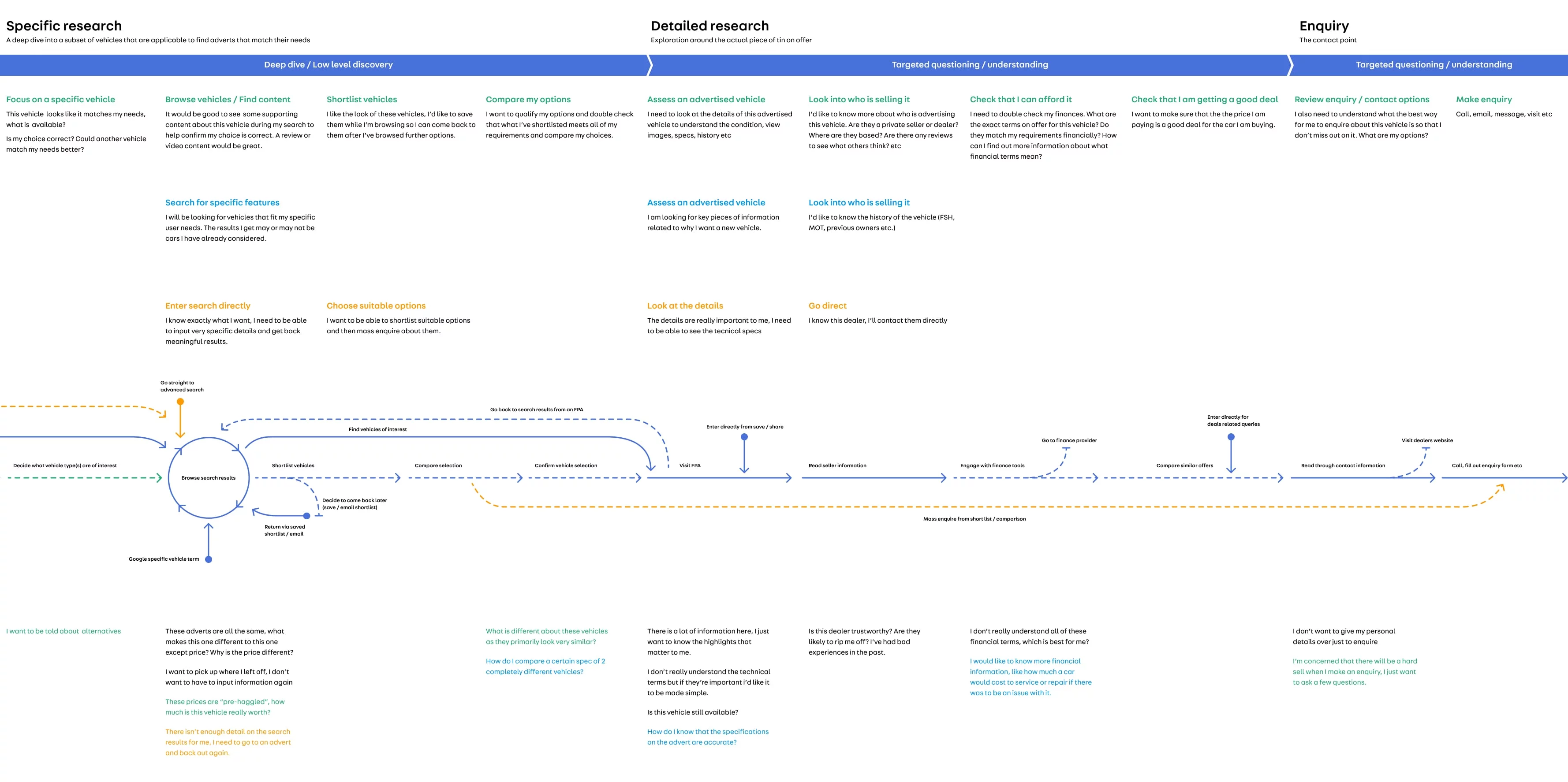
From a behavioural perspective, we conceptualised user types, their needs, and experiences, categorising them into three distinctive groups.
-
Majority: A group of users seeks a vehicle to fulfil their needs. The price is an important factor, along with various personal preferences, and they desire an easy experience in finding their next vehicle, expecting support along the way. They draw inspiration for their vehicle preferences from light-touch research via Google, social media advertisements, other cars they've seen on the road, and advice from friends and family. They are likely to disregard technical information outside their personal preferences, so it is essential to limit this to the core needs and present it in an understandable, human tone.
Some of the use cases for this group are:
I have recently moved to a new job out of town and need a reasonably priced car that will get me to work and last for a few years. I would prefer not to have a diesel, and I quite like blue.
My car has broken down, and the repair costs are too high. I need a car that I can easily afford, and that's available close to me. I'm not too fussed about the make or model.
I see many Range Rovers in my local area, and I like the look of them. A high-spec version would be ideal as I do love a white car with a sunroof and big wheels. -
Minority: A group of users has non-negotiable requirements that must be met for them to purchase a vehicle. They wish to specify their needs, which can encompass a broad range of choices. In general, they are open to suggestions regarding what is available within the confines of their requirements. They expect a bespoke experience aligned with the choices they make along the way and want the information that is important to them easily accessible at every step.
Some of the use cases for this group are:
We just had a baby and need a little more space. Isofix child seat points are essential, along with a boot large enough to accommodate the pram. Ideally, we need a car with a high safety rating.
I am looking for a sporty convertible car that has two seats and approximately 300 bhp. I have my eye on a Porsche 911 but would like to know what else is available in this class. I want to move away from fossil fuels and get a fully electric car.
I drive a fair distance each week for work, so long-range is a must. I am potentially open to a hybrid that offers good MPG. -
Edge case: A group of users who are detail-oriented and possess significant knowledge about vehicles. They are seeking deep access to information to make informed decisions. This group may include business owners, petrolheads, classic car buyers, or dealers. They understand their subject matter and expect access to information that reflects their expertise. These users visit the website regularly and are willing to put in extra effort to obtain the information they need, but prefer to save their preferences for customised future experiences with each visit to the website.
Some of the use cases for this group are:
I am looking to expand my business and require a larger van with substantial capacity. I expect to cover many miles each week and need a low-mileage van, preferably one that already has brackets installed and accommodates three seats in the cabin.
I own a car dealership and use AutoTrader as my primary online sales platform. I visit the website regularly to locate vehicles similar to those I have in stock to ensure I remain competitive. I am well-versed in how the website operates, having learned a few tricks over the years to achieve the desired search results.
I buy classic cars to restore in my spare time. I specialise in 1980s Ford Escorts and seek bargains with the potential for profit. I often purchase CAT N cars for spare parts. I carefully look for vehicles that may be mislabelled or have issues that my expertise can easily rectify. When searching for a car, I prioritise detailed listings and high-quality photographs. I have set up email alerts to ensure I don't miss out on new listings.
Experience flow
Workshop
We hosted a day-long workshop and invited researchers, engineers, QA professionals, product owners, and senior stakeholders involved or soon to be involved in the search project. The main goal of the workshop is to bring cross-functional teams together, engage them in the design process, consider their perspectives, and understand technical limitations and business expectations to deliver designs and projects smoothly.
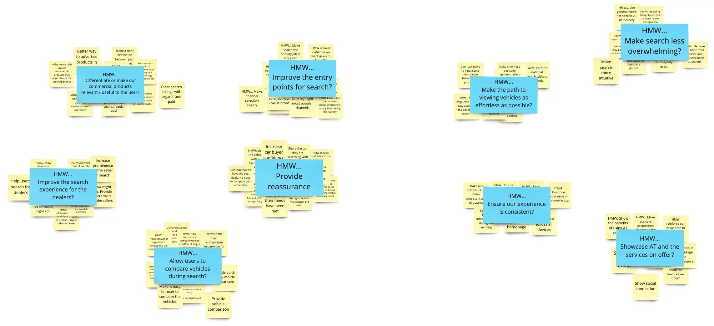
We begin the workshop with so-called "How might we?"—or HMW—questions. These capture important issues that need addressing as part of the product design. For example, if an expert complains that existing solutions limit users to searching for a single car make and model, someone might jot down "HMW let the user select multiple makes and models?" We show existing searches to the team and ask everyone to jot down their HMW questions. We gather all HMW questions, organise them into a few high-level categories, and ask everyone to vote next to the categories they consider most important. This will help us build a backlog and set priorities for deliverables.
HMW questions
We divide the backlog and prioritisation into two stages. In the first stage, we encourage the teams to break the project into small, achievable tasks. The team breaks down the project into 132 manageable tasks that appear realistic and can be delivered iteratively.
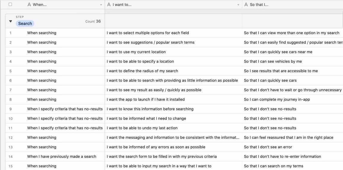
In the second stage, we asked the teams and stakeholders to prioritise tasks according to the impact-effort matrix.
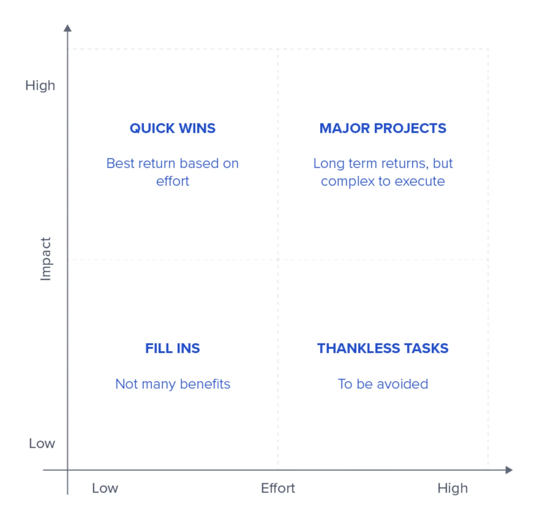
It is a simple yet powerful tool that helps people reach an agreement, clarifying priorities. The tasks requiring the least effort for the greatest impact rise to the top of the list, while those needing more effort but yielding lower impact sink to the bottom.
The tasks were prioritised by the teams and stakeholders accordingly. Everyone in the organisation shared the same vision throughout the project, and we have a solid foundation to commence designs.
Design
The AutoTrader already has a design system in place; I utilise an existing pattern library to create design concepts that expedite product delivery and maintain consistency across the website and mobile app. These concepts aim to enhance the overall search experience by testing, learning, and iterating designs based on user feedback and data insights.
The AutoTrader website is not responsive, and the developers maintain two separate codebases (desktop and mobile). The team and the business recognise that converting the entire website into a responsive format to merge the codebases is a significant project that could take months and delay the search project. I had a meeting with the engineering team and stakeholders, and everyone agreed to adopt a mobile-first approach, as 60% of our audience uses mobile devices for searches.


A/B Testing
Zero search results
I adopted a structured design approach to address the user problem and achieve a business goal. The data reveals that every hour, 60,000 users were landing on a search listing page with zero results and leaving the website. The biggest challenge for me was to reduce the occurrence of zero search results and the exit rate on the search listing page.
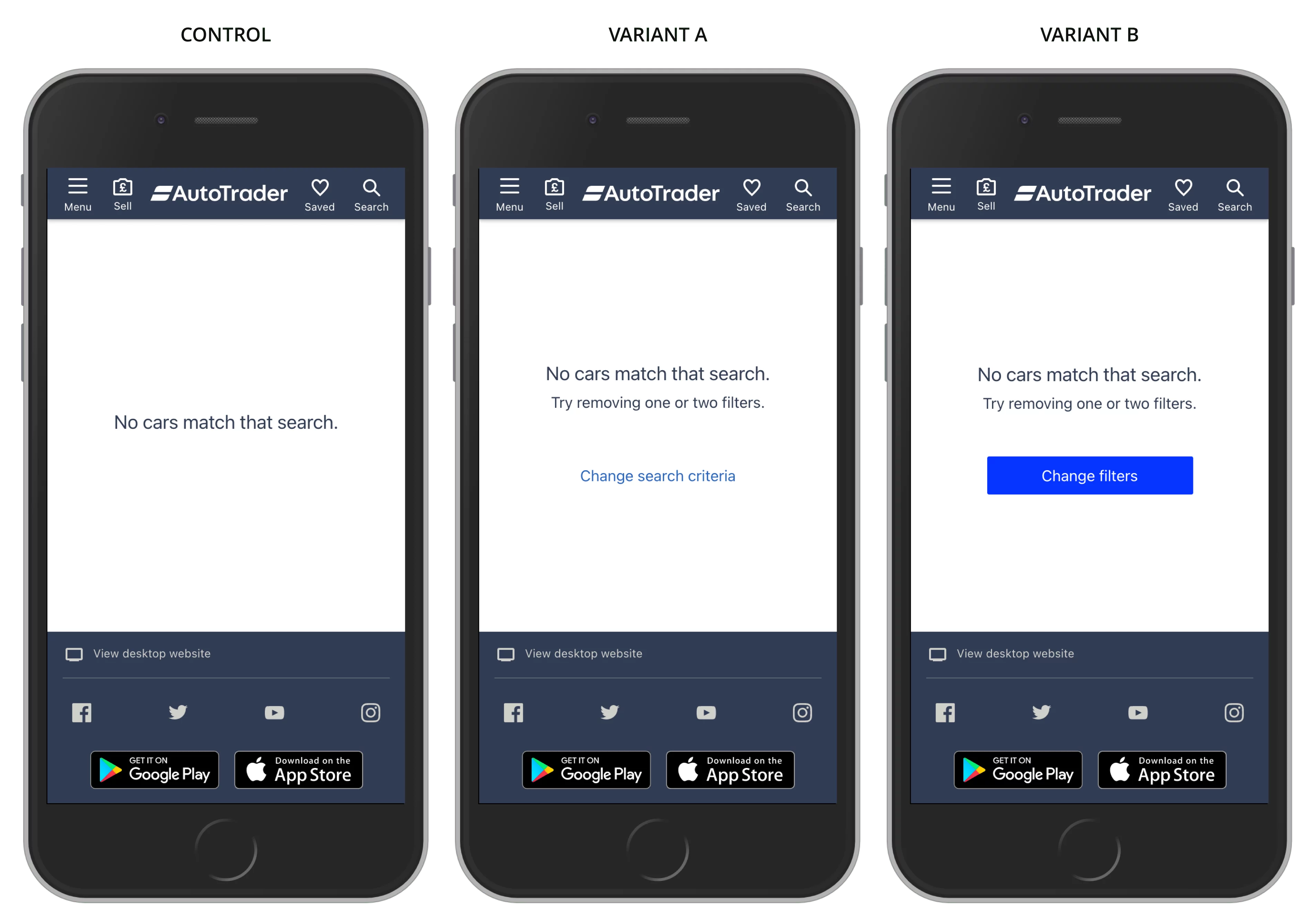
First, I explored quick wins and altered the messaging on the search listing page with zero results. I devised an experiment to display Variant A and B to 25% of users and monitor performance over a week. I also added a link to the form on the page to capture feedback from users. After a week, Variant A increased the exit rate, while Variant B slightly decreased it. The users were clicking on a "Change Filter" button and returning to the search page to adjust the filters. However, the number of zero search occurrences remained the same.
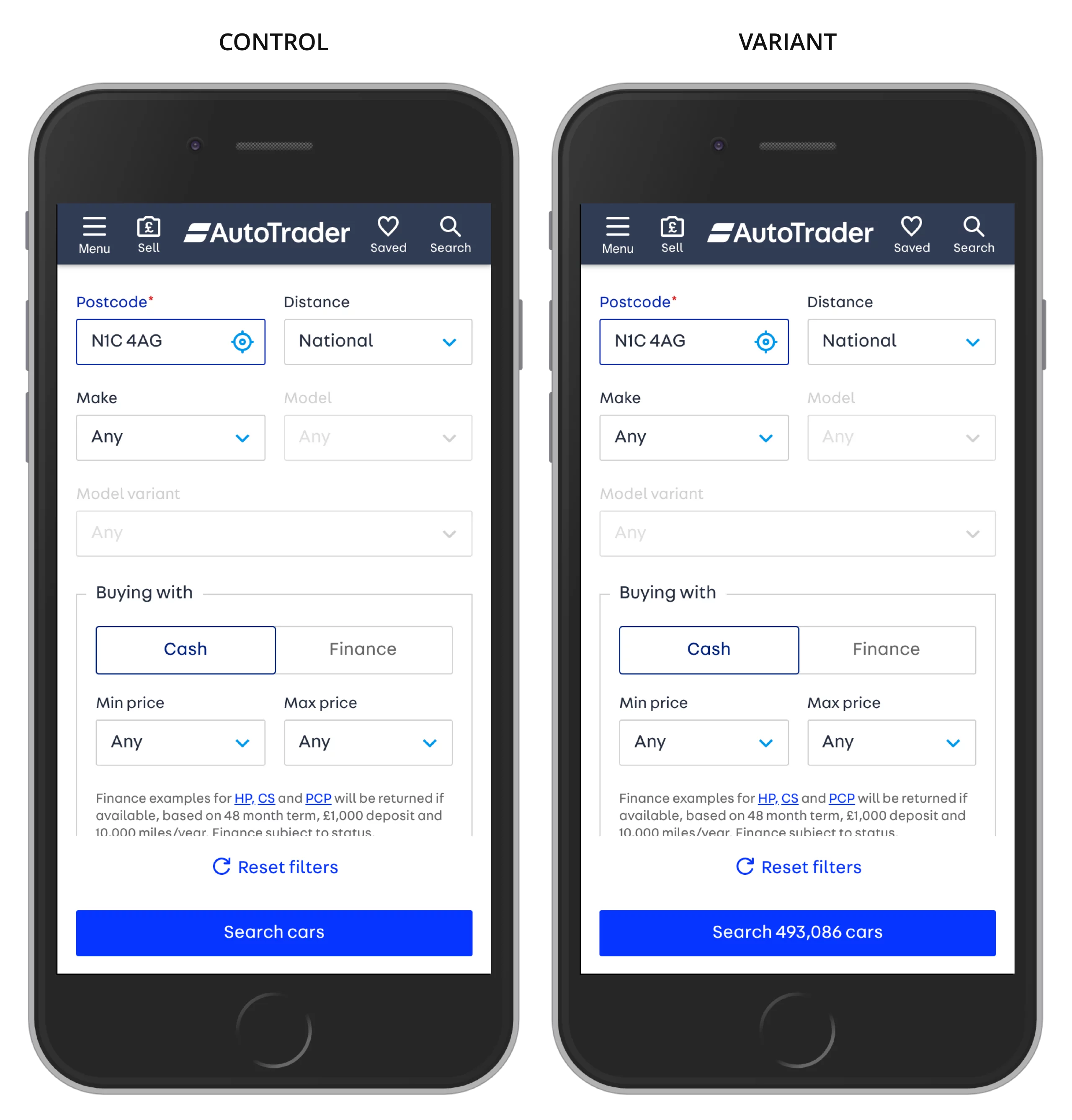
I examined the entrances to the search listing page and discovered that most mobile users enter through the advanced search page. When users interact with search filters, there is no feedback from the search to inform them about the number of search results available on the next page. I proposed adding a search count on the Search CTA to enhance communication between users and the system. As a result, the occurrence of zero search results reduced from 60,000 to 35,000 per hour. However, many users still clicked on the Search CTA even when they saw a zero search count.
With the aid of user feedback and session recordings, I discovered that users found it very challenging to comprehend which filter resulted in a zero search; there are over 40 filters available for their use. It requires significant effort for users to identify the filter, remove it, and initiate the search again. To alleviate this burden, I proposed a solution to revert the last filter selection that caused zero searches and disable the Search CTA until there are results. Although it was somewhat complex to implement, it had a high potential to positively impact both user experience and meet the business goal of reducing exit rates while increasing leads.
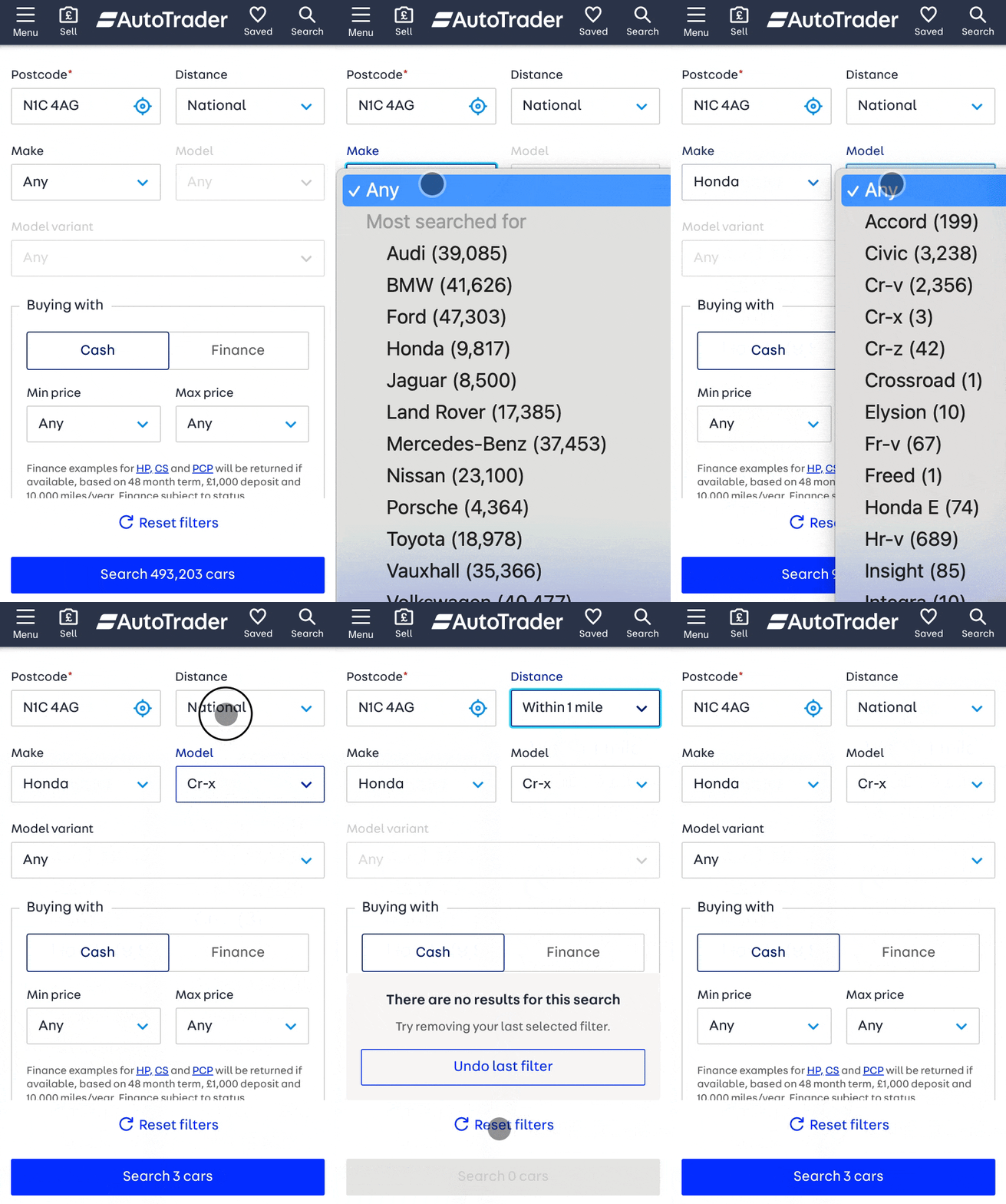
As anticipated, the removal of the last filter has positively influenced the overall search journey. The number of zero-result occurrences was reduced to 8,000 per hour, the exit rate on the search results page decreased from 30% to 21%, and leads to call sellers increased by 6.33%.
Projects
 Brand refresh delivered 4% conversion uplift on mobile and 3.8% on desktop.
Read case study
north_east
 Checkout optimisation drove a 5.22% increase in conversion YoY by enhancing clarity.
Read case study
north_east
 Delivered Bespoke Offers platform upgrade (zero downtime) & developed the innovative 'Beat My Price' tool.
Read case study
north_east
 Refactored complex B2B Portal to mobile-first experience, delivered with zero downtime.
Read case study
north_east
Refactored complex B2B Portal to mobile-first experience, delivered with zero downtime.
Read case study
north_eastContact
Please feel free to reach out if you have any ideas, projects, or opportunities you would like to discuss. I am always open to hearing new ideas and collaborating together.
You can contact me through LinkedIn, email, or phone. Alternatively, please complete the form below, and I will do my utmost to respond within 24 hours.