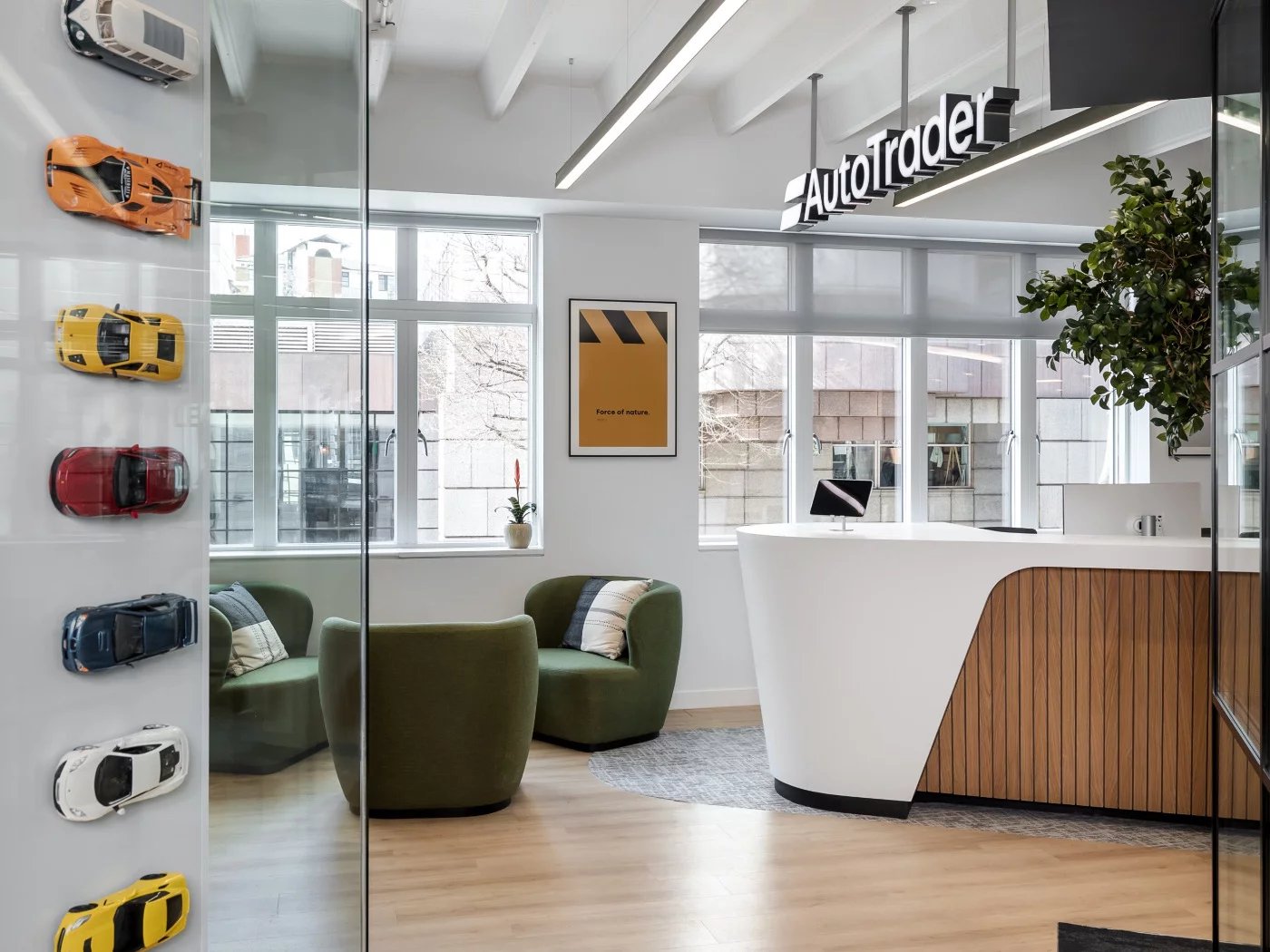
AutoTrader: Brand Refresh
Led the AutoTrader Brand Refresh on "Sell your car" pages. Delivered significant growth: 6.44% CTR and 4% conversion uplift on mobile; 4.75% CTR and 3.8% conversion uplift on desktop.
Summary
The AutoTrader is the UK's leading and most trusted marketplace for buying and selling used and new cars. With an average of 55 million monthly visits to its website and mobile app, some might say AutoTrader is a brand where customers feel the safest when trading cars. The company believed that the brand was outdated and that it was time to elevate it to a more premium status, establishing credibility as a destination for selling vehicles. Therefore, every detail had to be carefully considered in its development.
Creating a premium, user-friendly brand requires guidance from insights into what works and what does not. A design that looks good on a website or app may be impractical or confusing, hindering users from achieving their goals. That's where data-informed design comes into play.
As a Principal Product Designer, it was my responsibility to ensure that refreshing the brand improved the user experience and delivered value to users and the business by effectively utilising research and data. Successful completion of this project required collaboration across various teams to guarantee its success. I contributed to multiple aspects, including design strategy, developing a design system with the engineering team, setting achievable goals with stakeholders, working closely with a UX researcher to understand user behaviour, and analysing data patterns with a data scientist to inform decision-making.
Throughout the project, we focused on building brand trust and reputation among users while adhering to best practices and ethics, supported by both qualitative and quantitative data. We conducted user studies with over 300 participants and carried out multiple experiments to enhance and optimise the user experience. When we first launched the new branding on the "Sell your car" landing page, we noticed that the click-through rate for the "Create your advert" CTA had dropped significantly, negatively impacting conversions. However, through research, we found that the heading above the CTA did not sufficiently motivate users to click and create an advert. We then revised the heading to emphasise benefits, which resulted in a 4.75% increase in click-through rate and a 3.8% rise in conversions on desktop, as well as a 6.44% increase in click-through rate and a 4% uplift in conversion rate on mobile.
discovery
User and business needs
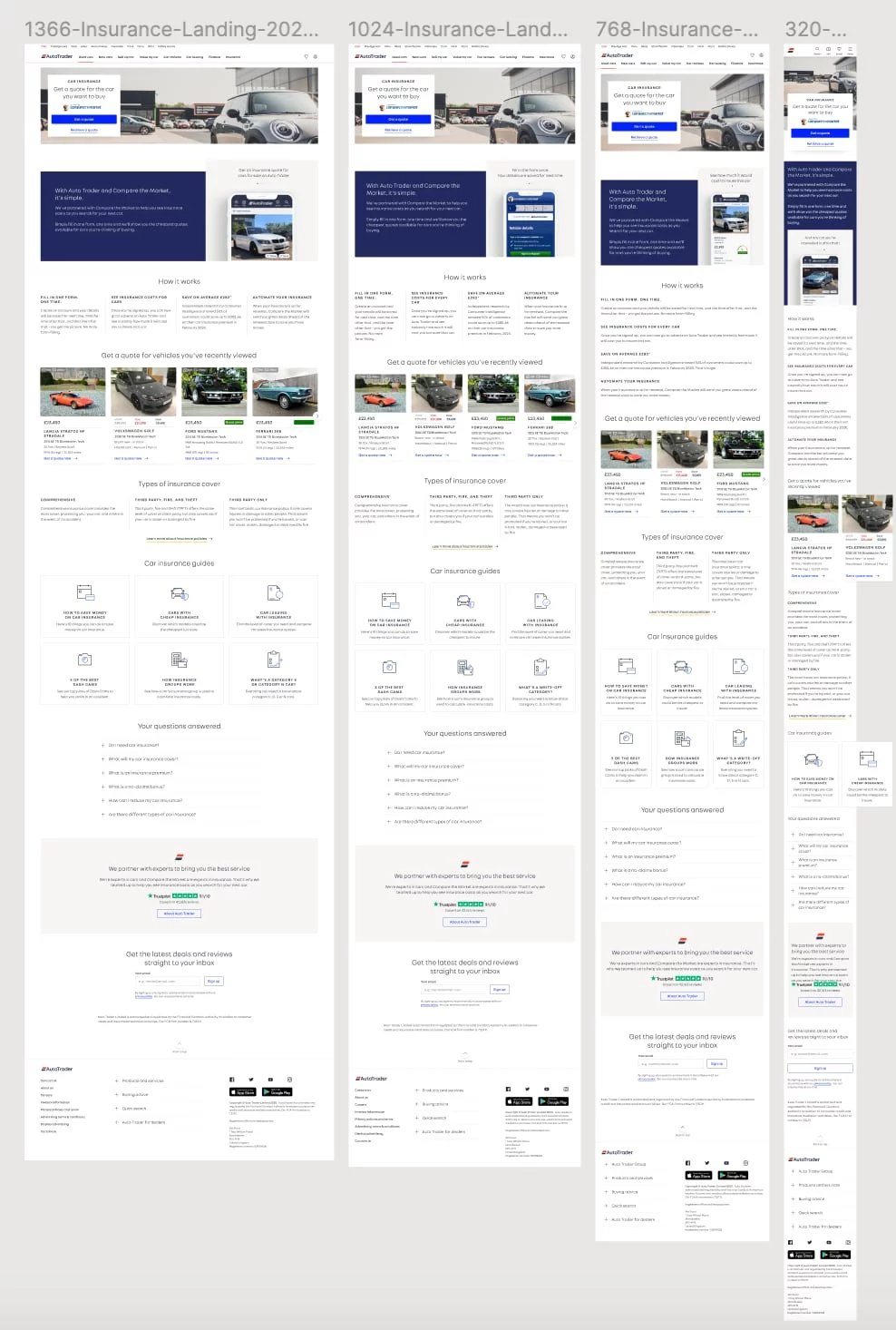
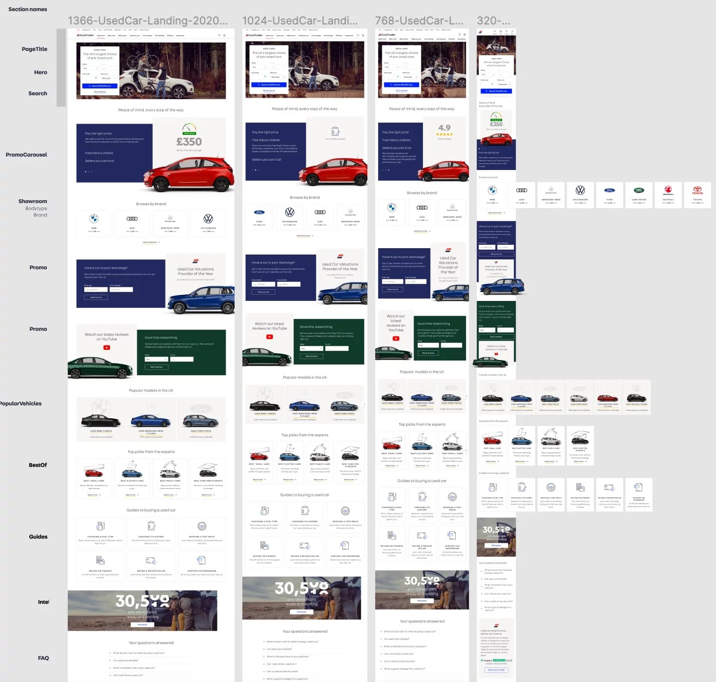
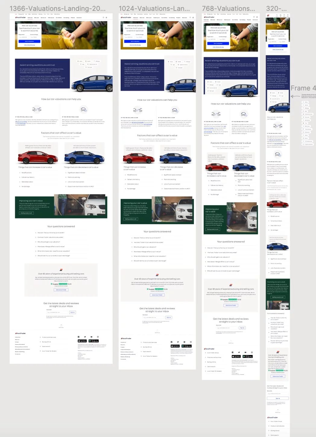
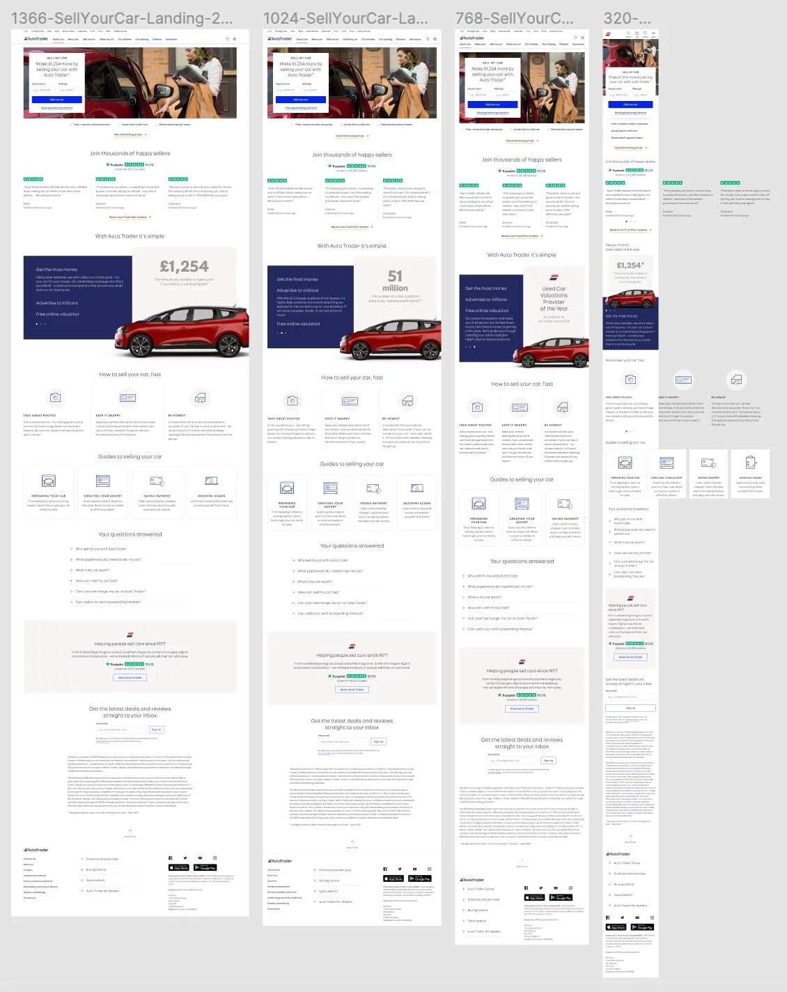
The brand was not initially demanding a refresh. The current design met industry standards, and the product's presentation was somewhat clear, but navigation has accessibility issues regarding structure and hierarchy on mobile devices. However, the design team gained valuable insights into user behaviour and the brand itself. The website required several improvements, and the engineering team had to maintain separate codebases for desktop and mobile, leading to an inconsistent experience across the site. The business and design teams see an opportunity to streamline and enhance the user experience by restructuring the website into eight new responsive landing pages to address users' questions about specific aspects of buying and selling a car.
Research
1. Understand interactions with landing pages: First, we analysed quantitative data regarding traffic acquisition channels and how they match the content on the landing pages. Using the Google Analytics landing page dashboard, Search Console data, and Google Ads keyword performance report, we identified answers to the following questions:
- What are the top landing pages?
- How do users discover those landing pages?
- What keywords do users use to find these landing pages?
- Can the user access the landings within the website?

The data helped us develop the new value proposition presented in the improved designs, as well as identify opportunities for content that resonates with website visitors. For example, out of the top 30 landing pages, 12 were blog articles and FAQS.
2. Analyse user session recordings and heat-maps to understand user flow: Although we had a clear picture of what users do after landing on the top landing pages, we decided to review session recordings and heat-maps for visual clues.
By analysing user flow with session recordings and heat-maps, we found that visitors mainly use menu navigation when visiting the website on desktop and mobile. Since most sessions occurred on mobile devices, the navigation bar in new designs should be easy to notice, simple, and accessible from any page of the website.
3. Identify industry trends through competitor analysis: The landing pages should align with the broader industry concepts. To find out what landing page trends are common in the motoring sector, we carried out a competitor analysis focusing solely on their landing pages. The aim was to clarify:
- The hierarchy of components and the overall structure of the landing pages.
- The elements are included in the initial fold of the landing pages.
- The value proposition appears on the landing pages.
The findings were crucial for establishing the tone of voice, visuals, and injecting personality into the product. We concluded that users visiting the AutoTrader website should feel more aligned with its 'pioneering' character trait through new aesthetic treatments.
4. Create a summary and initiate the design sprint: We gathered insights to develop the brand by translating a strategic repositioning into a brand design language. We involve all relevant teams to kick-start the design sprint.
ideation
Design sprint
With a solid understanding of user pain points and business objectives, we initiated a design sprint that involved all key teams. Our ideation process included:
- Collaborative Workshops: Facilitated brainstorming sessions to develop ideas for new landing page layouts, navigation, and visual designs.
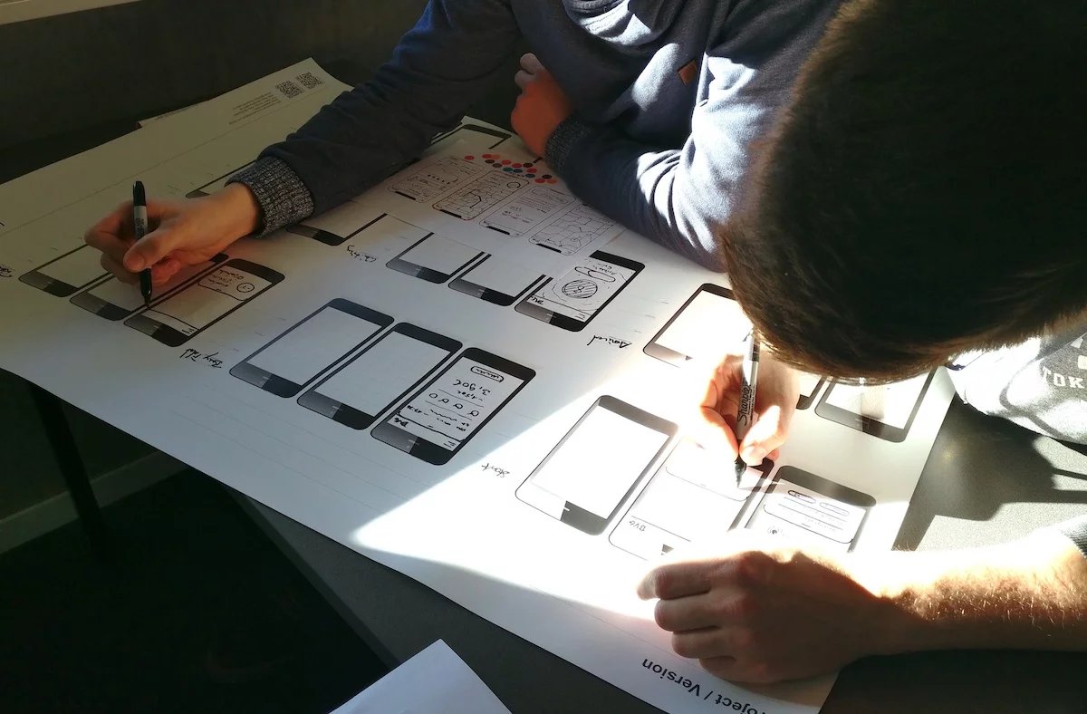
- Rapid Prototyping: Developed wireframes and low-fidelity prototypes to explore various layouts and user flows.
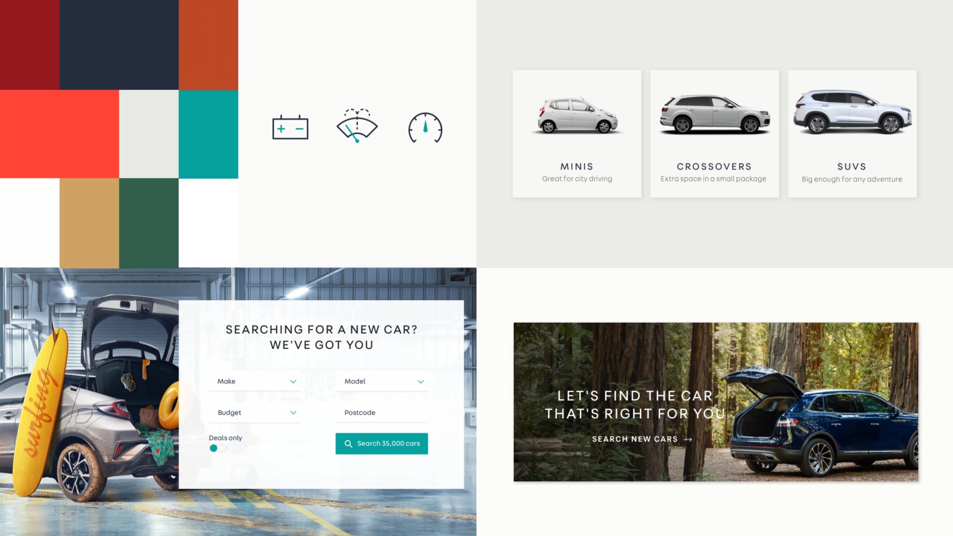
- Strategic Repositioning: Developed a new brand design language that highlighted AutoTrader’s “pioneering” character, modern, energetic, and premium.
Design
The design phase concentrated on transforming the design sprint exploration into practical, user-focused solutions.
- Responsive Landing Pages: Redesigned the website into eight new, responsive landing pages, each addressing specific user questions about buying and selling cars.
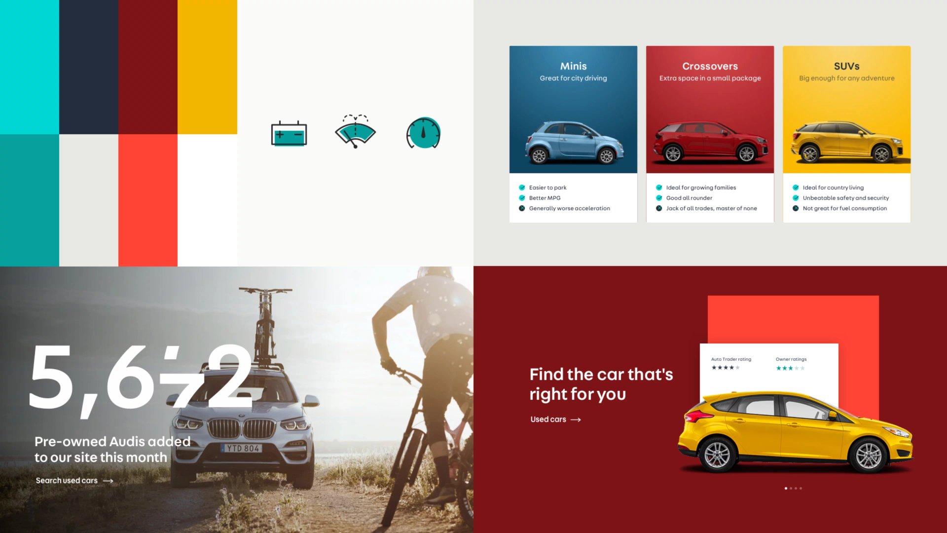
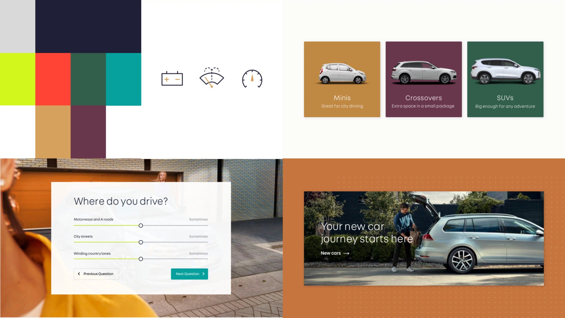
- Visual Identity: Refined typography, incorporated product-focused photography, and established a consistent colour palette inspired by car finishes, clean, crisp, and confident.
- Navigation Optimisation: Created a streamlined, accessible navigation bar that functions smoothly across desktop and mobile.
- Brand Personality: Infused the experience with a bold, inviting, and informative tone, making users feel excited and confident about their car transactions.
Throughout this phase, we refined our work based on feedback from cross-functional teams, ensuring every detail, from button placement to microcopy, was carefully considered.
Usability Testing
Before finalising the new experience, we conducted extensive usability testing with 300 participants. The aims were to:
- Evaluate Design Effectiveness: Analyse user reactions to colours, imagery, and overall brand perception.
- Gather Qualitative Feedback: Obtain insights into what made users feel excited, confident, or confused.
- Iterate Based on Findings: Refined designs using feedback, such as making imagery more professional and striking, and ensuring navigation remains intuitive.
User feedback was overwhelmingly positive, with participants describing the new brand as “modern, stylish, and inviting.”
A/B Testing
The AutoTrader values customer feedback highly. Any feature we release was initially hidden behind a feature flag to monitor user behaviour and inform them if needed about the new design or features.
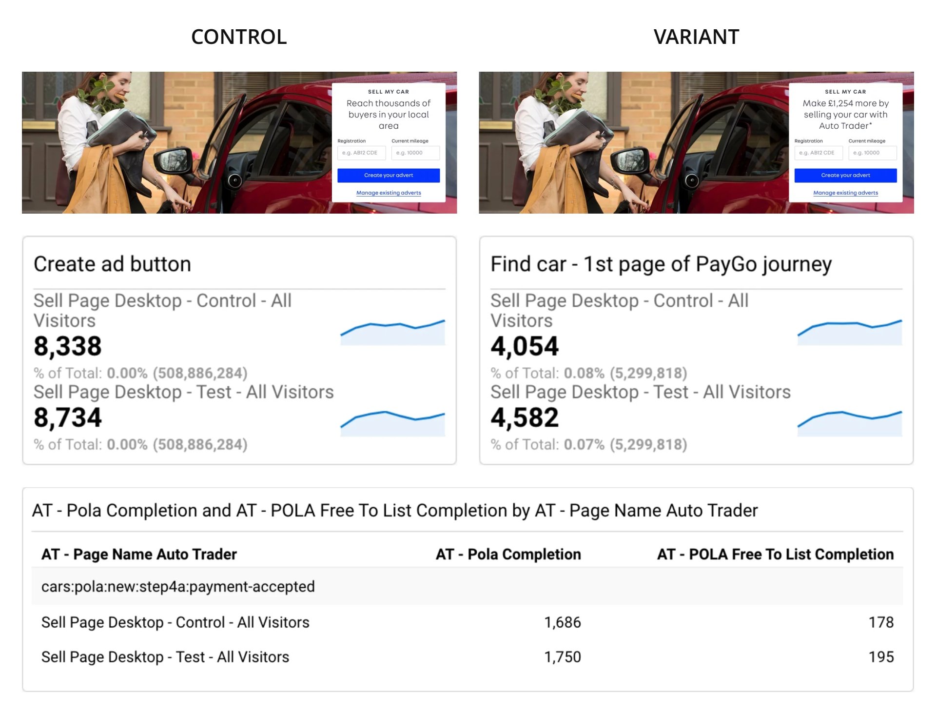
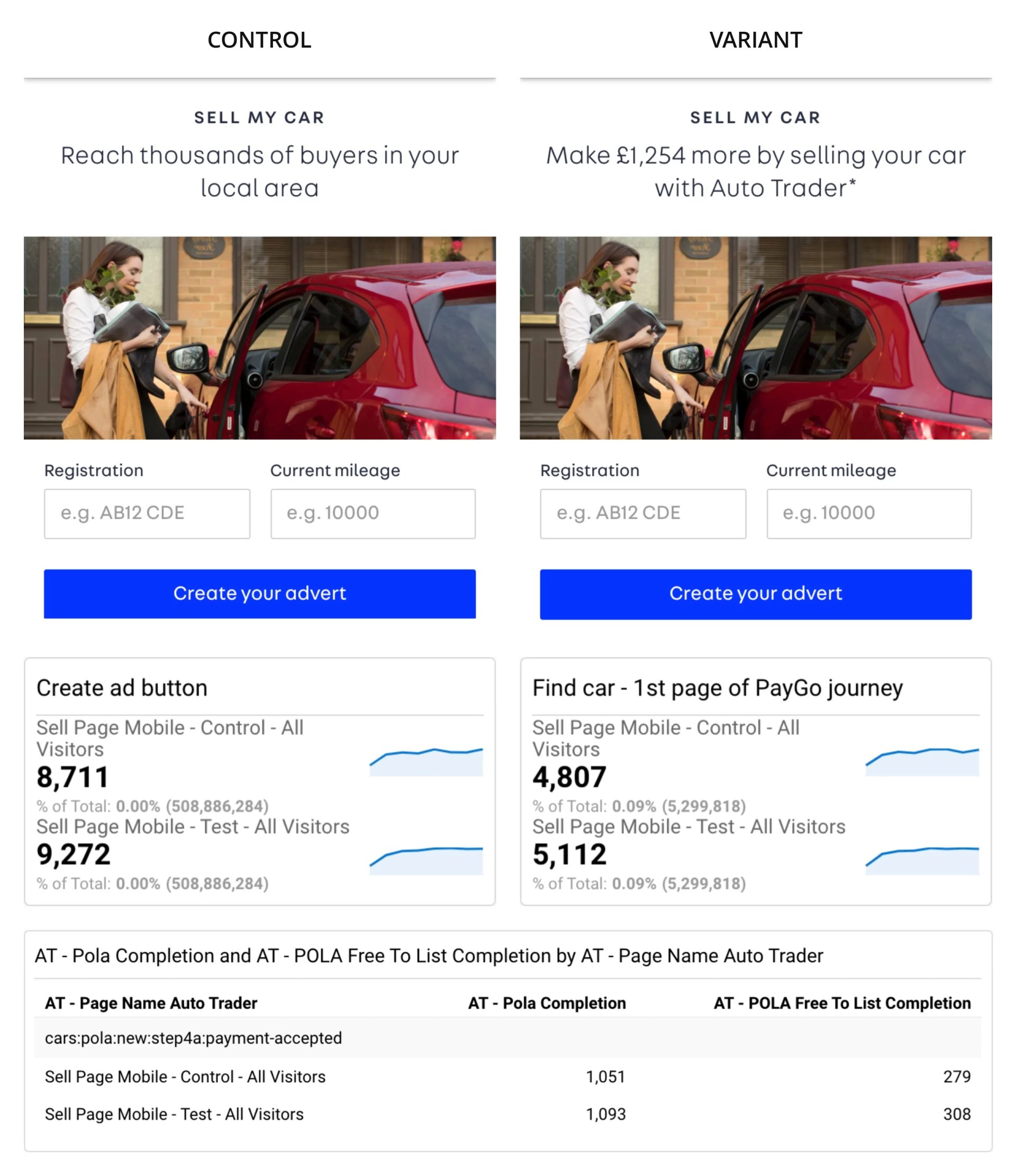
To validate our changes and enhance performance, we conducted A/B tests on key pages, especially the “Sell your car” landing page. Initial results indicated a significant drop in the click-through rate for the “Create your advert” CTA. Further analysis showed that the heading above the CTA didn't sufficiently motivate users to click and create an advert.
By recognising that the issue lies with the heading, we modified it to better communicate the benefits of listing a car with AutoTrader. This slight adjustment resulted in a 4.75% increase in click-through rate and a 3.8% rise in conversions on desktop, as well as a 6.44% increase in click-through rate and a 4% uplift in conversion rate on mobile.
Desktop heading change
Mobile heading change
Challenges
The project was not without its hurdles:
- Cross-Functional Collaboration: Effective coordination between design, engineering, and research teams depends on clear communication and shared objectives.
- Technical constraints: Ensuring consistency across platforms while modernising the codebase was a major challenge.
- User Expectations: Balancing the need for a premium feel with the practical requirements of a high-traffic marketplace demanded careful attention to detail.
improvements
Throughout the project, we introduced several important enhancements:
- Streamlined navigation: Simplified the user journey, particularly on mobile.
- Consistent Branding: Unifies the visual language across all touch-points.
- Data-Informed Iteration: Utilised both qualitative and quantitative data to guide design decisions, resulting in measurable improvements in user engagement and conversion.
Learnings
This project reinforced several valuable lessons:
- Research Is Crucial: In-depth user and data analysis should support every design choice.
- Collaboration Fuels Success: Cross-functional teamwork is vital for delivering complex digital products.
- Small Changes, Big Impact: Even minor tweaks, such as adjusting a headline, can greatly influence user behaviour and business outcomes.
- Adaptability Matters: Embracing feedback and being willing to iterate are essential for ongoing progress.
Projects
 Search optimisation reduced the exit rate and increased agent lead conversion by 8.76%.Read case studynorth_east
 Designed TSB's unified design system, enabling the business to deliver features 35% faster.Read case studynorth_east
 Search UX improved. Reduced zero results by 86% and increased seller leads by 6.33%.Read case studynorth_east
 Checkout optimisation drove a 5.22% increase in conversion YoY by enhancing clarity.Read case studynorth_east
 Delivered Bespoke Offers platform upgrade (zero downtime) & developed the innovative 'Beat My Price' tool.Read case studynorth_eastRefactored complex B2B Portal to mobile-first experience, delivered with zero downtime.Read case studynorth_east
Contact
Please feel free to reach out if you have any ideas, projects, or opportunities you would like to discuss. I am always open to hearing new ideas and collaborating together.
You can contact me through LinkedIn, email, or phone. Alternatively, please complete the form below, and I will do my utmost to respond within 24 hours.