TSB's Design System Transformation
Led the creation and implementation of a unified, accessible design system for TSB Bank. This foundational change enabled the business to deliver new features to the market 35% faster.
Summary
TSB Bank's mission is to help customers get the most out of their money so they can feel confident about their finances every day. This confidence enables them to enjoy life more, which is central to our work.
As the Product Designer, I led a thorough overhaul of the design system. The goal was clear: the current system was fragmented, inconsistent, and outdated, causing inefficiencies and a disjointed customer experience. I aimed to create a unified, scalable, and accessible design system that would underpin all digital products, enhance collaboration between design and engineering, and provide a seamless, trustworthy experience for our customers.
After implementing a robust, dynamic, and scalable design system, the business has seen a significant impact in releasing new products and features to the market, giving them a competitive edge and enabling them to ship products 35% faster.
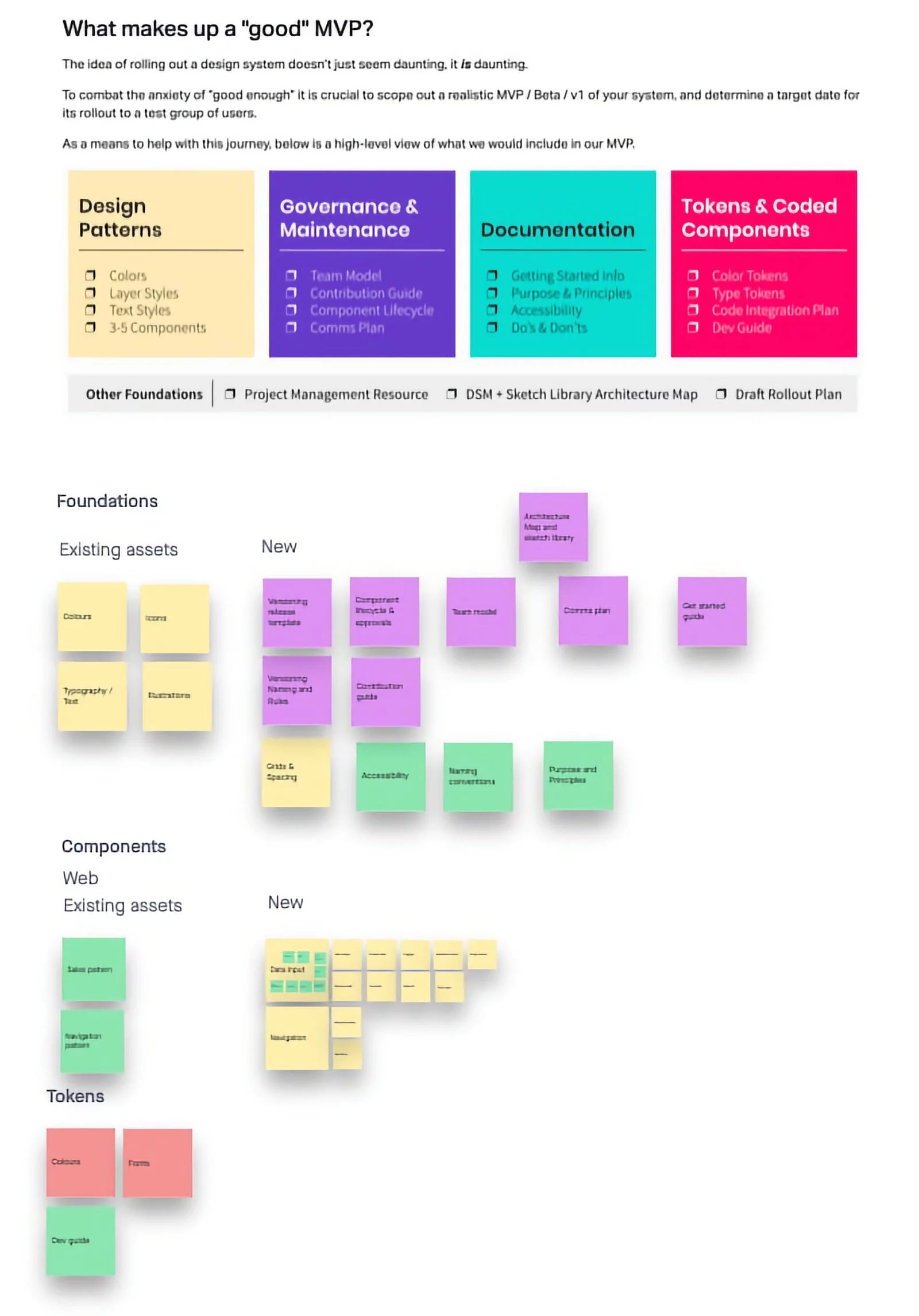
discovery
Deep dive into the current state
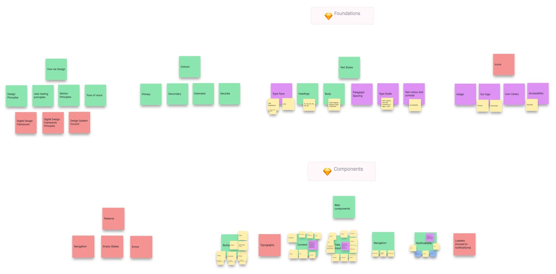
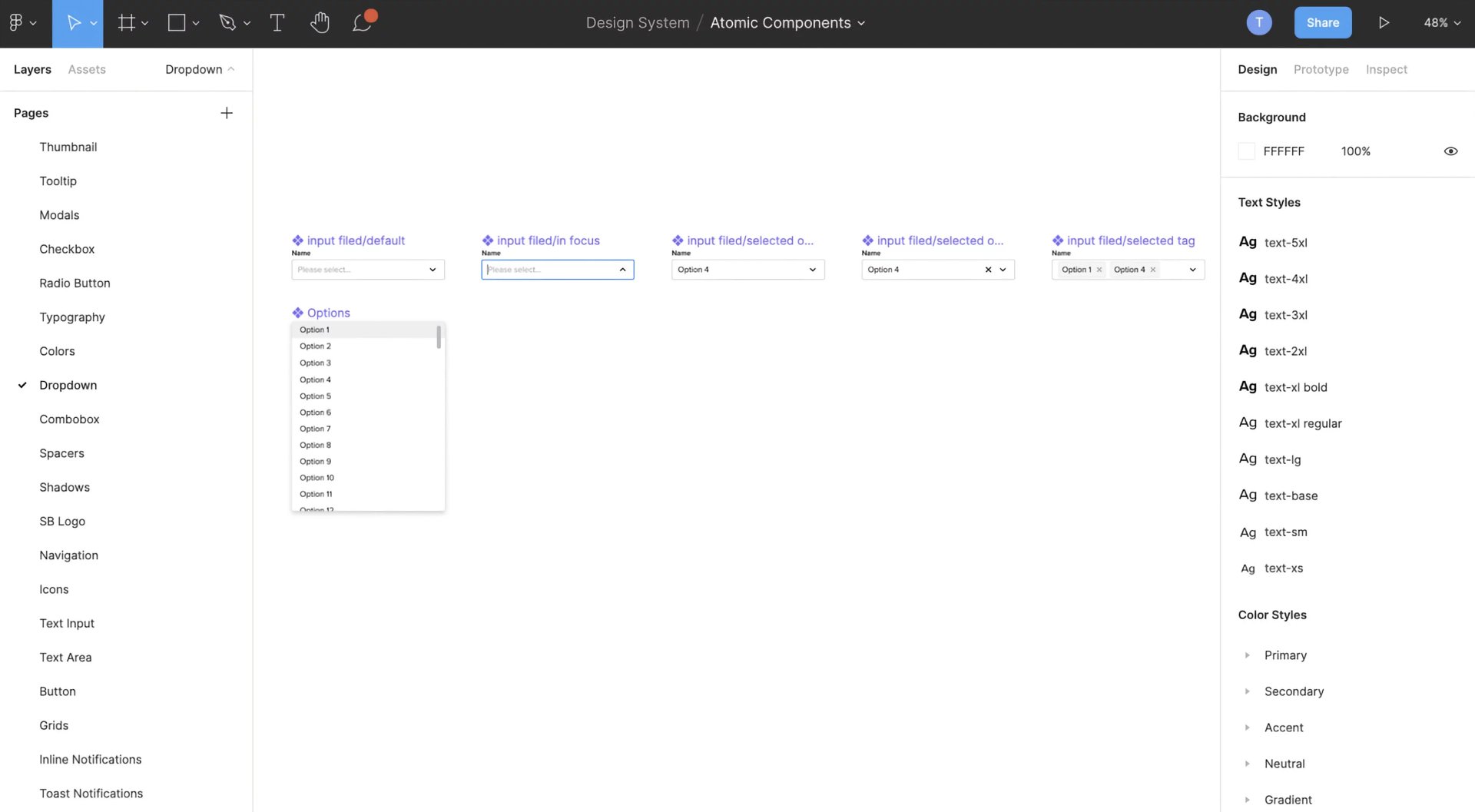
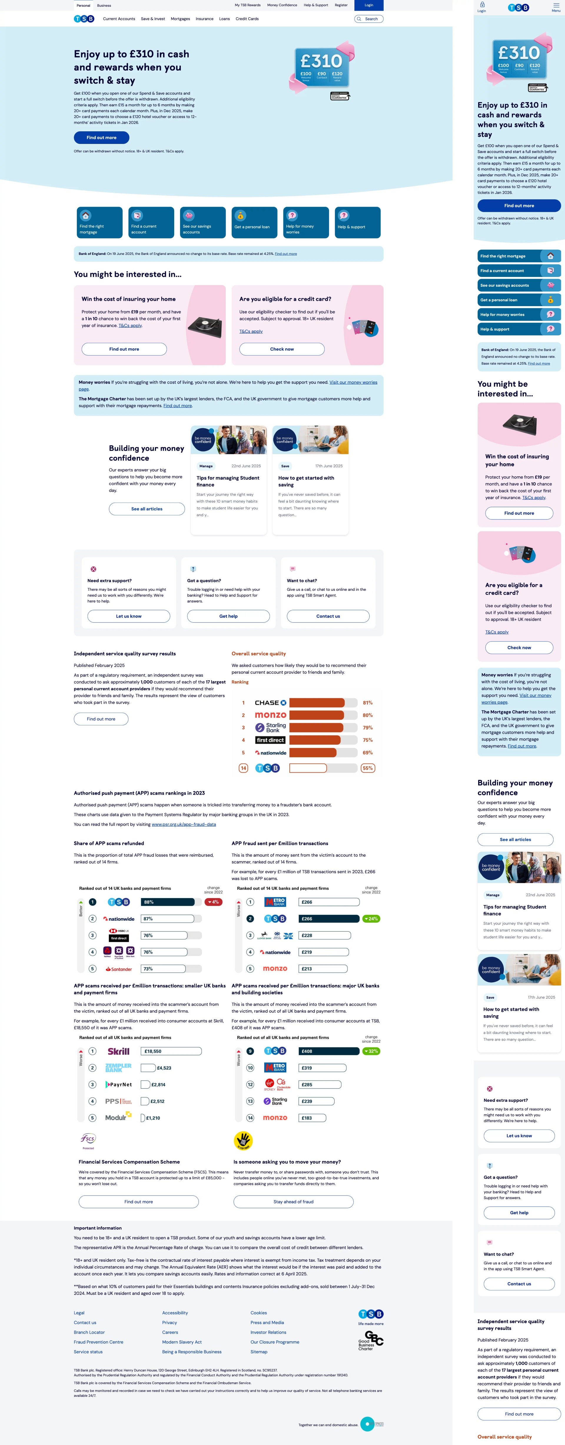
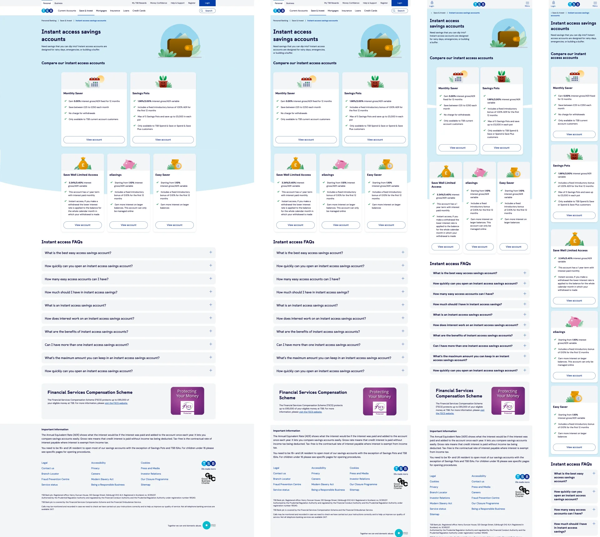
We began with a thorough UI inventory, inspired by Brad Frost’s interface inventory methodology. Over the course of a full day, a cross-functional team of three designers and two developers methodically examined our digital products, capturing screenshots of every unique design element, including typography, buttons, icons, input fields, drop-down menus, and more. This method was intended to ensure that no component was overlooked.
Key Insights
- Inconsistency Everywhere: We encountered multiple versions of alerts, select menus, pagination, and text inputs, each with varying styling, spacing, and colours.
- Ambiguous Documentation: Existing guidelines were unclear, causing teams to interpret designs independently, which resulted in more inconsistencies.
- Collaboration Barriers: The absence of a common language and process hindered effective teamwork among design, engineering, and product teams.
Research and Analysis
- UI Inventory: We documented every component and its variations, establishing a visual record of inconsistencies.
- Stakeholder Interviews: We spoke with designers, developers, and product managers to understand their challenges and goals for the new system.
- Competitive Analysis: We examined leading design systems (IBM Carbon, Material, Atlassian, Salesforce Lightning) to identify best practices and gather inspiration.
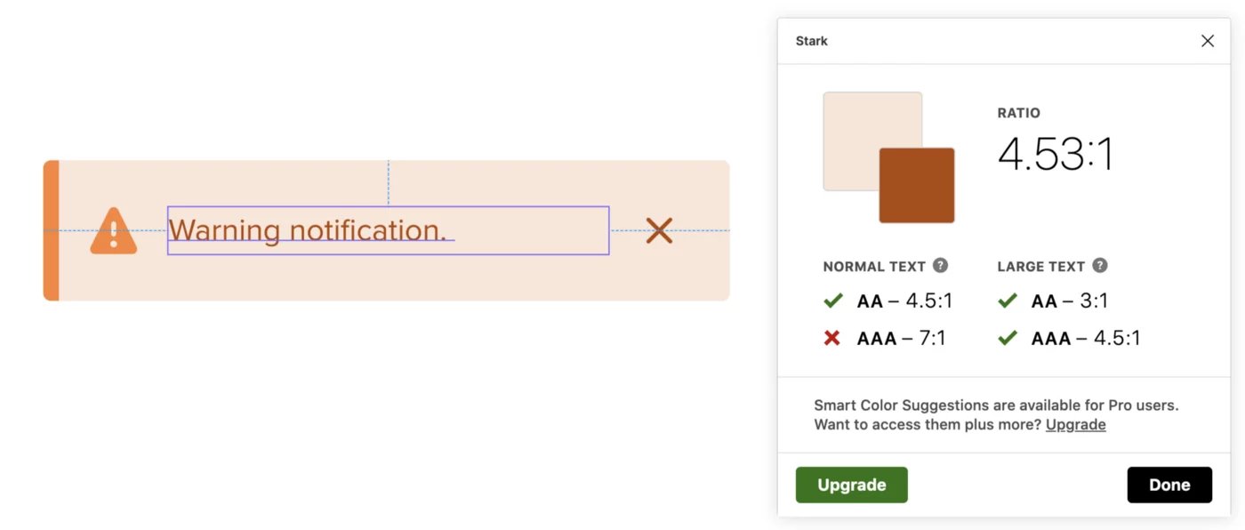
- Accessibility Review: We evaluated compliance with WCAG AA standards and highlighted areas for improvement.
This discovery phase was vital, as it rooted our work in factual evidence and laid the groundwork for a user-centred, inclusive design system.
ideation
Defining the vision and strategy
With a clear understanding of the current challenges, we moved into the ideation phase. Our goal was to create a system that would:
- Unify Brand Identity: Act as a single source of truth for all digital products and assets.
- Streamline Workflows: Enable teams to design and build more quickly with a pre-made library and patterns.
- Promote Accessibility: Ensure that all components adhere to accessibility standards.
- Promote Collaboration: Bridge the divide between design and engineering through shared processes and documentation.
Workshops and brainstorming
We organised cross-functional workshops, bringing together designers, developers, and product managers. Using brainstorming and affinity mapping, we explored different approaches and aligned on key principles. These sessions were vital in building consensus and generating innovative ideas.
Key ideation outcomes
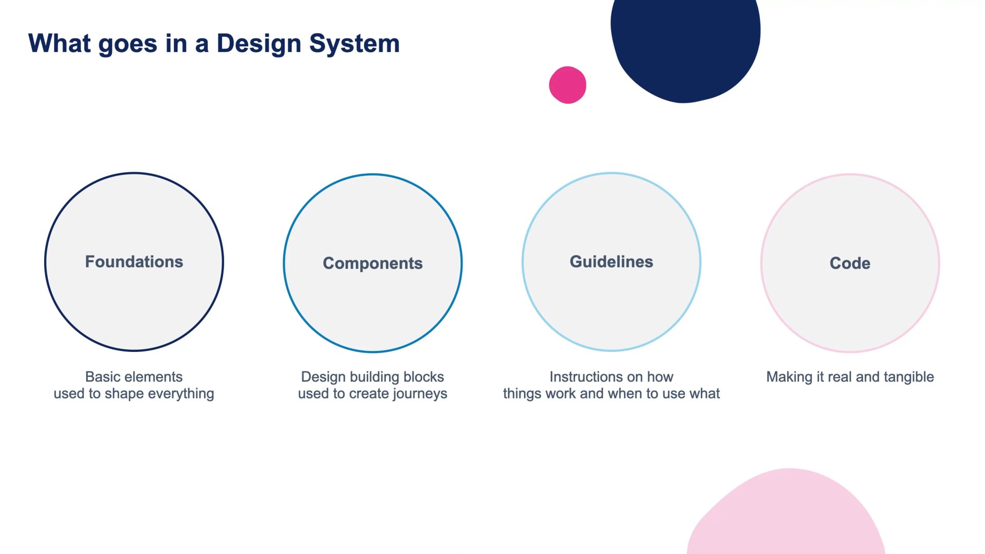
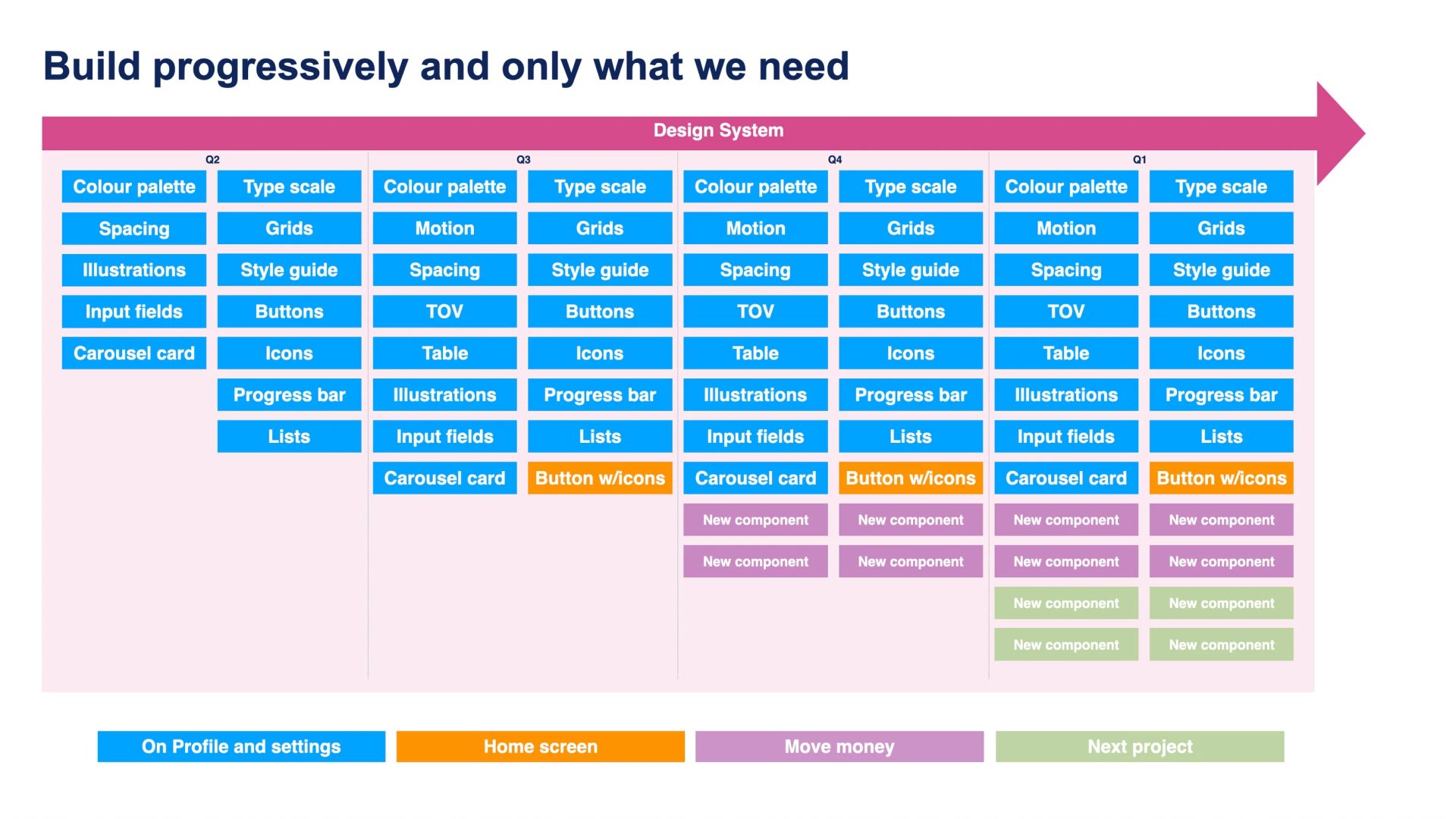
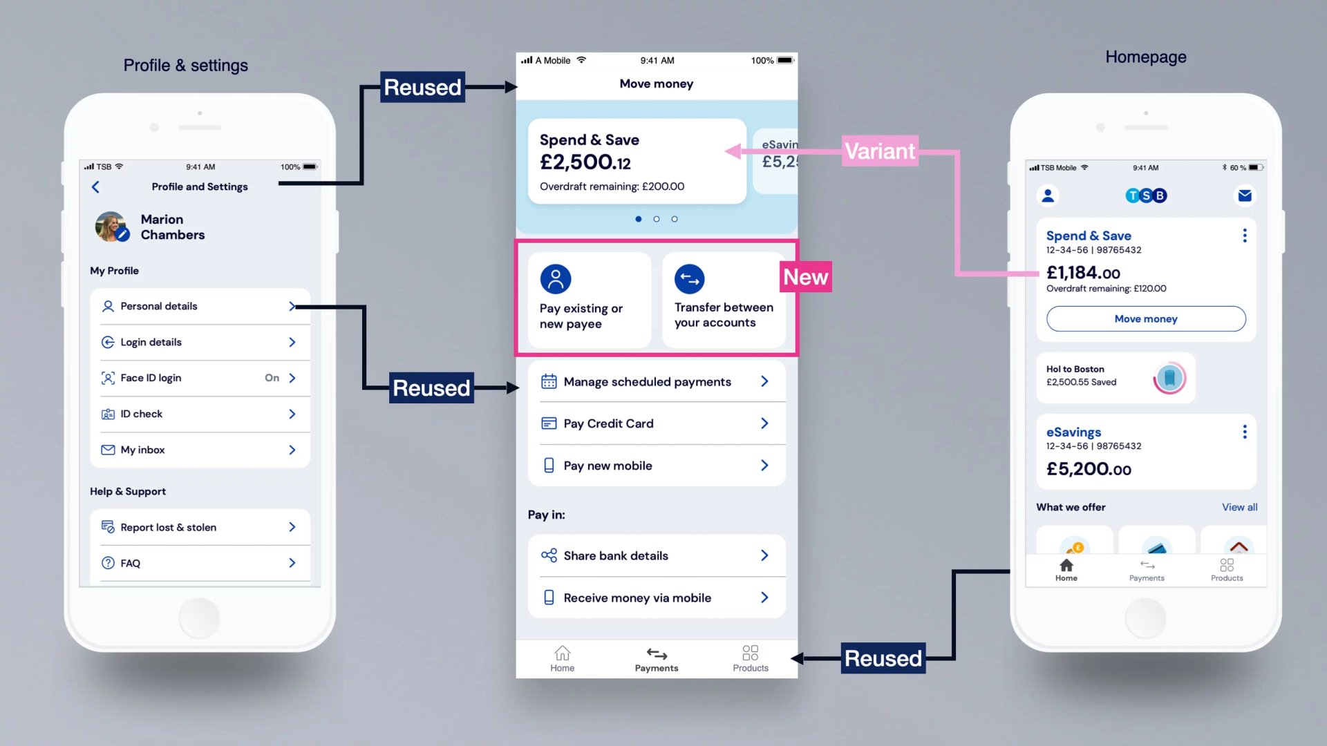
- Atomic Design Approach: We adopted Brad Frost’s atomic design methodology, starting with foundational elements (atoms) and progressing to more complex components (molecules, organisms, templates, and pages).
- Tool Selection: We switched from Sketch to Figma to enhance collaboration and component management.
- Component Consolidation: We limited colour palettes and component variations to maintain consistency and simplicity.
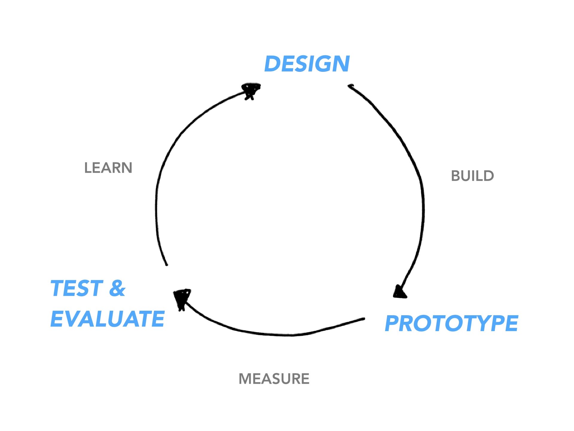
Design
Building the foundations
We began with essential elements: colour palettes, typography, grids, and spacing. Each component was crafted with accessibility in mind, utilising Figma’s auto-layout for responsiveness and variants for managing states (hover, focus, error, disabled).
Design principles
- Consistency: A single set of components for all products.
- Accessibility: All components comply with WCAG AA standards.
- Maintainability: Variants and auto-layout for easy updates and reuse.
- Collaboration: Utilising shared Figma libraries and Slack channels for feedback.
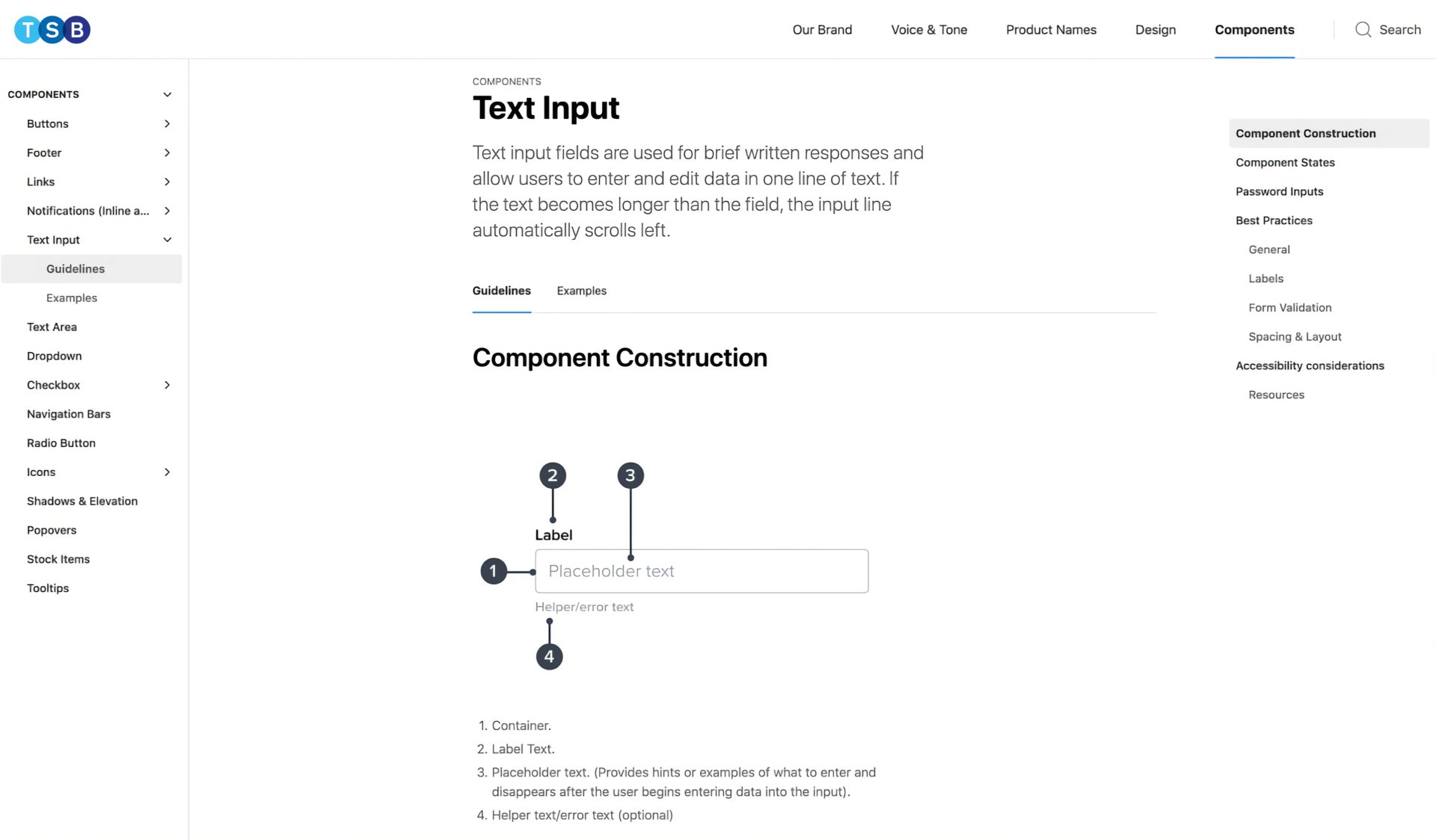
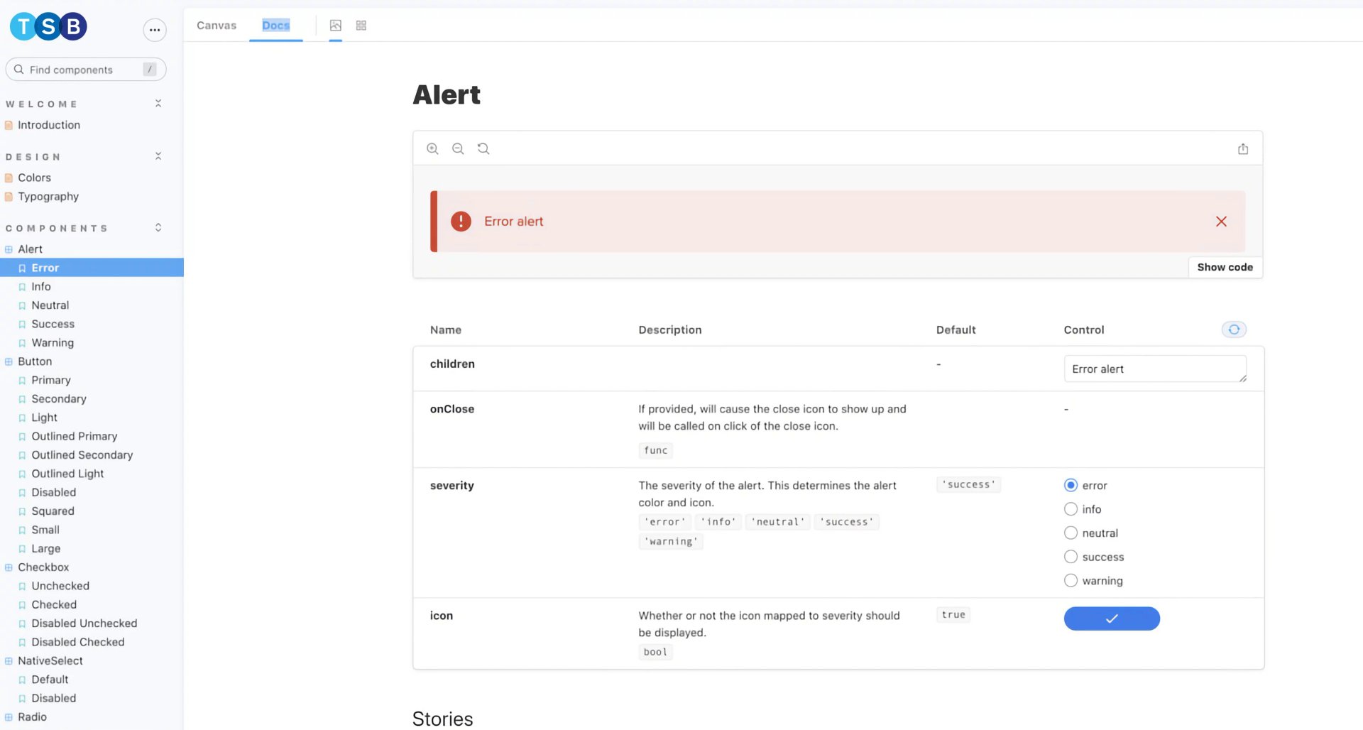
Component documentation
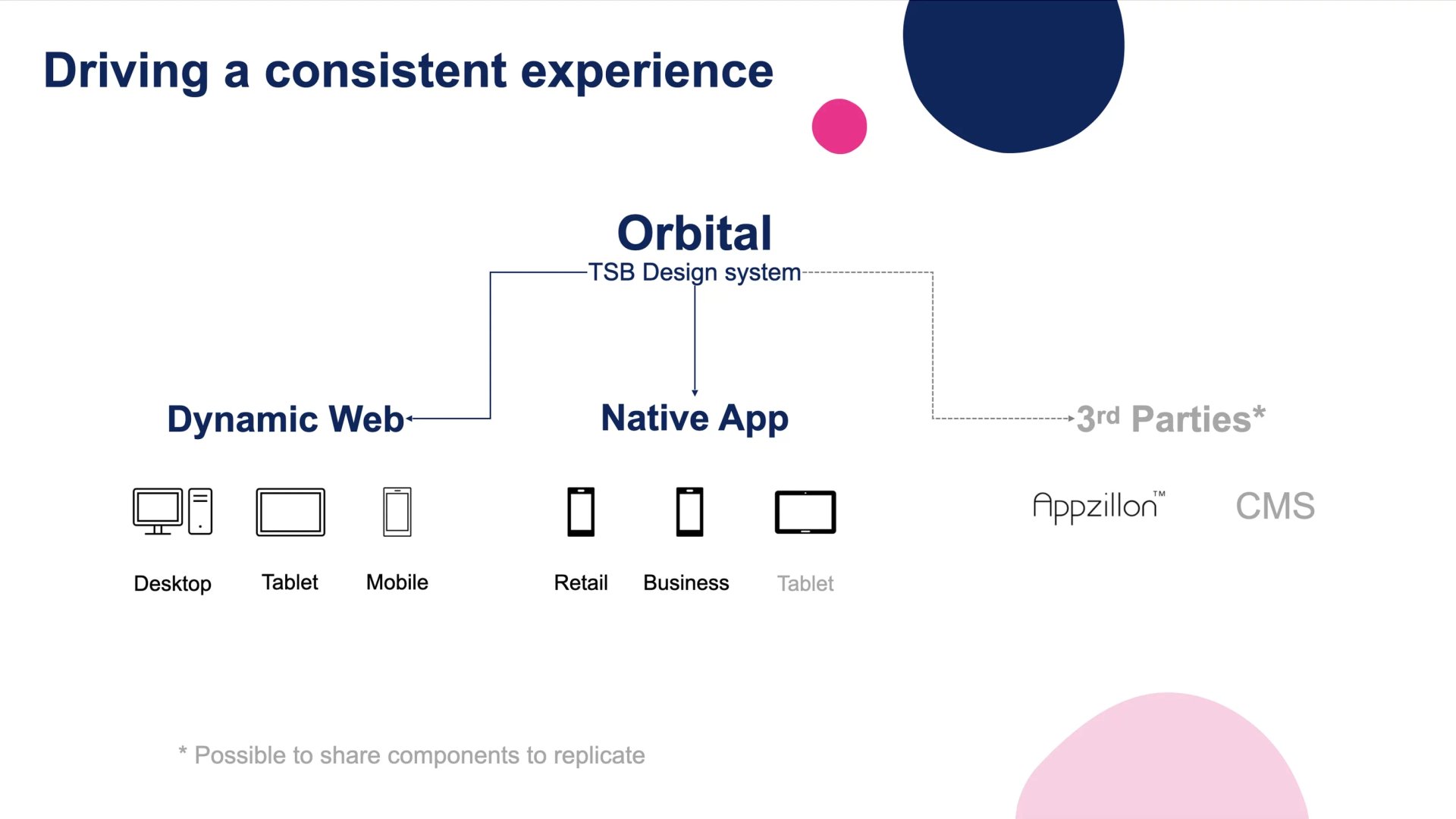
We created comprehensive documentation using Zeroheight, combining design and development guidelines. Our Storybook repository (“Orbit”) offered a live, interactive library for code components, synchronising with Zeroheight for smooth updates.
Process and review
- Component Review Meetings: Every two weeks, the multidisciplinary design system team met to discuss direction and progress.
- Asynchronous Feedback: A dedicated Slack channel was established for ongoing feedback and updates.
- Naming Conventions: We agreed on consistent and clear naming standards between design and code, covering font styles, colours, spacing, and icons.
Usability Testing
Validating the design
Throughout the design phase, we carried out usability tests with both internal teams and external users. We focused on:
- Component Clarity: Are the components easy to understand and use?
- Accessibility: Do components comply with accessibility standards?
- Consistency: Do all components appear to be integrated into a single system?
Feedback was gathered during bi-weekly design system meetings and through Slack, promoting ongoing enhancement.

A/B Testing
A/B testing was a pivotal phase in validating the effectiveness of our new unified design system at TSB Bank. We systematically tested redesigned components and layouts against their previous versions to measure real-world impact on user experience, efficiency, and business outcomes.
Unified system, accelerated delivery
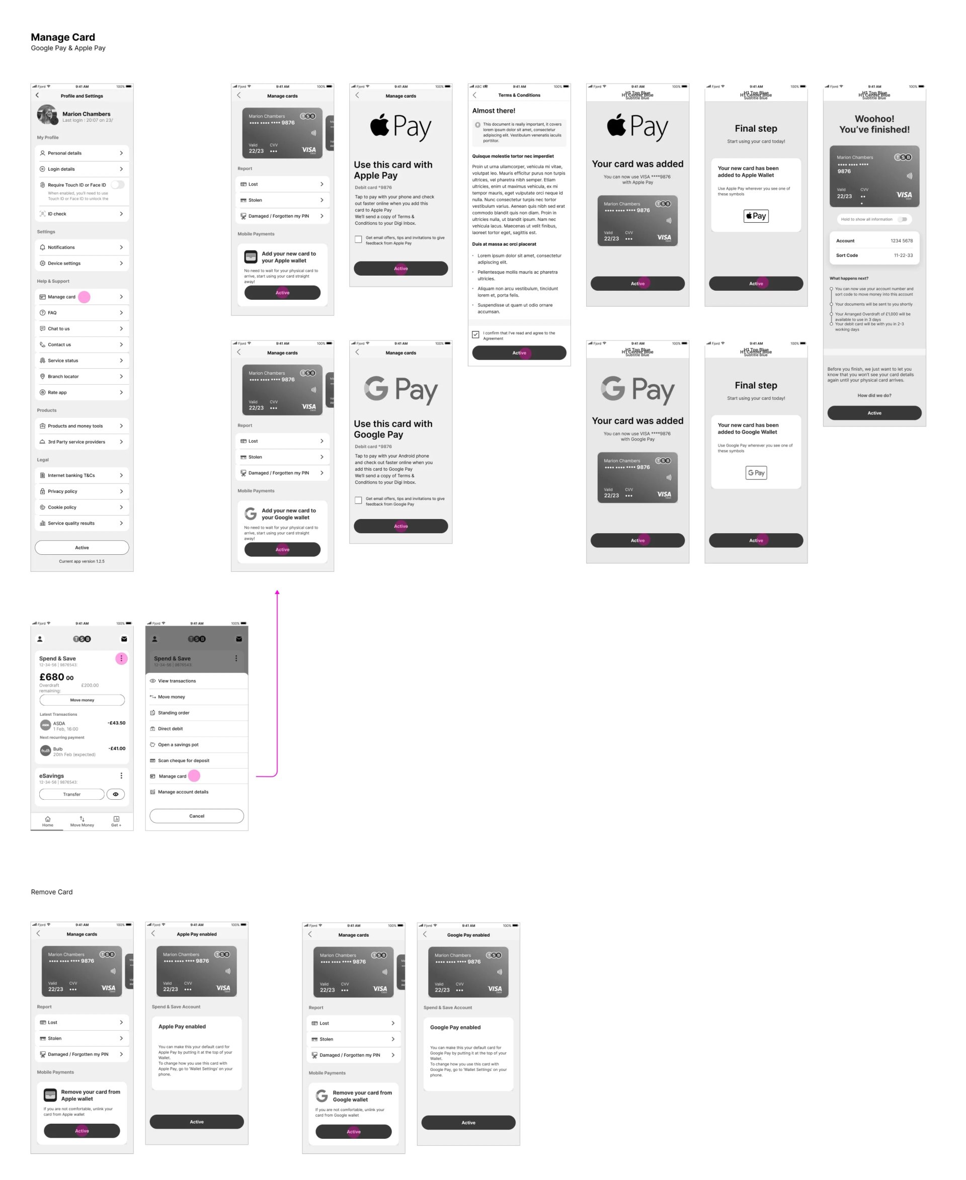
By leveraging the new design system, we were able to test not just isolated UI elements but entire layouts and user flows. This holistic approach allowed us to observe how the unified components performed in realistic scenarios, ensuring consistency and usability across products. We set up controlled experiments where users interacted with both the old and new versions of key interfaces, such as onboarding forms, account dashboards, and transaction modules.
Key Metrics and Outcomes
- Task completion rates: We measured how quickly and accurately users could complete everyday tasks, such as transferring money or updating account details, using both versions.
- Error rates: We tracked the frequency of user errors, particularly in forms and navigation, to ensure the new system reduced friction.
- User satisfaction: Post-test surveys and interviews captured qualitative feedback on clarity, trust, and ease of use.
Quantifiable Impact
The results were clear: Through A/B testing of components and layouts developed with the unified design system, the new components and layouts outperformed earlier versions, and TSB was able to design and launch new products and features 35% faster than with the previous fragmented system. This acceleration was driven by the ready-to-use, reusable component library, streamlined documentation, and improved cross-team collaboration. The unified system allowed designers and engineers to focus on solving user problems rather than reinventing UI patterns for each project, significantly reducing time-to-market.
Continuous feedback loop
We didn't stop at a single round of testing. Insights from each A/B test informed further refinements to both the design system and our implementation process. This iterative approach ensured that improvements were data-driven and aligned with user needs, reinforcing our commitment to delivering accessible, consistent, and delightful banking experiences.
Challenges
Overcoming obstacles
We began with essential elements: colour palettes, typography, grids, and spacing. Each component was crafted with accessibility in mind, utilising Figma’s auto-layout for responsiveness and variants for managing states (hover, focus, error, disabled).
- Resource Constraints: No dedicated design system team; we integrated component development into existing squad tasks.
- Adoption: Promoting team uptake of the new system involved continuous communication and training.
- Documentation Synchronisation: Maintaining alignment between design and code documentation was an ongoing endeavour.
Despite these challenges, our collaborative approach and clear communication maintained consistent progress.
improvements
Iterative refinement
We refined the system based on feedback from usability and A/B testing. Key improvements included:
- Expanded component library: Included more advanced components and comprehensive documentation.
- Enhanced accessibility: Further improved colour contrast and keyboard navigation.
- Process automation: Implemented automated checks for documentation and code consistency.
Learnings
Key takeaways
- Collaboration is essential: Involving all teams from the beginning fostered ownership and adoption.
- Research fuels success: Evidence-based decisions created a stronger, user-focused system.
- Iteration never stops: A design system is a living product that evolves with the organisation.
The TSB Design System "Orbit" project highlights the importance of thorough research, cross-department collaboration, and user-centred design. By developing a unified, accessible, and scalable system, we empowered both our teams and customers, improving banking for everyone.
Projects
 Search optimisation reduced the exit rate and increased agent lead conversion by 8.76%.Read case studynorth_east
 Brand refresh delivered 4% conversion uplift on mobile and 3.8% on desktop.Read case studynorth_eastSearch UX improved. Reduced zero results by 86% and increased seller leads by 6.33%.Read case studynorth_east
 Checkout optimisation drove a 5.22% increase in conversion YoY by enhancing clarity.Read case studynorth_east
 Delivered Bespoke Offers platform upgrade (zero downtime) & developed the innovative 'Beat My Price' tool.Read case studynorth_eastRefactored complex B2B Portal to mobile-first experience, delivered with zero downtime.Read case studynorth_east
Contact
Please feel free to reach out if you have any ideas, projects, or opportunities you would like to discuss. I am always open to hearing new ideas and collaborating together.
You can contact me through LinkedIn, email, or phone. Alternatively, please complete the form below, and I will do my utmost to respond within 24 hours.