Bespoke Offers: Personalised Discounts at Scale
Successfully upgraded the Bespoke Offers platform without a single minute of downtime. Designed and developed the innovative 'Beat My Price' negotiation tool, enhancing customer value through secure, personalised daily deals.
Summary
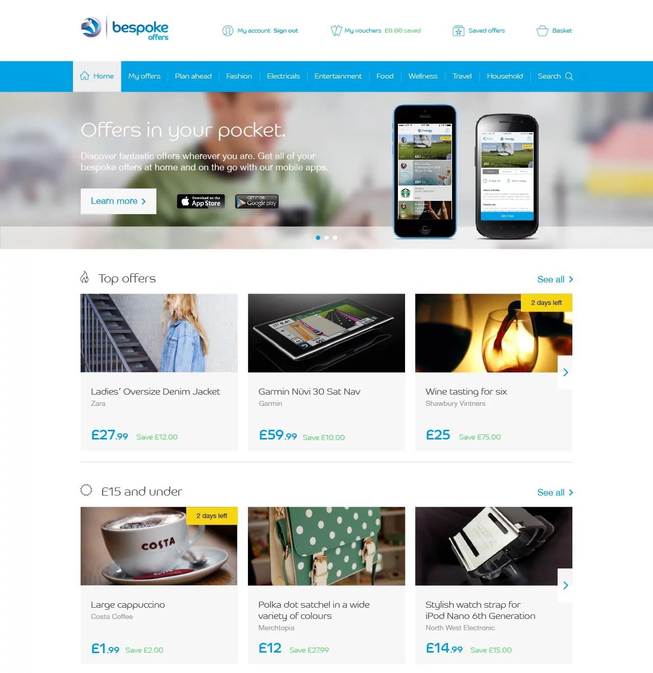
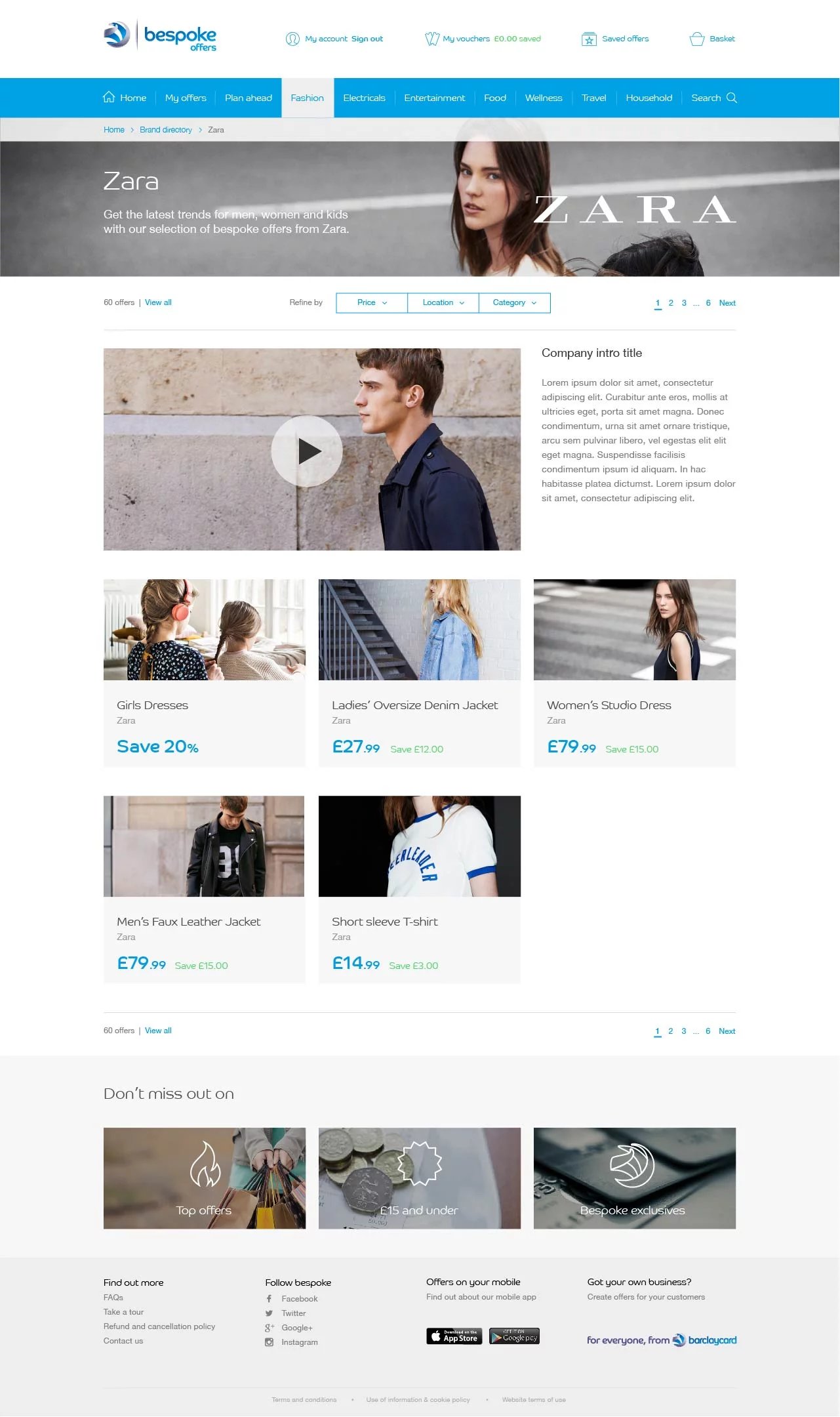
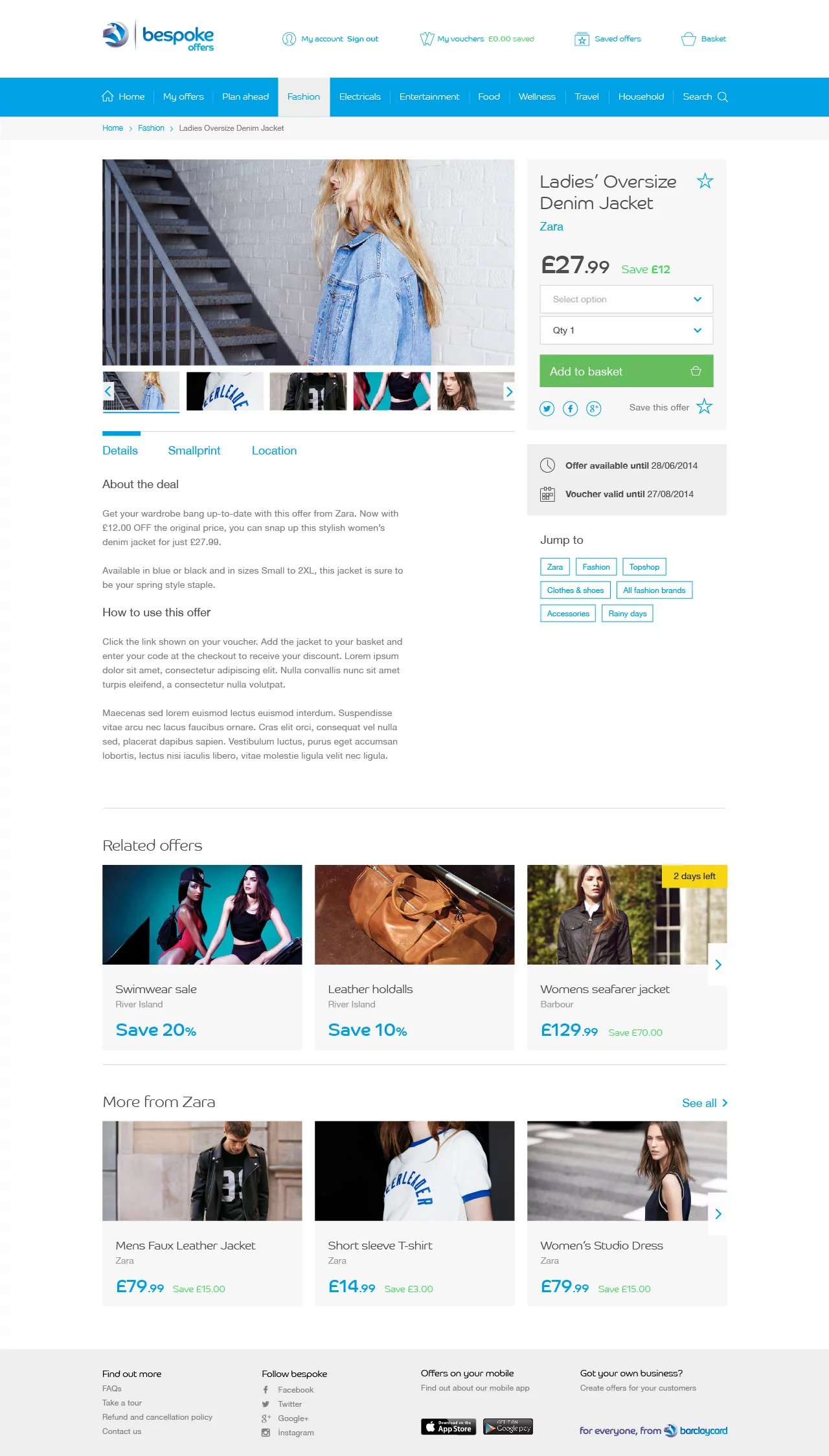
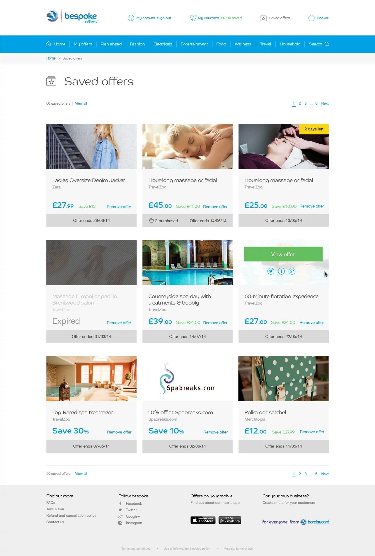
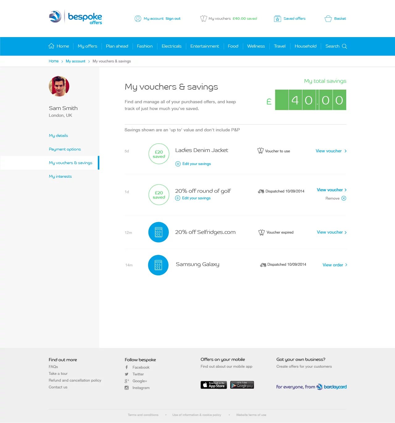
Bespoke Offers set out to make it easy for people to discover and enjoy discounts from local businesses, whether you’re searching for a weekend getaway, a new pair of shoes, or a fantastic meal. Not only did we connect users with merchants, but we also introduced a “Beat My Price” tool, allowing shoppers to negotiate for an even better deal.
As a front-end developer with a product design background, I had the opportunity to help shape the entire experience, from early sketches to a polished, high-performing website. The best part? We upgraded everything behind the scenes without a single minute of downtime, and the leadership team adored the results.
Discovery
Before jumping into design or coding, I needed to get to the heart of the problem. I began by speaking with real people: Barclays customers, local merchants, and everyday shoppers. I posed questions like:
- What's frustrating about finding local deals online?
- How do you decide which offers to use?
- What would make you trust a new marketplace?
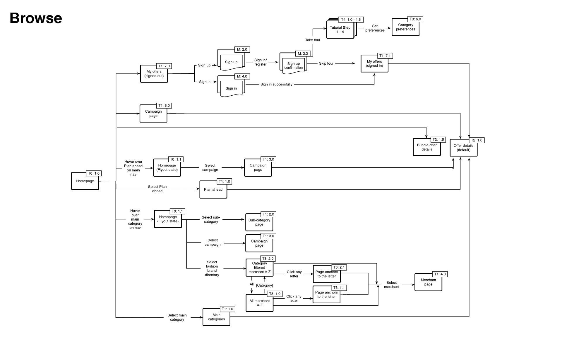
I also examined what competitors were doing (and not doing) and mapped out every step a user might take, from landing on the homepage to redeeming a discount. This enabled me to identify pain points and opportunities that might have otherwise gone unnoticed.
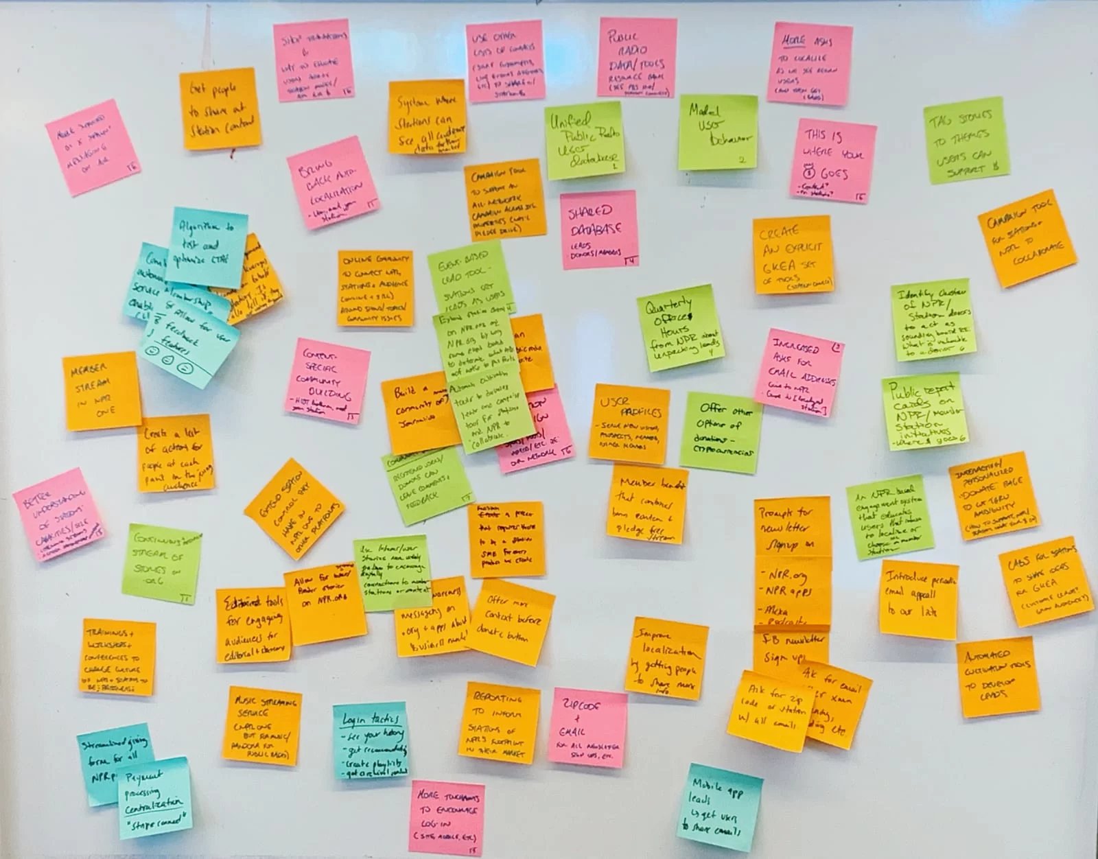
Ideation
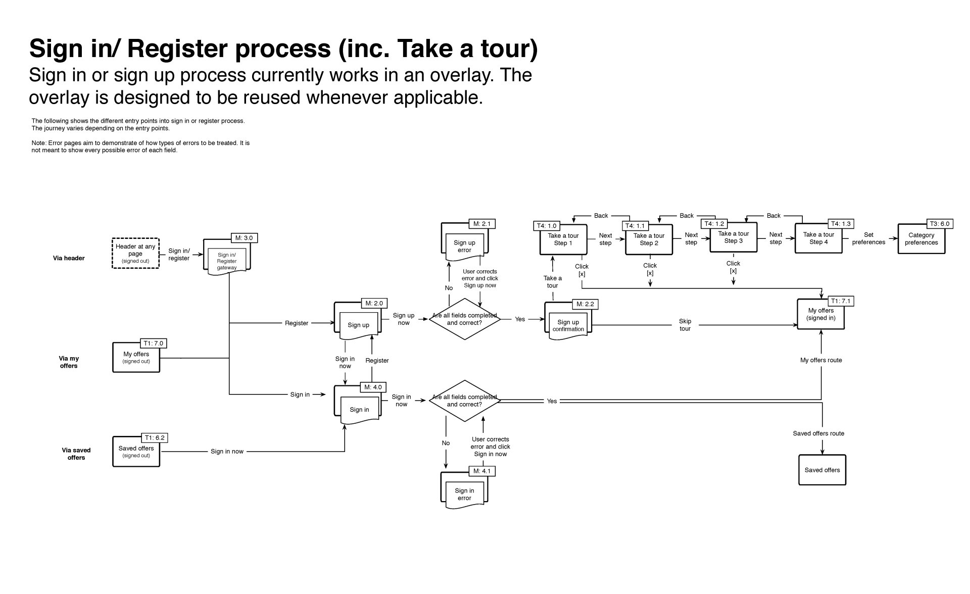
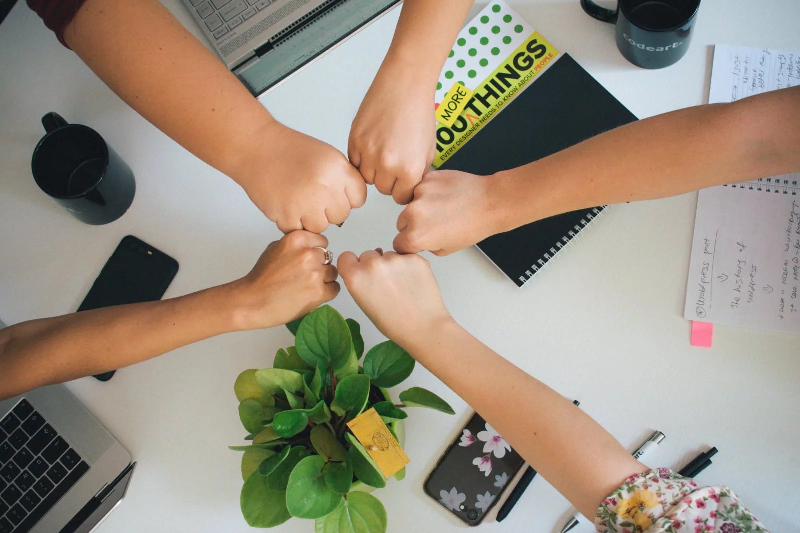
I gathered the team of designers, developers, and business professionals for some good old-fashioned brainstorming. No idea was too outrageous at this stage! I sketched out user flows, envisioning how someone might discover an offer, use “Beat My Price,” and ultimately make a purchase. I deliberated, voted, and helped narrow down the features that would truly make a difference.
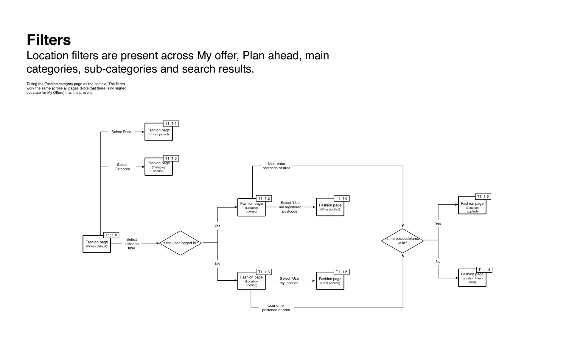
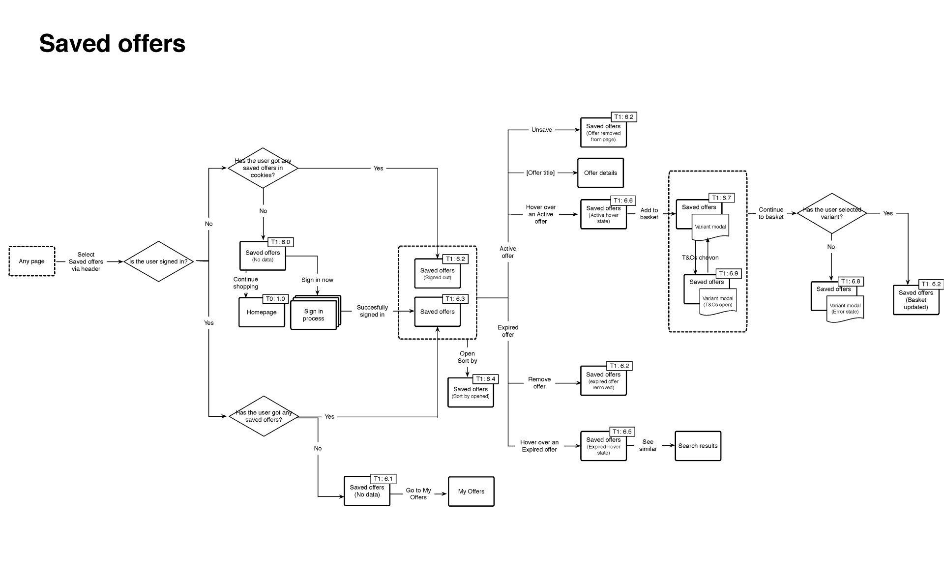
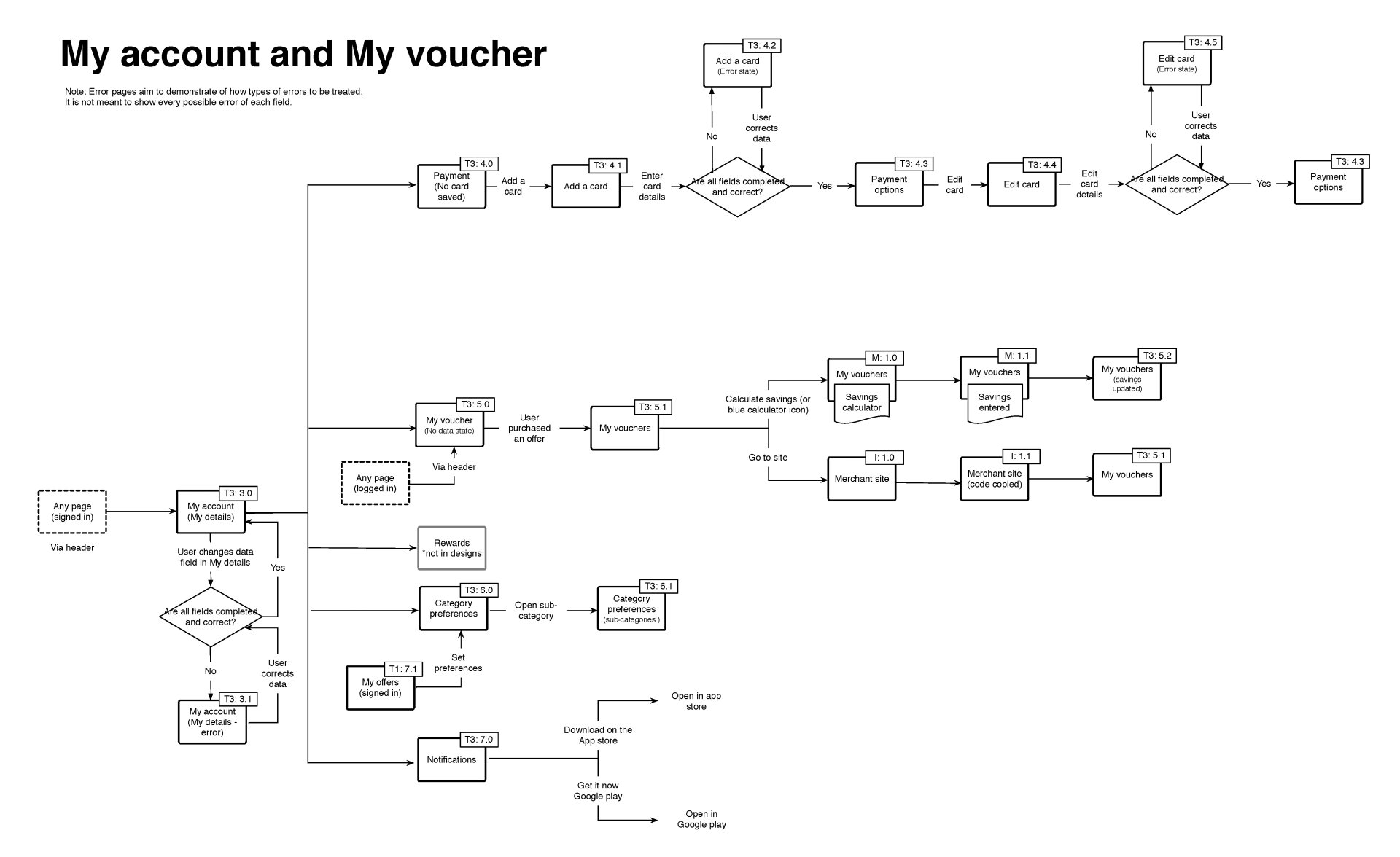
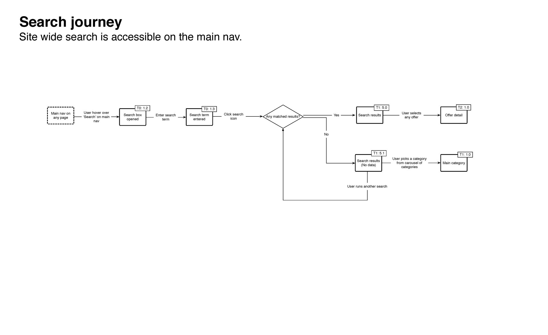
Design
With ideas in place, it was time to bring them to life. I began with simple wireframes, think black-and-white sketches to establish the layout. Next came high-fidelity mockups, where colours, fonts, and images made the site feel real. I paid special attention to accessibility: ensuring that text was easy to read, buttons were large enough to tap, and everything functioned with screen readers.
I shared prototypes with users and observed them clicking around. Their feedback was invaluable; sometimes they’d get stuck in areas I hadn’t anticipated, so I made adjustments until everything felt seamless.
Development
I took an incremental approach, swapping out old code for new, one piece at a time, so users never noticed a thing. I employed modern tools: HTML5 for structure, CSS3 and SCSS for styling, and JavaScript ES6+ (with a dash of React) for interactivity. Zurb Foundation aided in keeping things responsive and accessible.
I collaborated closely with the back-end team to ensure everything loaded quickly and functioned seamlessly. Regular code reviews and automated tests contributed to keeping bugs at bay.

Best practices
Throughout the project, I adhered to a few golden rules:
- Use semantic HTML so search engines and screen readers understand the content.
- Keep the design responsive; it looks great on any device.
- Write clean, modular CSS with BEM and SCSS for easy maintenance.
- Test early, test often, and never skip a code review.
Accessibility
Accessibility wasn't an afterthought, it was integrated from day one. I ensured:
- Colours had sufficient contrast for everyone to read.
- The site could be navigated using just a keyboard.
- ARIA labels enabled screen readers to describe every button and link.
- I tested with real users who rely on assistive technology.
Usability Testing
I presented my designs to real users, sometimes in person and other times remotely. I observed them as they attempted to find offers, use “Beat My Price,” and check out. If anyone encountered difficulties or confusion, I took notes and implemented improvements. Additionally, I distributed brief surveys to gather further feedback.
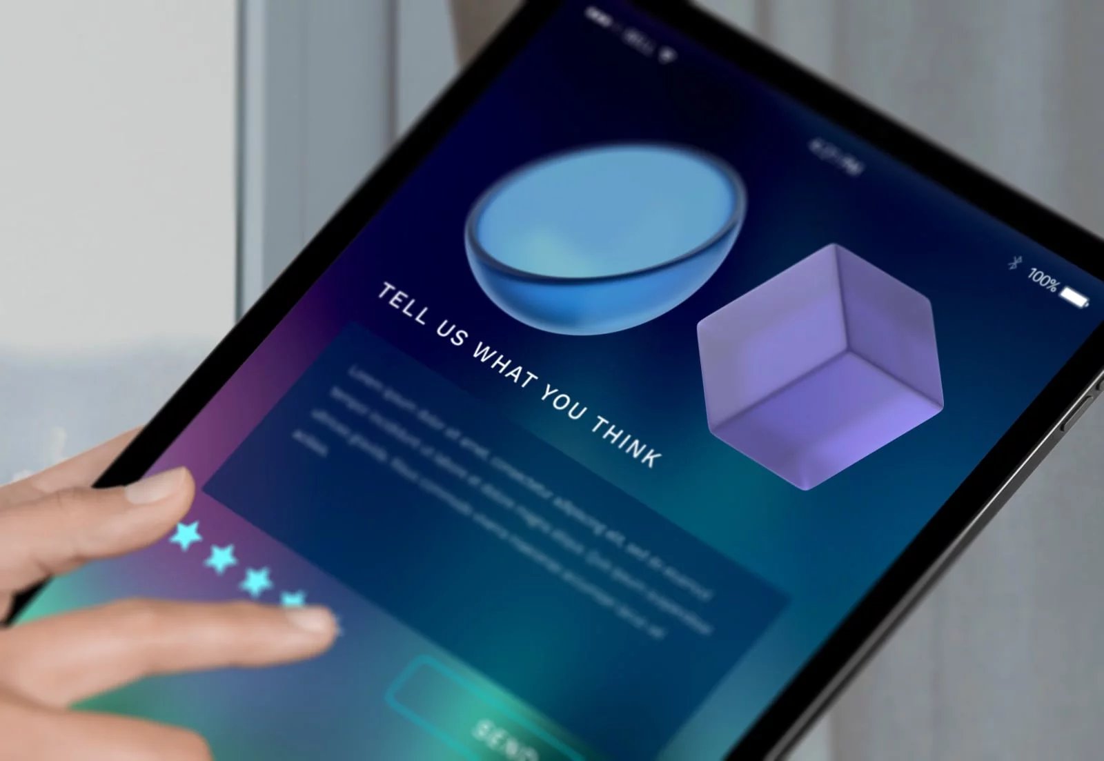
A/B Testing
After the launch, I conducted A/B tests to determine what truly worked. For instance, I experimented with two different layouts for the “Beat My Price” tool to ascertain which one encouraged more users to complete a negotiation. I monitored clicks, conversions, and user satisfaction, then implemented the winning versions.
Challenges
No project is without its challenges! My biggest obstacles were:
- Upgrading the old codebase without disrupting anything (or anyone noticing).
- Balancing user privacy with personalised offers.
- Ensuring that the site functions for everyone, regardless of device or ability.
- Keeping everyone from designers to developers to business leads aligned.
- However, with teamwork and effective communication, I addressed each challenge directly.
Improvements
Following the launch, I did not stop. I:
- Built a reusable component library to accelerate future development.
- Made “Beat My Price” smarter with AI suggestions.
- Streamlined the sign-up and checkout process based on user feedback.
- Continued to optimise performance and resolve bugs.
Learnings
Reflecting on my experience, a few things stand out:
- The Double Diamond process helped me maintain focus, first on understanding the problem, then on identifying the right solution.
- Involving users early and frequently made all the difference.
- Accessibility and performance are just as crucial as aesthetics.
- Incremental updates ensure stability and minimise stress.
- Collaboration is essential, great products are created by teams, not individuals.
Projects
 Search optimisation reduced the exit rate and increased agent lead conversion by 8.76%.Read case studynorth_east
 Designed TSB's unified design system, enabling the business to deliver features 35% faster.Read case studynorth_east
 Brand refresh delivered 4% conversion uplift on mobile and 3.8% on desktop.Read case studynorth_eastSearch UX improved. Reduced zero results by 86% and increased seller leads by 6.33%.Read case studynorth_east
 Checkout optimisation drove a 5.22% increase in conversion YoY by enhancing clarity.Read case studynorth_east
 Refactored complex B2B Portal to mobile-first experience, delivered with zero downtime.Read case studynorth_east
Contact
Please feel free to reach out if you have any ideas, projects, or opportunities you would like to discuss. I am always open to hearing new ideas and collaborating together.
You can contact me through LinkedIn, email, or phone. Alternatively, please complete the form below, and I will do my utmost to respond within 24 hours.