Zoopla Search Optimisation
Discover how transforming search problems into opportunities by improving map interaction led to a 2.1% rise in lead conversions, and how simplifying a sign-up form increased lead conversions by 8.76% for the Sales channel.
Summary
Zoopla is the UK's leading real estate platform, offering comprehensive search tools for homes to buy and rent, as well as detailed property valuation data. Founded in 2007, Zoopla is recognised by 90% of the UK population, with 90% of people planning to move in the next year identifying the brand. In May 2025, the site had 9 million monthly unique users and generated over 4 billion minutes of user time annually.
As the Senior Product Designer, I had the opportunity to lead an end-to-end redesign of Zoopla’s search experience by thoroughly understanding the consumer and business problems through analytics, behavioural research, stakeholder discovery, and validating solutions through design, usability testing, and A/B testing.
Using a combination of quantitative tools such as Contentsquare journey and funnel analysis, Google Analytics, and filter‑usage data, along with qualitative methods like user research, surveys, and workshops, I identified key pain points, including high SRP exit rates, confusing filters, an underperforming map view, and friction in the save-search sign-up. I then translated these insights into targeted design and experimentation workstreams that enhanced both the consumer experience and lead generation for the business.
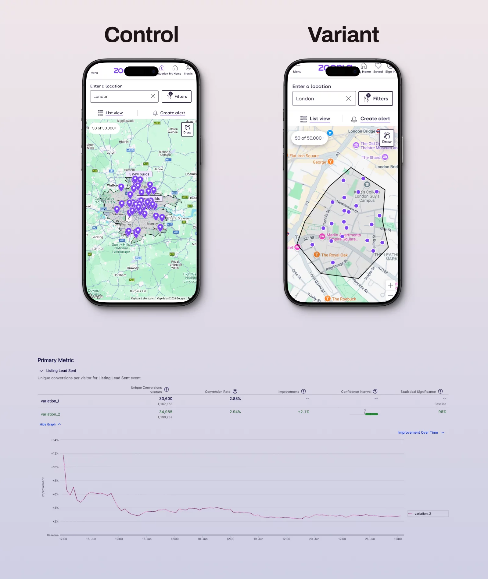
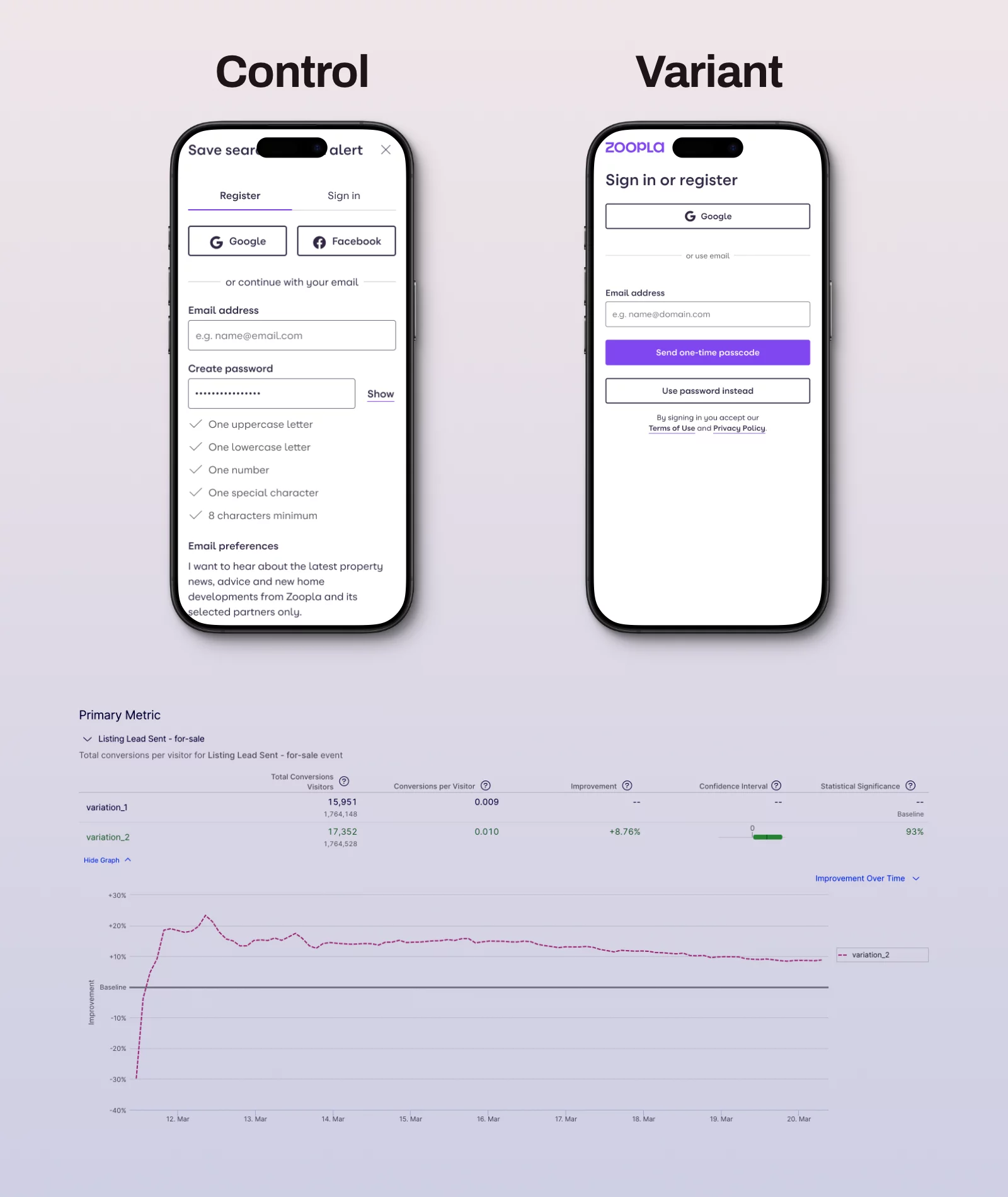
By defaulting to a more zoomed-in map with clearer controls, reduced exits, and increased listing pin taps, boosting call and email lead rates to 2.1% on For Sale SRPs. Additionally, a shorter, unified, password-free registration and sign-up form with a prominent call-to-action increased save-search sign-up completions and raised call and email lead conversions to 8.76% on For Sale SRPs.

discovery
Deep dive into the current state
Search is the core of Zoopla; most users arrive directly at the search results page (SRP), which is the most common entry point. Two-thirds of users viewing 'For Sale' SRPs land there directly, meaning the page must be self-explanatory without prior context from the homepage.
Despite this, 38% of users exited the SRP without visiting a listing detail page or contacting an agent, and of these, mobile accounted for 72% of listing page sessions but had a lower conversion rate than desktop.
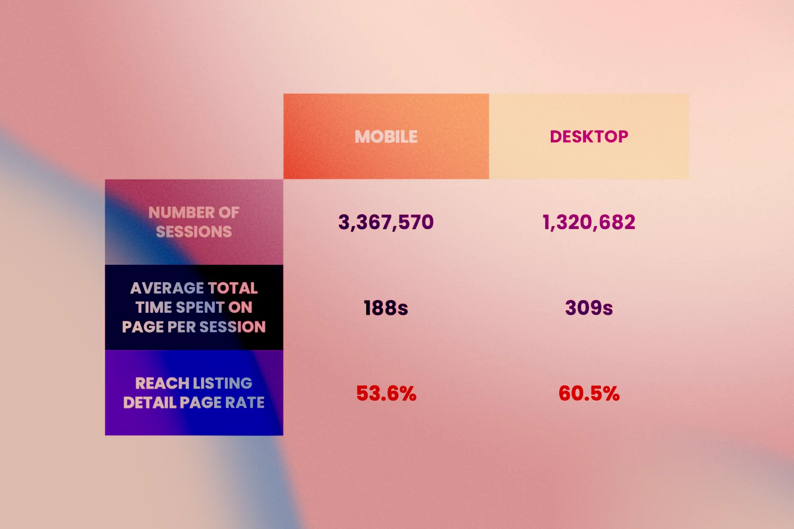
Behavioural analysis showed:
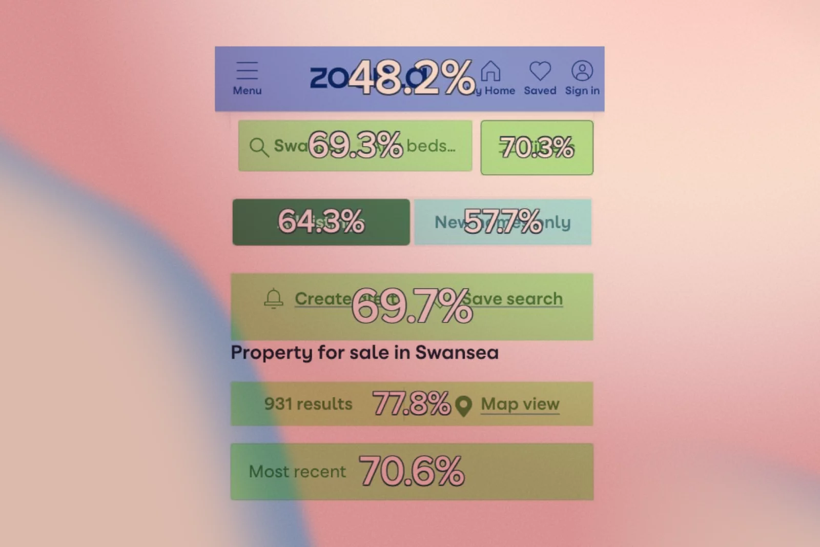
70% of users who click Filters or Sort By, and 78% who click Map View, reach a listing detail page.
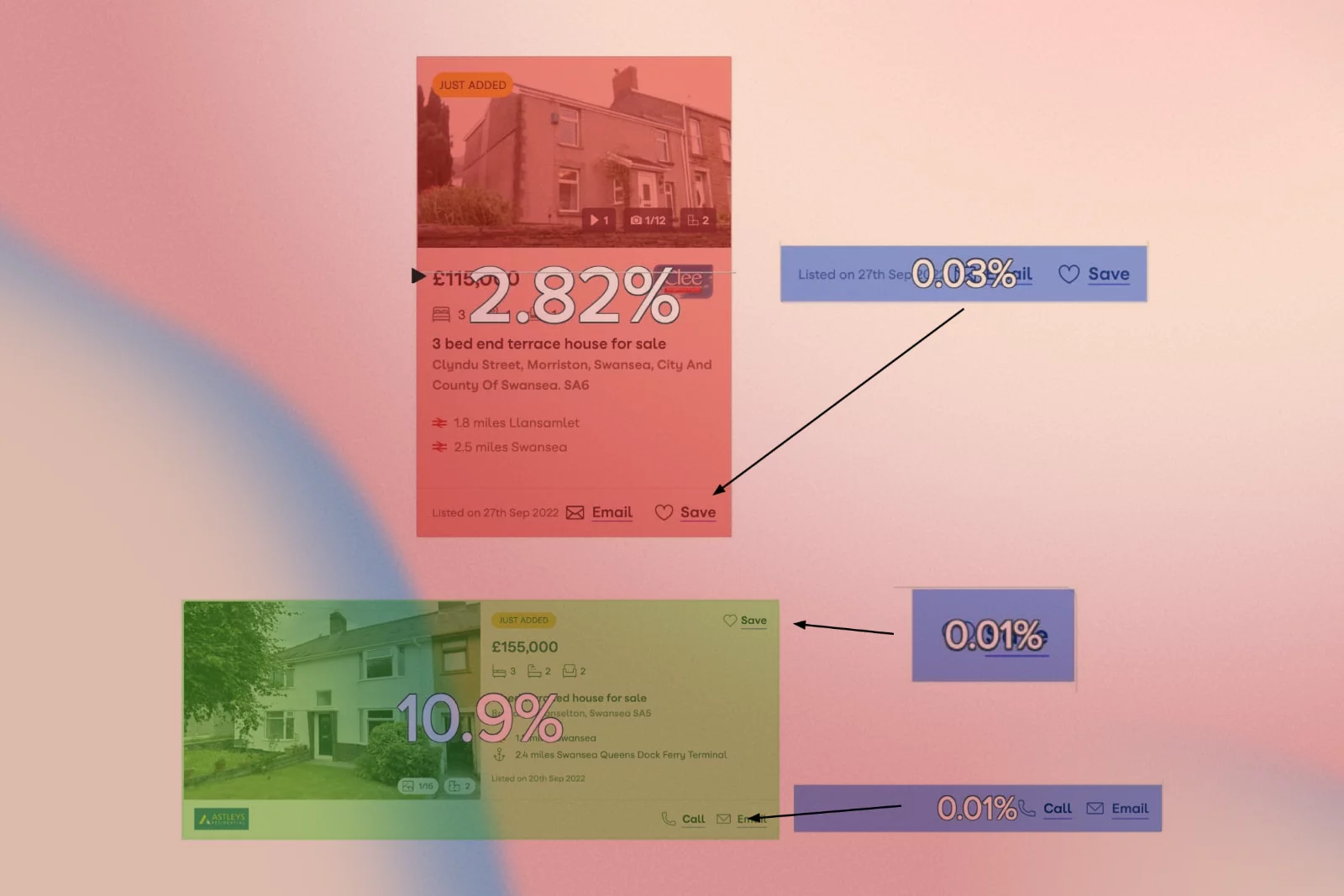
Only 11% of all Call/Email clicks happen on the SRP; the vast majority occur on listing detail pages, suggesting SRP shortcuts are underused.
1 in 6 mobile users exit immediately after opening the search bar, and 16.8% of those users leave the site without viewing another page.
In parallel, long‑term analytics revealed that users who perform more searches and use more filters are significantly more likely to send a lead, making refinement an important value lever for the business.
Research
I combined qualitative and quantitative methods to understand both user behaviour and business value drivers. The goal was to map where users struggle, which features signal high intent, and where we were wasting precious above‑the‑fold space.
1. Landing and journey behaviour
- The For Sale SRP is the most common landing page on both mobile and desktop.
- Around 70% of mobile and 58% of desktop users who view SRPs land on them directly, or arrive via a listing detail page and navigate back.
- Journeys for To Rent and For Sale are structurally similar, but renters are more likely to refine searches and to convert once on listing details.
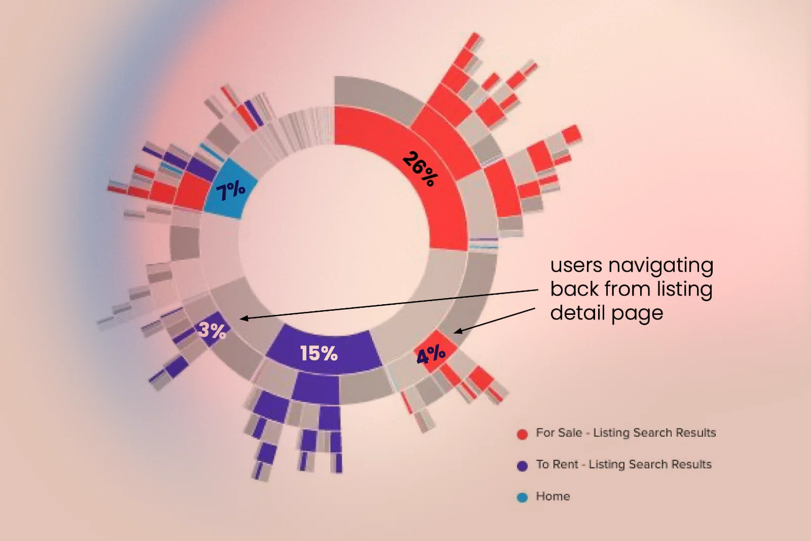
2. Interaction with core SRP controls
- 14% of users click Filters, and 6% click Sort By; both features strongly correlate with reaching an LDP and later conversion.
- The search bar has high click‑through, but for mobile users, it is a drop‑off point; 16.8% exit after using it, versus 2.7% on desktop.
- Search radius changes are among the most popular refinements on both devices, reflecting how people naturally widen their area to find options.
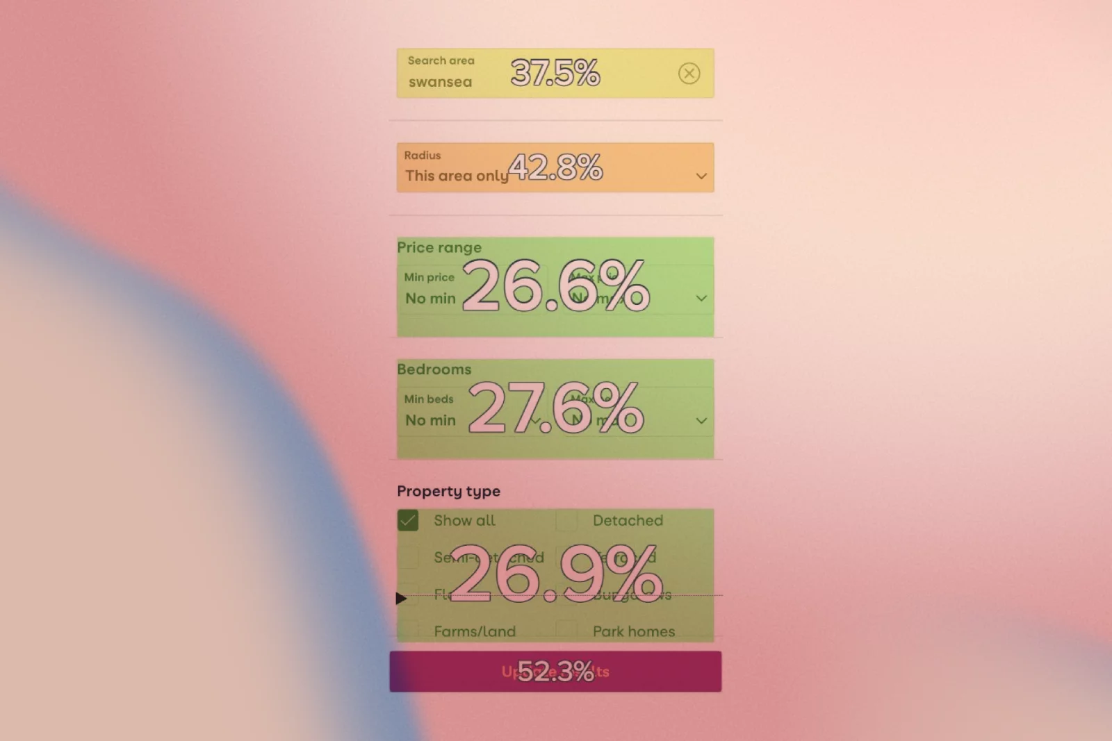
3. Map view behaviour
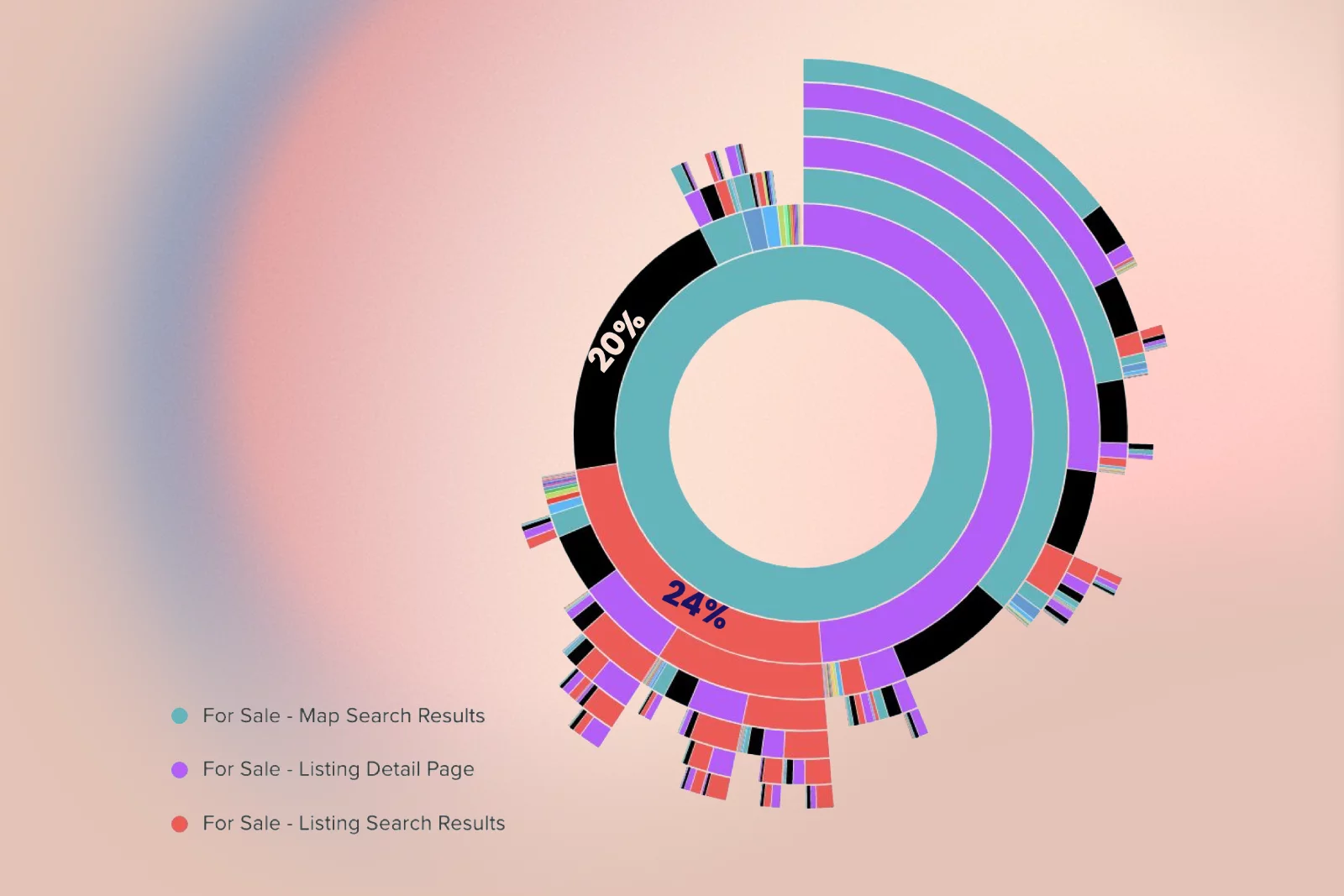
- On mobile map view, 20% of users exit after their first glance at the map, and another 24% immediately switch back to list view.
- Almost half of mobile exits from map view occur within five seconds, indicating first‑impression issues.
- Users who exit map view actually engage more with the map, dragging 42% more and pinching more, but click fewer listings, indicating usability friction.
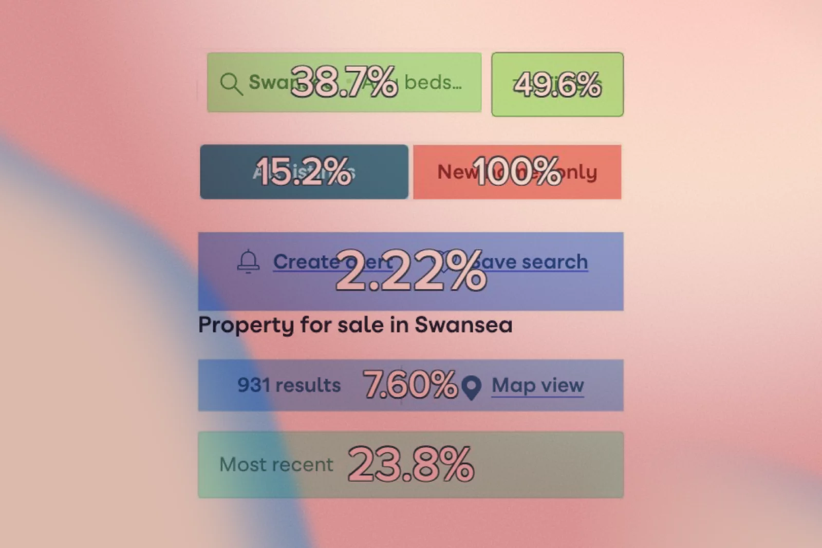
4. New Homes and secondary features
- The “New homes only” toggle has a 0.5% click rate, around 30 times lower than the main Filters entry point.
- 15% of users who click 'New Homes' immediately then click “All listings” to dismiss it, and some click “All listings” multiple times, indicating confusion.
- Travel time search and Draw your search have very low click and hover rates on For Sale SRPs, and Travel time converts poorly compared to other options.
5. Save search and account creation
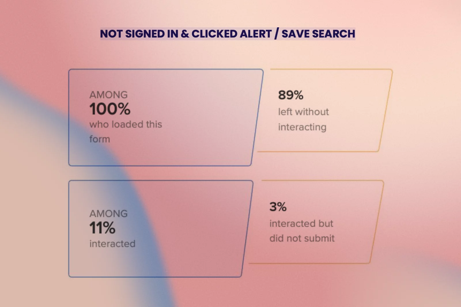
- Create/Save Search is most effective at prompting users to Call/Email, but only 7% of those who click it log in or sign up.
- 90% of users who see the pop‑up exit without interacting with the form, indicating significant friction due to perceived effort.
- Signed-in users are approximately twice as likely to convert on most elements compared to non‑signed-in users, making registration a crucial business lever.
6. Search volume and conversion over time
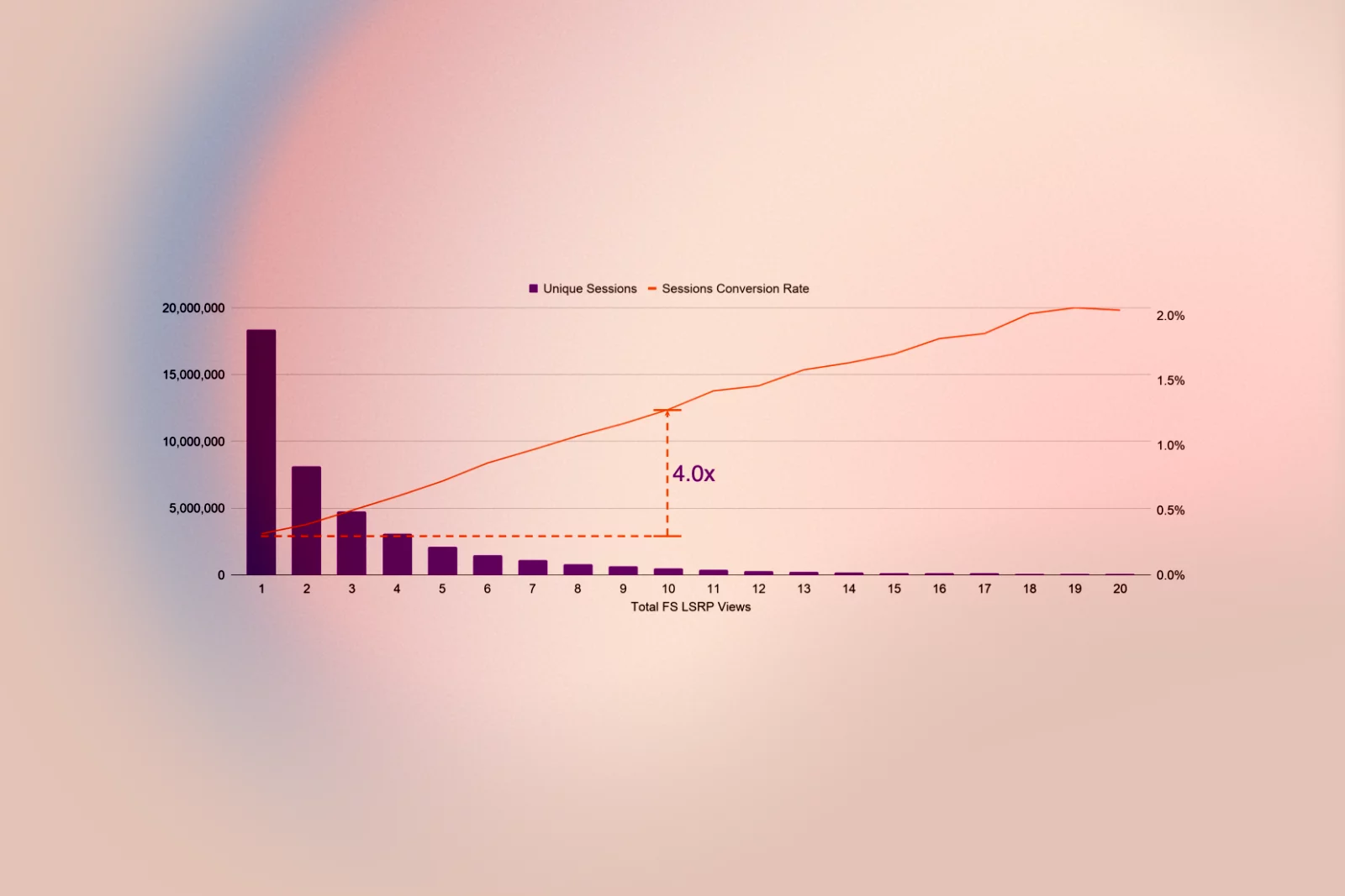
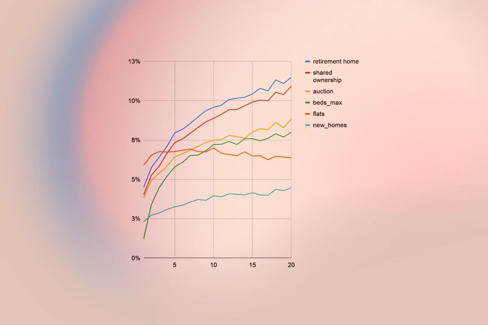
- Consumers searching For Sale perform an average of 3.3 searches, but those who send a lead perform 6.1 searches.
- People who visit 10 For Sale SRPs are four times more likely to send a lead than those who only view one, highlighting the value of encouraging iterative refinement.
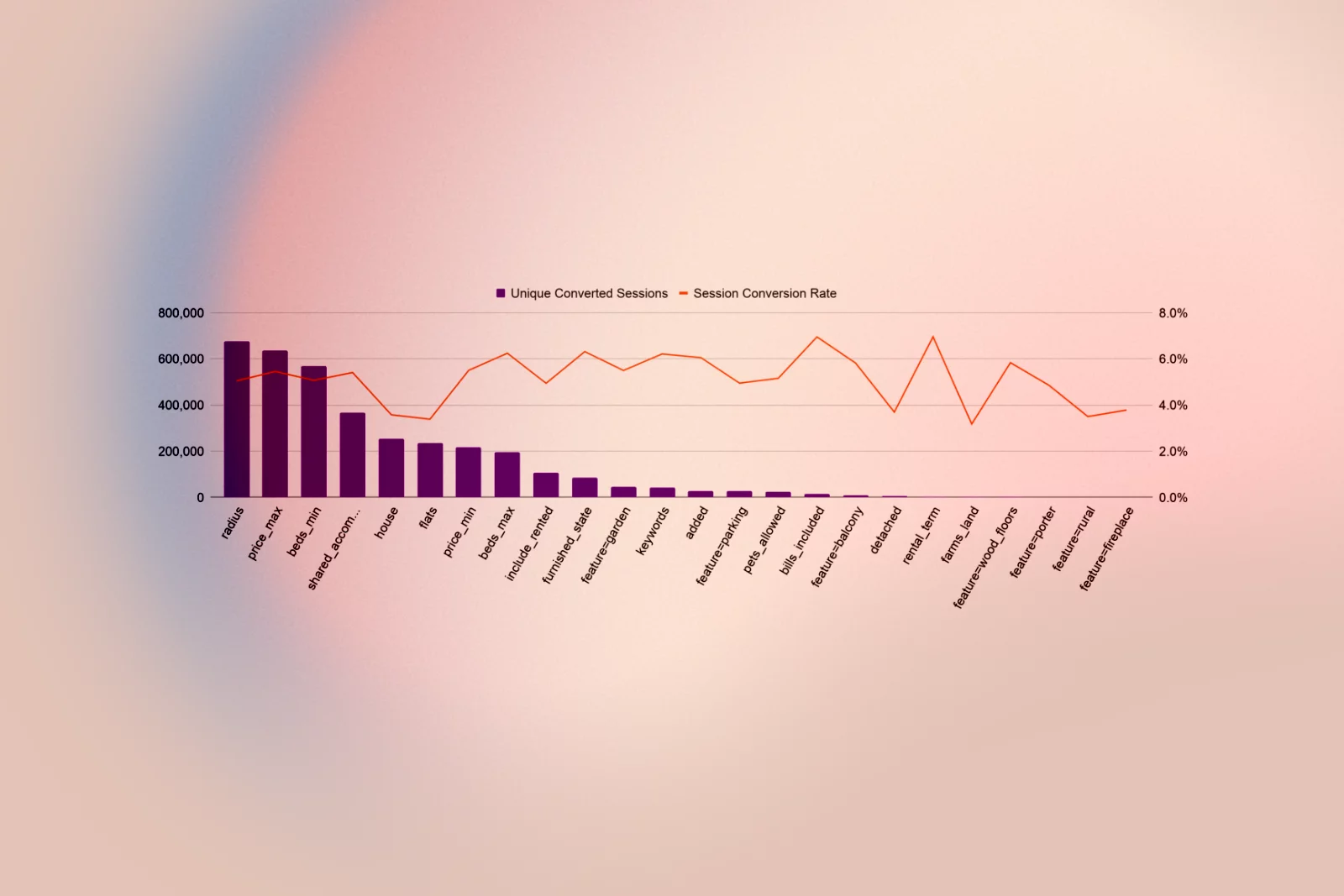
7. Filters as an intent signal
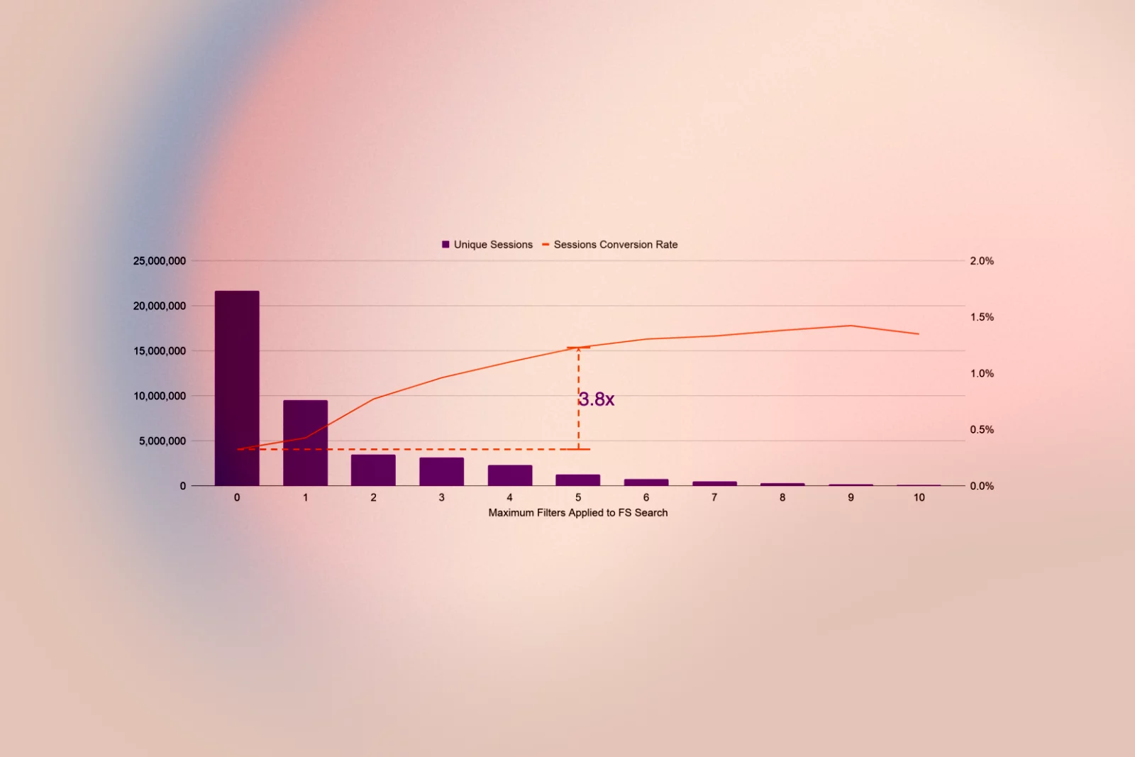
- On For Sale pages, users typically apply an average of 1.3 filters; those who generate a lead use 2.3 filters.
- Consumers who apply up to 5 filters are 3.8 times more likely to send a lead than those who apply none.
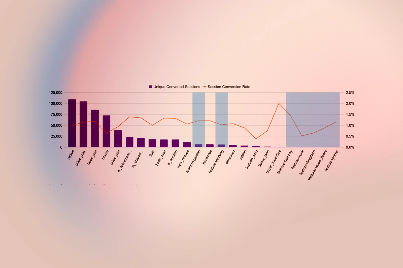
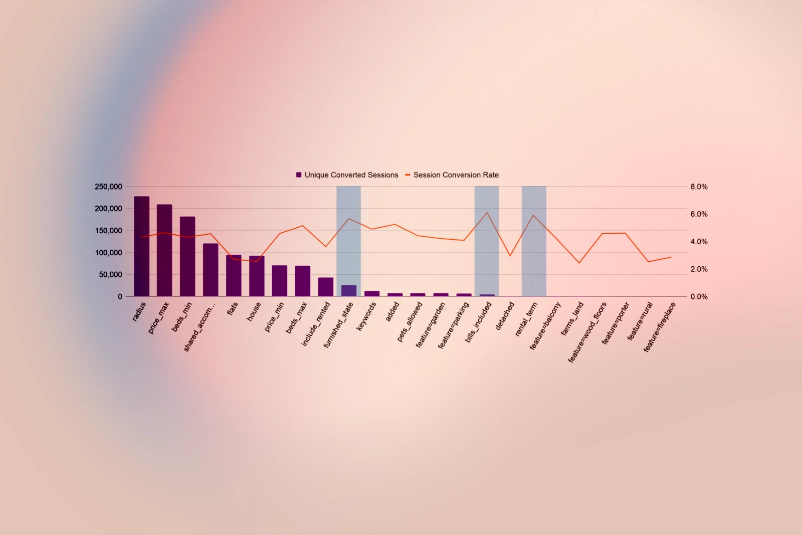
- Most filters have a long tail of low usage, but some, like garden and parking, are frequently used and have strong conversion, whereas others, such as balcony, fireplace, rural, porter, and wood floors, see very low adoption and may be removed.
8. High‑value, underused filters
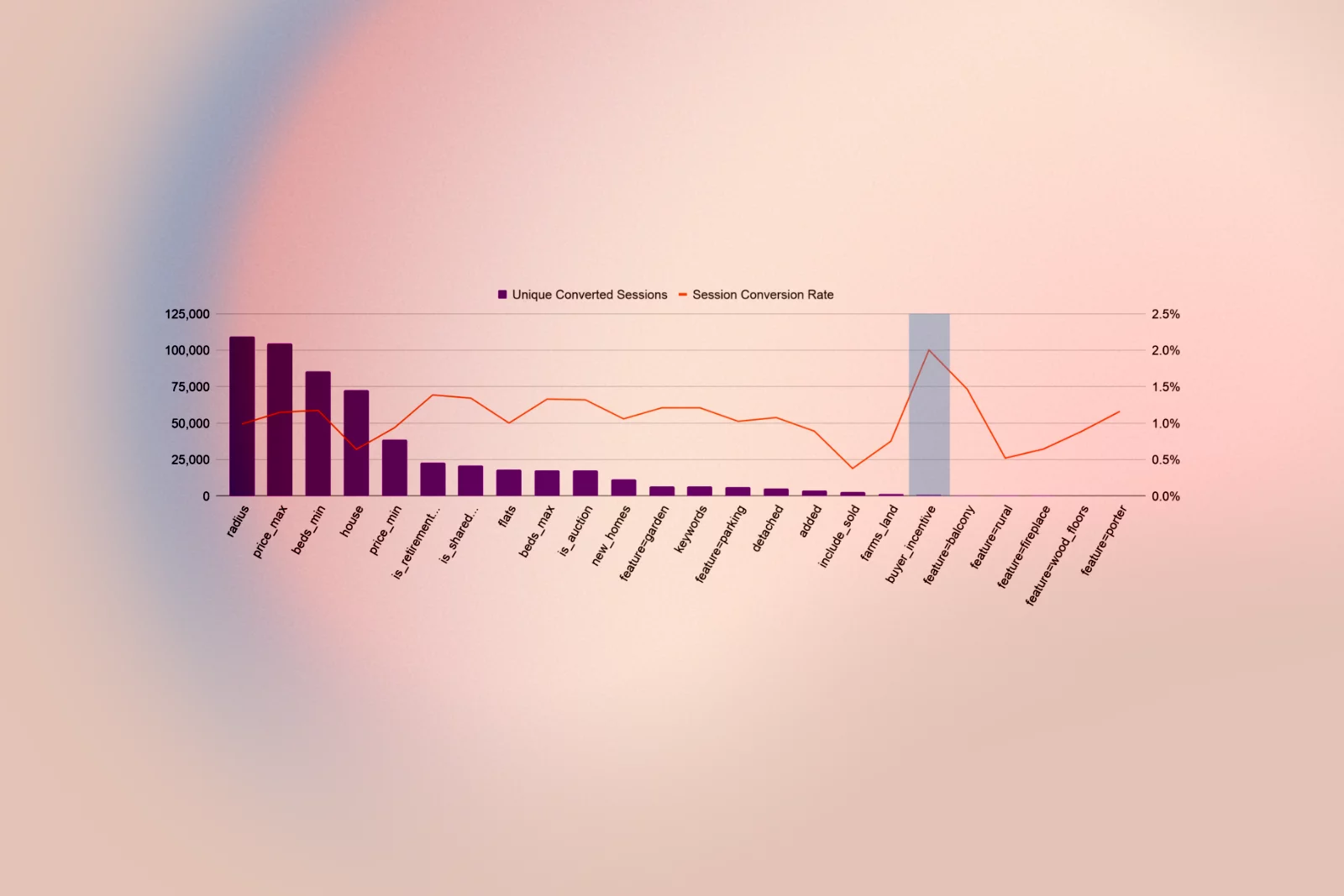
- For Sale “Help to Buy” buyers show the highest likelihood of sending a lead, but the filter is not often used, indicating discoverability issues.
- Retirement home, shared ownership, and auction filters, when used, are strongly associated with a higher conversion rate.
- To rent, the most important filters include furnished condition, bills included, and rental duration, which are commonly used by more experienced searchers.
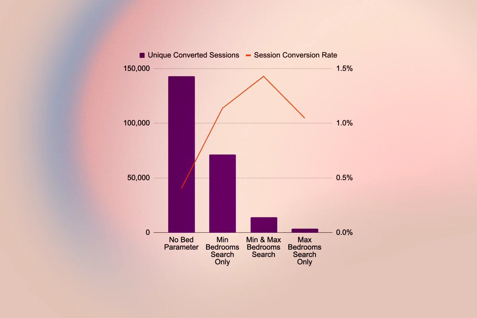
9. Price and bedroom filter behaviour
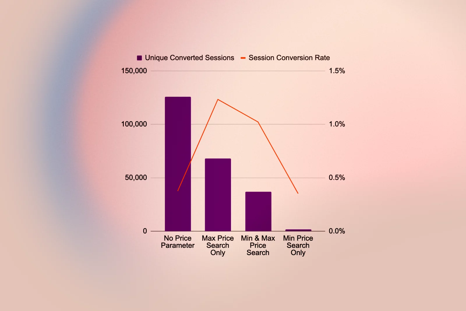
- For Sale: users are more likely to set a maximum price and minimum bedrooms than the opposite, and those only using a minimum price filter perform as poorly as users with no price filter, indicating “dream browsing”.
- Users who set only a maximum price are 21% more likely to send a lead than those who also set a minimum and maximum.
- Setting minimum and maximum bedroom counts for both For Sale and To Rent listings is a strong indicator of conversion likelihood.
10. Radius and multi‑search behaviour
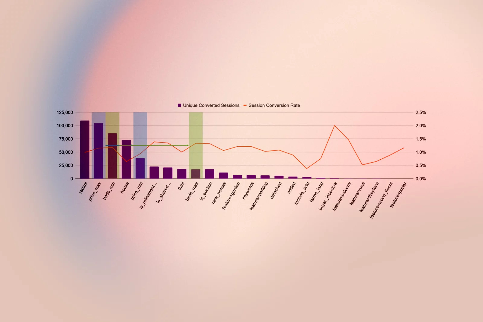
- As users perform more searches, search radius and max price become increasingly important in converting sessions, indicating users develop market understanding as they iterate.
- More than half of searches that lead to results use the radius filter, supporting the idea of making it a main search control rather than a hidden “advanced” feature.
11. What buyers look for
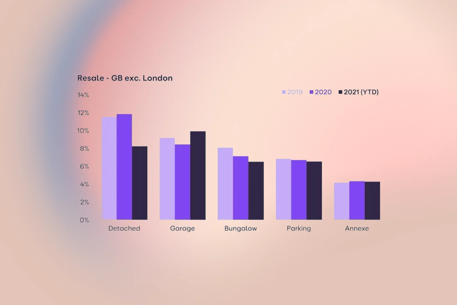
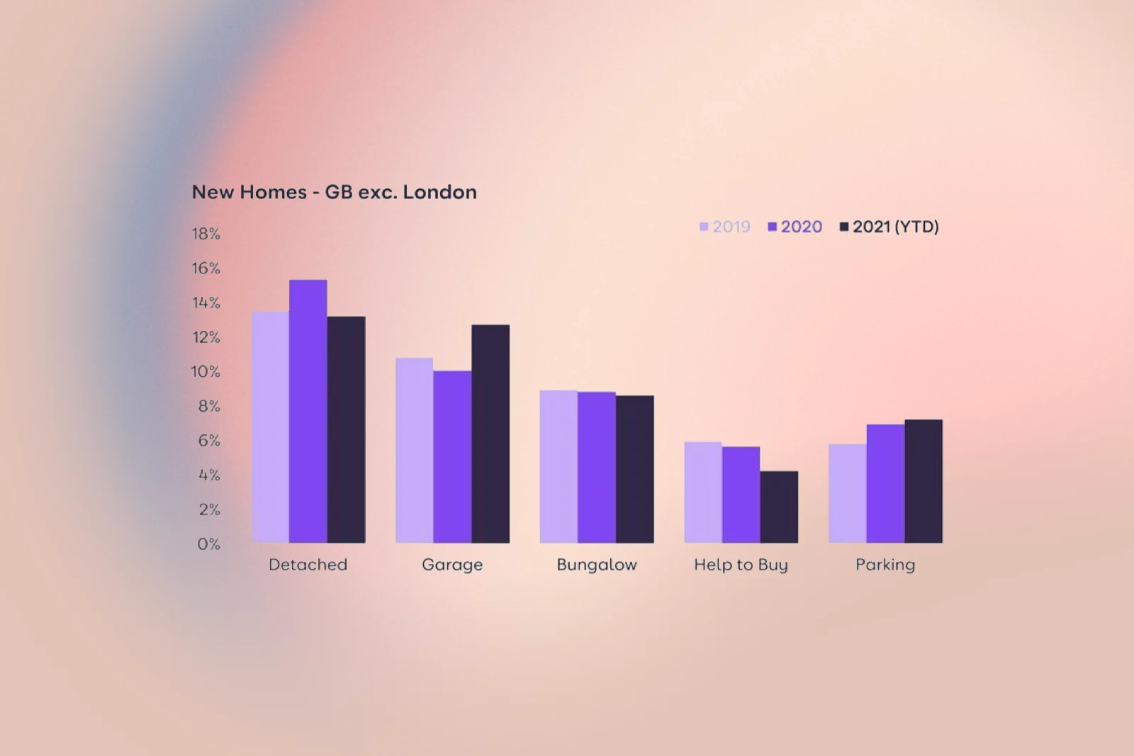
- Among new homes, detached houses are the most searched property type, and off-road parking is the most sought-after feature.
- Bungalows are the second most searched‑for type, likely driven by downsizers and older buyers seeking single‑storey living.
- Outside London, Help to Buy is present but modest in share; in London, around a fifth of keyword searchers look for Help to Buy, even after a drift down from 2019.
ideation
I structured ideation around the clearest opportunities: simplifying the SRP, making refinement effortless, clarifying New Homes and advanced tools, and resolving friction in the map and search bar.

In the multi‑disciplinary workshop, we used “How Might We” prompts anchored in the data:
- “How might we make refining a search feel fast and rewarding, so that using 3–5 filters becomes the norm?”
- “How might we reduce confusion between ‘New homes’, ‘All listings’, and ‘filters’, and free up above‑the‑fold space for what users really care about?”
- “How might we make map view immediately useful for a first‑time lander with no zoom or panning?”
- “How might we surface radius, price, and bedrooms in a way that matches how users think about compromise?”
The cross‑functional group (research, engineering, QA, product, data science, and senior stakeholders) generated HMW notes against screenshots of current SRPs and journeys, which we clustered into themes:
- Clarity and hierarchy (what’s visible above the fold)
- Refinement and filters (which options, how many clicks)
- Map and spatial search (zoom defaults, interactions, draw and travel time)
- New homes and high‑intent segments (Help to Buy, retirement, shared ownership)
- Save search, alerts, and account creation (how to make value obvious)
We voted on the themes with the highest impact and feasibility, then, with the Product Manager, decomposed them into deliverable workstreams for an iterative release.
Design
I used Zoopla’s existing design system as the foundation, extending it where necessary to support a more modern, mobile‑first search experience and to align web and app patterns. The design work focused on several key areas.
1. Unified layout and hierarchy
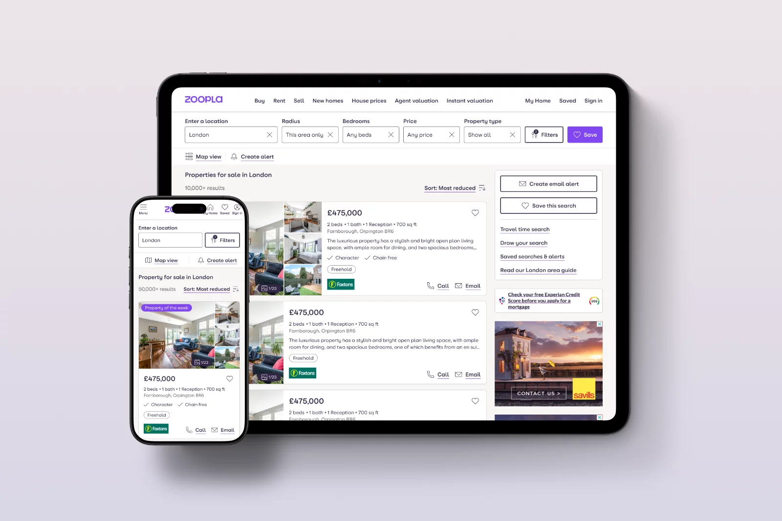
- Simplified the SRP header so that core search inputs (location, radius, price, bedrooms, property type) are immediately visible and scannable, reducing the need to dive into buried filters.
- Repositioned Save Search / Create alert into a more central, visible area near the primary search controls, reflecting their strong conversion impact.
2. Filters and high‑value options
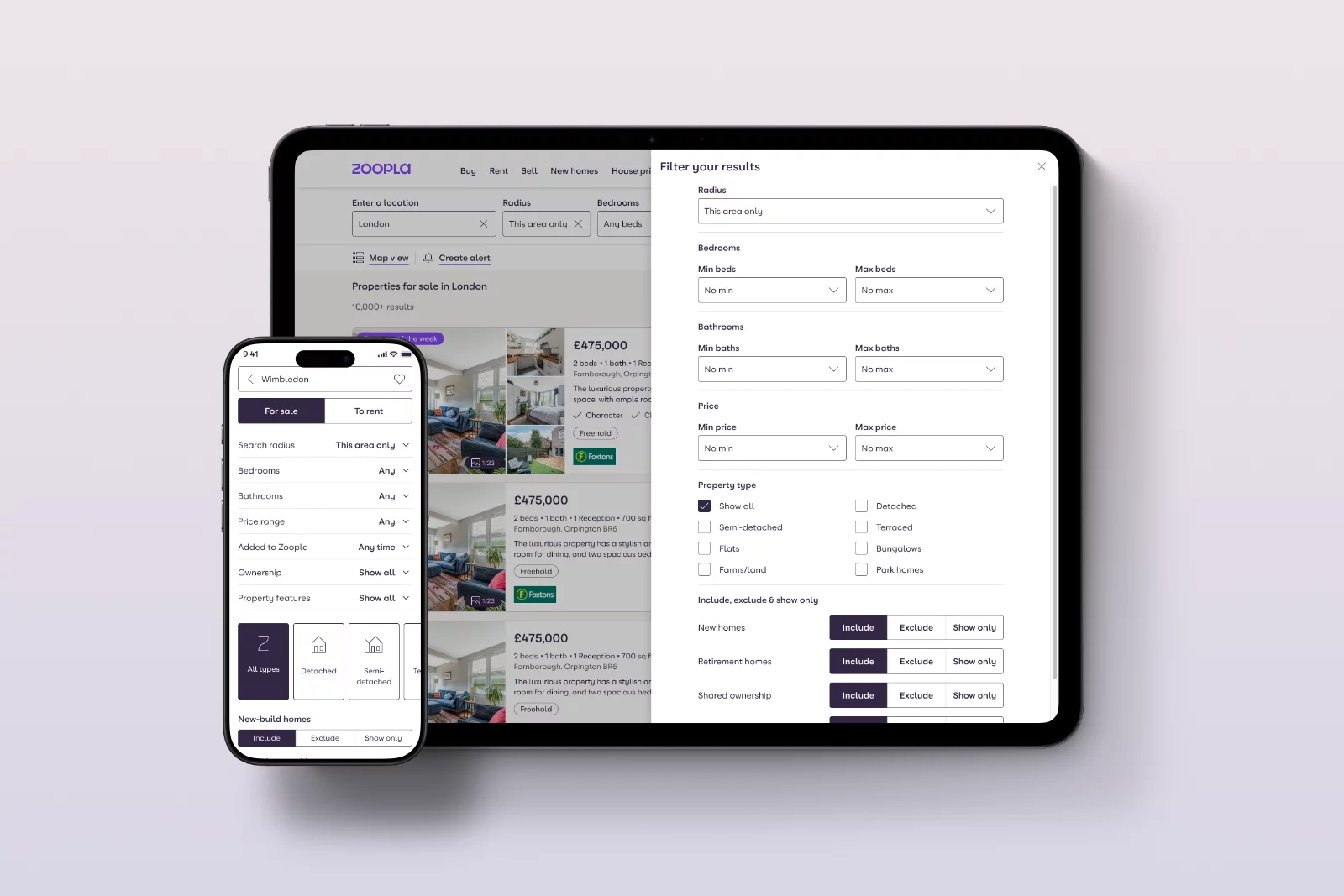
- Promoted search radius and maximum price into primary controls, reflecting their high correlation with conversion.
- Rationalised the long tail of low‑usage filters, recommending deprioritisation or removal of features like balcony/terrace, rural, fireplace, wood floors, porter, and Include Sold (For Sale) while planning alternative ways to express user “preferences” without excluding inventory.
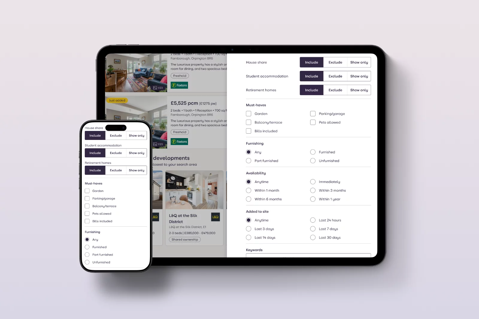
- Surfaced high‑intent niche filters (Help to Buy, retirement home, shared ownership, auction, furnished state, bills included, rental term) in more discoverable clusters for relevant channels.
3. New Homes and segmentation
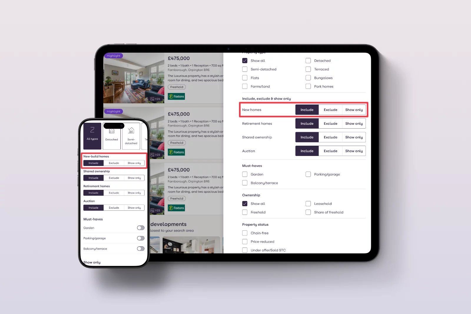
- Proposed moving “New homes only” into the Filters panel as a clearly labelled checkbox, rather than giving it top‑level toggle status that confuses users and consumes space.
- Aligned copy and behaviour with research on user confusion between “new homes” and “newly listed homes”, clarifying expectations.
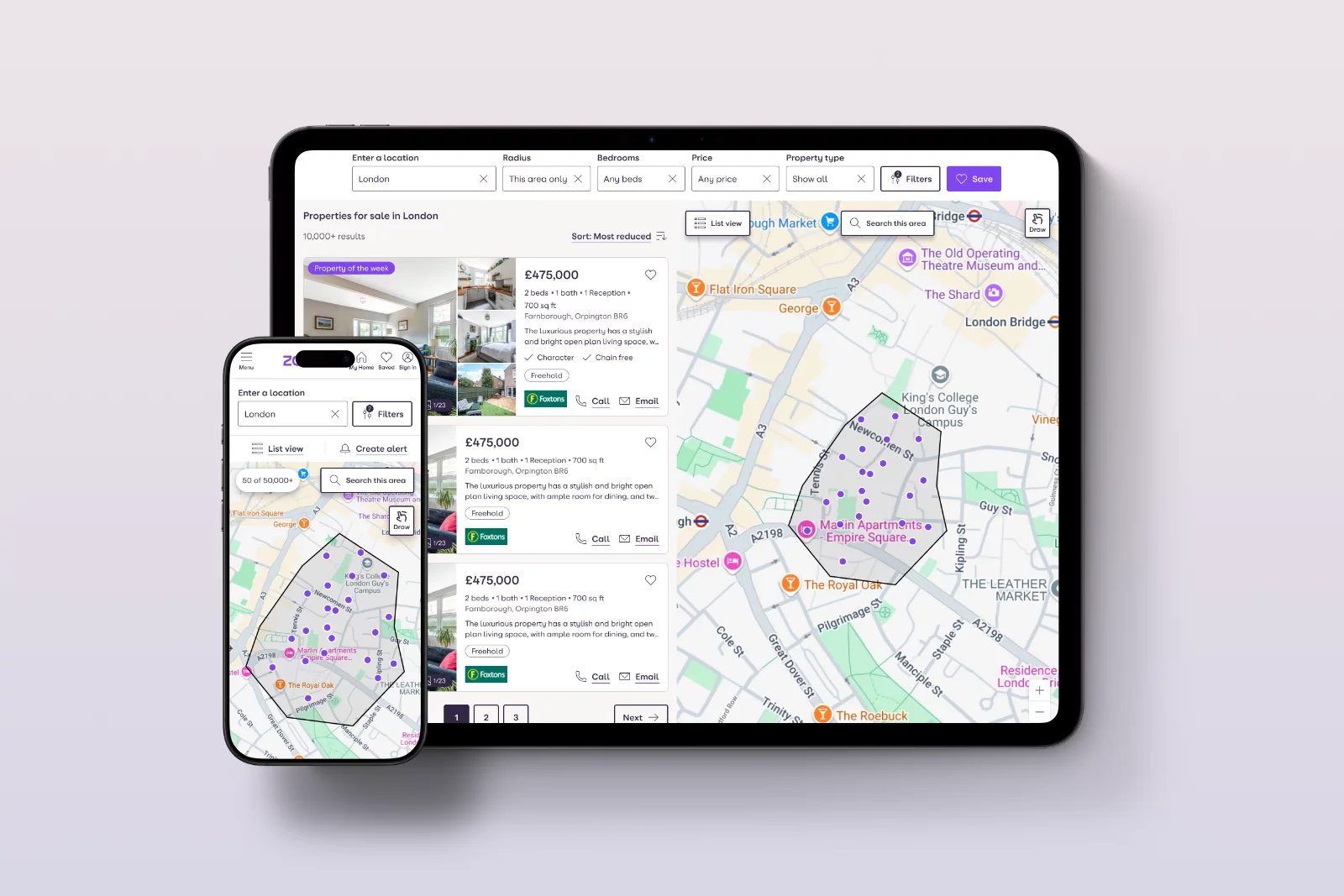
4. Map view redesign
- Set a more zoomed‑in default based on typical search areas, so users see recognisable streets and a manageable number of pins immediately.
- Added clearer zoom‑in/out controls on mobile, matching desktop patterns and improving accessibility.
- Introduced a visible “Reset view” to recover from being “lost on the map”, directly addressing the behaviour of highly interactive users who drag and pinch themselves out of context.
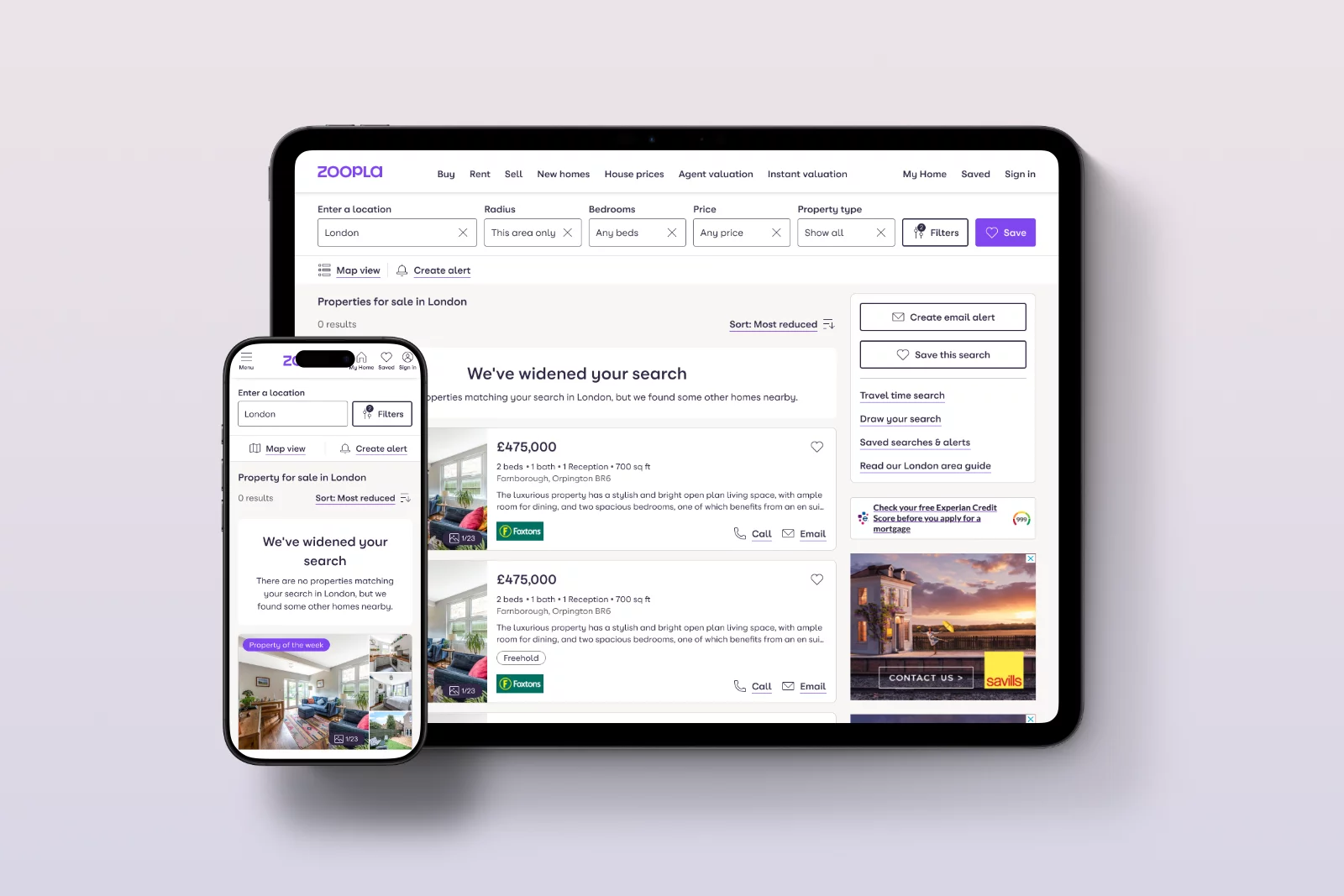
5. “Outside radius” results and empty states
- When a user scrolls through all matching listings, the page now communicates that there are no more properties in that exact area and then offers nearby properties just outside the radius with clear messaging.
- This supports exploration and reduces bounce for users who would otherwise leave after reaching the end of the list.
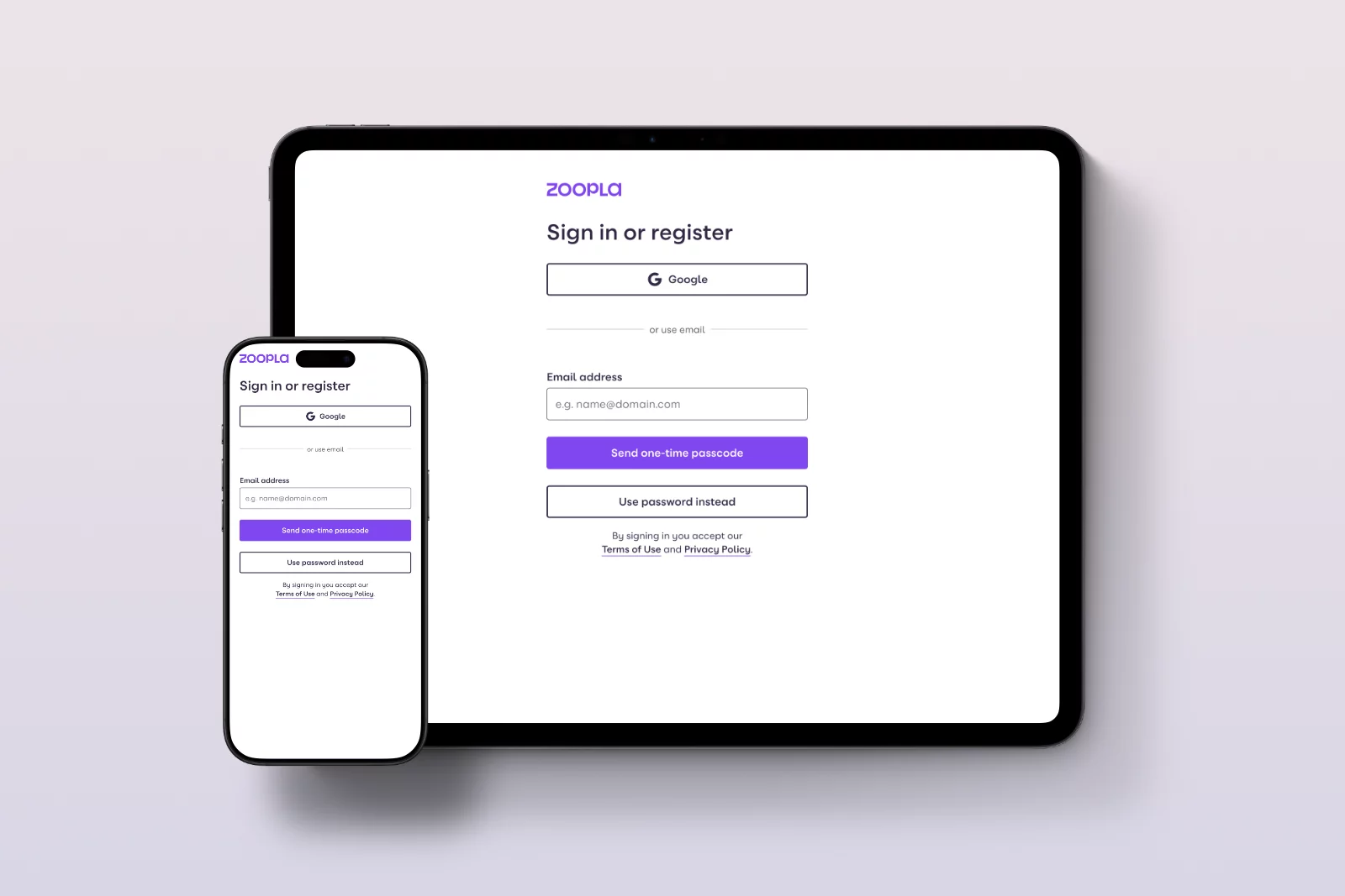
6. Save search & sign‑up journey
- Shortened and visually compressed the sign‑up form, bringing the primary CTA above the fold and defaulting to the Register view for new users.
- Reduced optional explanatory text and visually de‑emphasised secondary elements (e.g., long “public device” copy) to make the task look quicker and more approachable.
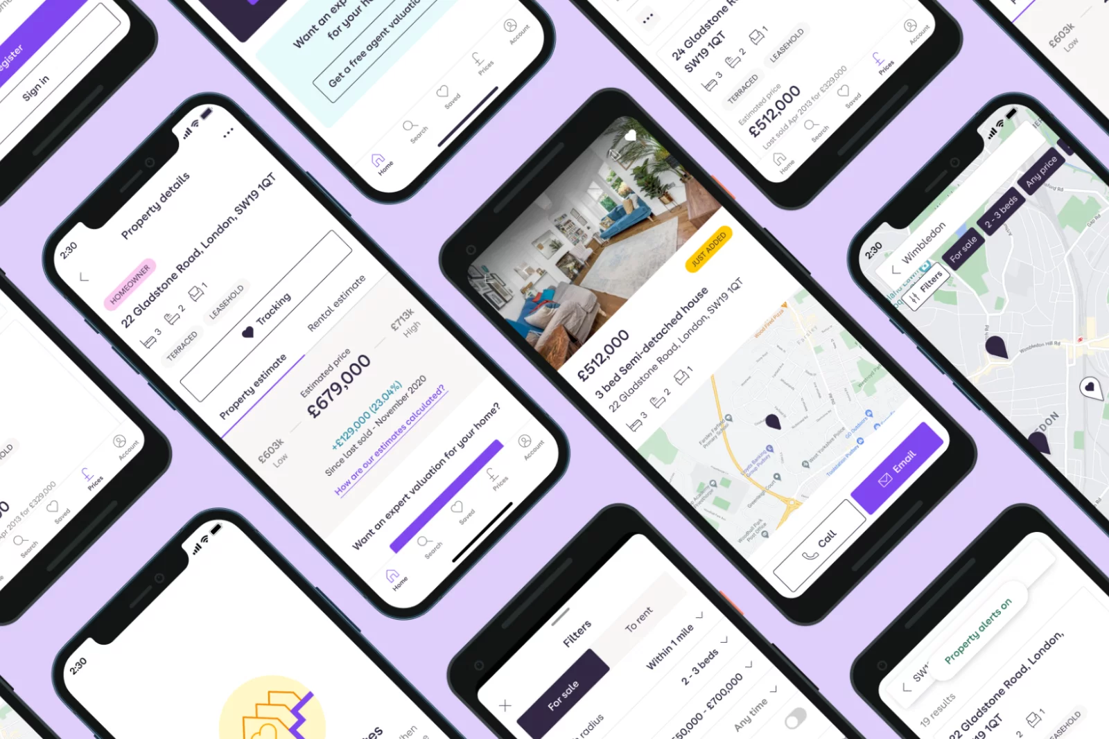
7. Platform and system alignment
Partnered with engineering and stakeholders to align on a React‑based SRP across web and app, streamlining implementation and making future experiments faster to ship and maintain consistently.

Usability Testing
I ran moderated and unmoderated usability tests across web and mobile prototypes with a mix of buyers and renters, focusing on ease of refinement, understanding of New Homes, map interactions, and the updated Save search flow.
Key observations included:
- Participants found it easier and quicker to change the radius and budget when they were visible in the main header, reducing the need to open a dense filters panel.
- When “New homes only” was presented as a simple toggle switch inside Filters, confusion between “All listings” and “New homes” largely disappeared, and participants were clearer about what they were including/excluding.
- A more zoomed‑in default map with visible zoom buttons led to fewer early exits in test sessions and more listing pin taps, consistent with the behavioural diagnosis.
- The compressed sign‑up form for Save search felt “less heavy”, and people were more willing to complete it when at least part of the form and CTA sat above the fold.
A/B Testing
To validate that design changes produced a measurable impact, we translated research and design hypotheses into A/B experiments anchored in the quantified opportunities surfaced earlier.
Map view zoom and controls
By default, a more zoomed‑in map and clearer zoom controls reduce exits and increase listing pin taps. Users who exited on the first map view were now more engaged, with improved call and email lead rates to 2.1% on For Sale SRPs.
Unified save search sign-up flow
A shorter, unified, and passwordless save search sign-up form with a prominent CTA increased registration completion rates and boosted call and email lead conversions to 8.76 for Sale SRPs.
Each experiment was monitored for changes in: SRP bounce rate, SRP→LDP reach, Calls/Emails per SRP session, filter usage per converting session, and signed‑in conversion rates.
Challenges
Throughout the project, I navigated several challenges:
- Managing legacy expectations: Some internal stakeholders were attached to long‑standing features like New Homes Only and a large set of filters, even when data showed low usage; I used clear evidence (click rates, confusion metrics, and projected Call/Email uplift) to align the room.
- Complexity of audience segments: For Sale and To Rent users behave differently (e.g., renters use more filters and convert more; buyers have more repeat sessions), so changes had to respect channel‑specific nuances rather than blindly unifying everything.
- Technical constraints: Moving to a unified React implementation required careful phasing and close collaboration with engineering to ensure experiments remained valid as core tech evolved.

improvements
From this work, I recommended specific improvements tied directly back to user needs and business outcomes:
- Cleaner, more focused SRP header that surfaces high‑value controls (radius, price, bedrooms, property type) and Save search / Create alert, while reducing low‑value clutter.
- Reworked map view with sensible zoom defaults, more intuitive navigation controls, and reset options to reduce early exits and support exploration.
- Streamlined save search sign‑up flow that respects user effort and encourages account creation, improving long‑term value from high‑intent users.
- Foundation for future AI‑powered search journeys built on a cleaner UI, clearer intent signals (filters, keywords, radius), and a more coherent information architecture.
Learnings
This project sharpened my approach to leading search‑centric initiatives at scale:
- The most powerful search improvements come from aligning information architecture, interaction design, and data modelling, not from isolated UI tweaks.
- Analytics and qualitative research must feed each other: behavioural metrics flagged problems (e.g., map exits, search‑bar drop‑offs, underused filters), while usability sessions and workshops explained why users behaved that way.
- Not all filters are equal: a small set of well‑chosen, well‑placed options meaningfully increases conversion, while an overloaded set erodes clarity and dilutes user effort.
- Registration flows attached to high‑value actions (like Save search) deserve the same design attention as the core journey, because they quietly compound value over time.
- For a property portal like Zoopla, where most journeys now start on SRPs, search is essential: changes to this surface shape affect brand perception, advertiser value, and user trust more than nearly any other page.

Looking ahead, these foundations position Zoopla well for the next phase: AI‑enabled search that understands natural language, personal preferences, and nuanced constraints, all built on a cleaner, more intentional search experience.
Projects
 Brand refresh delivered 4% conversion uplift on mobile and 3.8% on desktop.
Read case study
north_east
 Search UX improved. Reduced zero results by 86% and increased seller leads by 6.33%.
Read case study
north_east
 Checkout optimisation drove a 5.22% increase in conversion YoY by enhancing clarity.
Read case study
north_east
 Delivered Bespoke Offers platform upgrade (zero downtime) & developed the innovative 'Beat My Price' tool.
Read case study
north_east
 Refactored complex B2B Portal to mobile-first experience, delivered with zero downtime.
Read case study
north_east
Refactored complex B2B Portal to mobile-first experience, delivered with zero downtime.
Read case study
north_eastContact
Please feel free to reach out if you have any ideas, projects, or opportunities you would like to discuss. I am always open to hearing new ideas and collaborating together.
You can contact me through LinkedIn, email, or phone. Alternatively, please complete the form below, and I will do my utmost to respond within 24 hours.