Zoopla Listing Redesign
Reimagining the Listing Detail Page (LDP) turned Zoopla visitors into customers by improving visitor-agent interaction, which led to a 2.79% rise in lead conversions, and by removing friction from the contact form, which increased lead conversions by 3.9%.
Summary
Zoopla is one of the UK's most visited property marketplaces; it isn't just another property portal. It's a brand that 90% of the UK recognises, and for the 90% of people planning to move in the next year, it's often the first place they look. With 9 million monthly users and more than 4 billion minutes spent on the site annually, even small friction points ripple out into thousands of missed conversations between buyers, renters, and agents. When the business identified the Listing Detail Page (LDP), the page that is visited roughly every 4 seconds, as an underperforming link in that chain, I was brought in to lead its redesign from the ground up.
As a Senior Product Designer, I led the redesign of the Listing Detail Page from inception to completion, covering early discovery, validation, and funnel conversion, in collaboration with researchers, engineers, data scientists, product managers, and senior stakeholders. My contribution spanned the full design lifecycle:
- Conducting qualitative and quantitative research to understand user needs and behaviour.
- Creating screen and visual designs to deliver a seamless, consistent listing experience.
- Developing and optimising the listing detail page and lead form, enriching listing data in partnership with the engineering team.
- Leading workshops, prioritising the backlog, and setting realistic delivery goals with the product manager and stakeholders.
- Designing and validating test strategies through A/B experimentation.
- Monitoring the consumer funnel and lead conversion alongside data scientists to keep decisions grounded in evidence rather than opinion.
Across the project, I ran user studies, surveys, and usability sessions with more than 100 participants to understand how people think, feel, hesitate, and decide when they're considering a home to buy or rent. We took a data-informed approach throughout, running numerous experiments to learn, refine, and re-test rather than shipping a single "big bang" redesign.
The Listing Detail Page is where curiosity turns into a phone call, an email, or a viewing request. By diagnosing the problem with behavioural data, not assumptions, and rebuilding the listing experience around what people actually do on the page: where they linger, what they tap (even when it isn't clickable), what they scroll past without ever seeing, and what finally convinces them to take the next step. The result was an iterative, A/B-tested, evidence-based LDP redesign and contact form, unified across web and app on a single React codebase, enriched with new AI-assisted and data-driven features that didn't exist anywhere else in the UK property market at the time.
discovery
On average, visitors opened a Listing Detail Page on Zoopla roughly every 4 seconds; it was, without question, one of the highest-traffic pages on the platform. That scale is exactly why even small usability problems mattered so much.
When we started digging, the business and design teams quickly agreed that this page deserved a serious rethink. A few things stood out immediately:
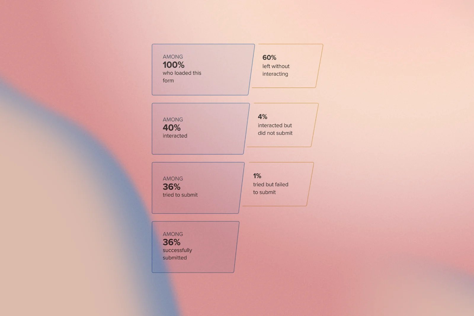
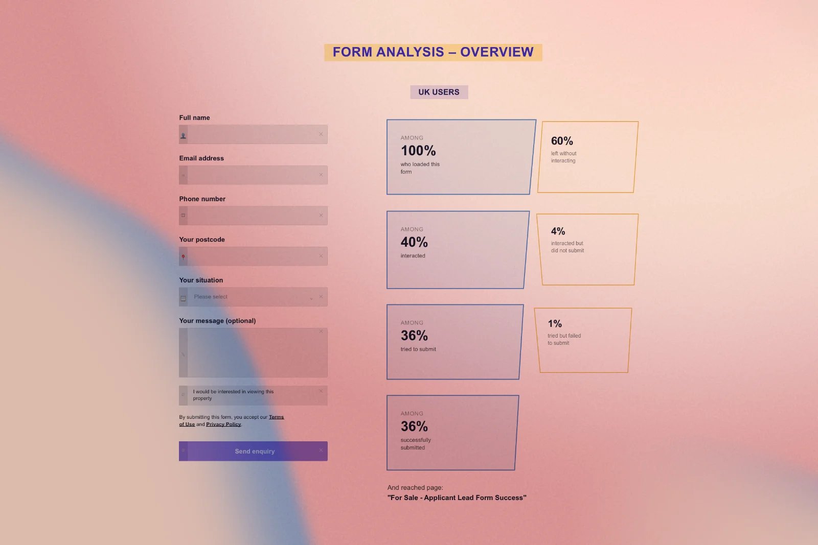
60% of users exit the listing page without ever interacting with the contact form or engaging with an agent, indicating that most interested visitors simply walked away.
The experience felt inconsistent across platforms. Engineers maintained separate codebases for desktop and mobile, so new features consistently shipped to the web first and trickled down to the app much later, sometimes months later.
Property information that mattered, such as floor plans, local area context, energy costs, and agent details, was often hard to find, buried below key content, or presented inconsistently.
Together, these symptoms pointed to a clear opportunity, and we framed our goals accordingly:
- Enhance the overall listing experience across the website and mobile app.
- Reduce the exit rate on the listing page.
- Improve the discoverability of property information.
- Motivate users to engage with the page and increase time spent on it.
- Foster stronger interaction between buyer and seller.
Before touching a single pixel, I spent time with stakeholders across product, engineering, and commercial teams to understand the business goals driving this project, e.g., revenue from agent leads, retention, and competitive differentiation, so that everything we designed afterwards could be traced back to a real, shared objective.
Research
Good design starts with humility, the willingness to admit you don't know why users are leaving until you look closely enough to find out. Before proposing a single solution, I partnered with our analytics and data science teams to run a deep, page-by-page behavioural analysis of both the Listing Detail Page and the Contact Agent form, and to run qualitative sessions to understand the why behind the numbers.
This wasn't a single research sprint; it was an ongoing investigation across session recordings, heatmaps, funnel analysis, and journey mapping, covering the "For Sale," "To Rent," and "New Homes" listing types on mobile and desktop across the UK market. Below are the core problems this research identified.
On the Listing Detail Page itself:
1. Sequential browsing signals hidden intent
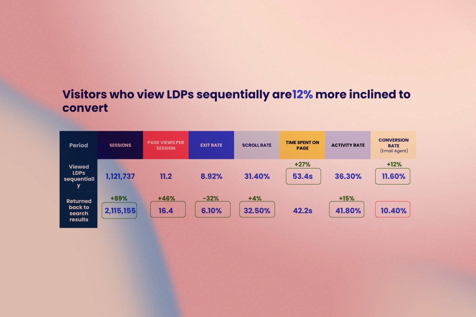
Users who viewed listings in sequence, one after another, converted 12% more often than those who repeatedly returned to the search results in between, yet nothing on the page actively encouraged this browsing pattern.
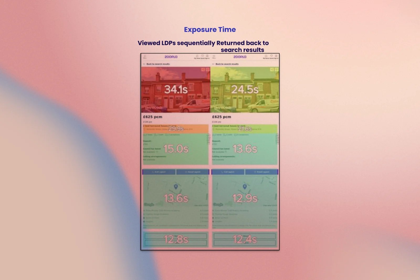
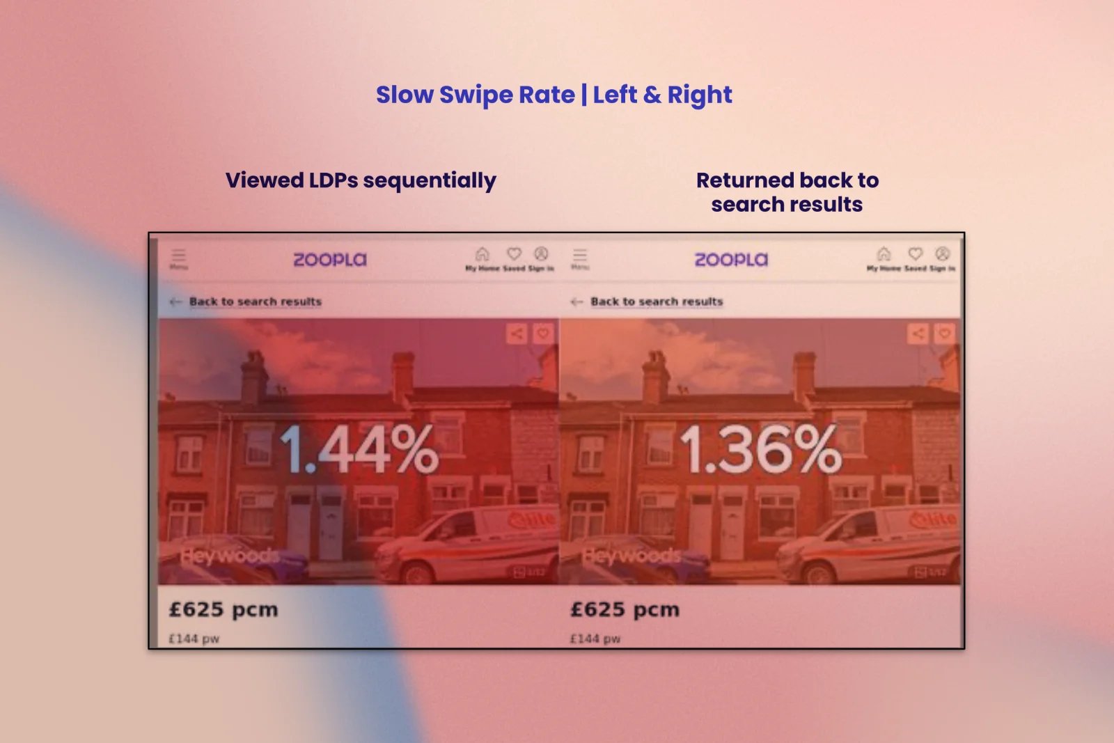
2. A high-performing module buried too low
The "similar properties" module, one of the most effective tools for keeping people engaged, was positioned far enough down the page that most mobile users scrolled past it without ever seeing it.Users who viewed listings in sequence, one after another, converted 12% more often than those who repeatedly returned to the search results in between, yet nothing on the page actively encouraged this browsing pattern.
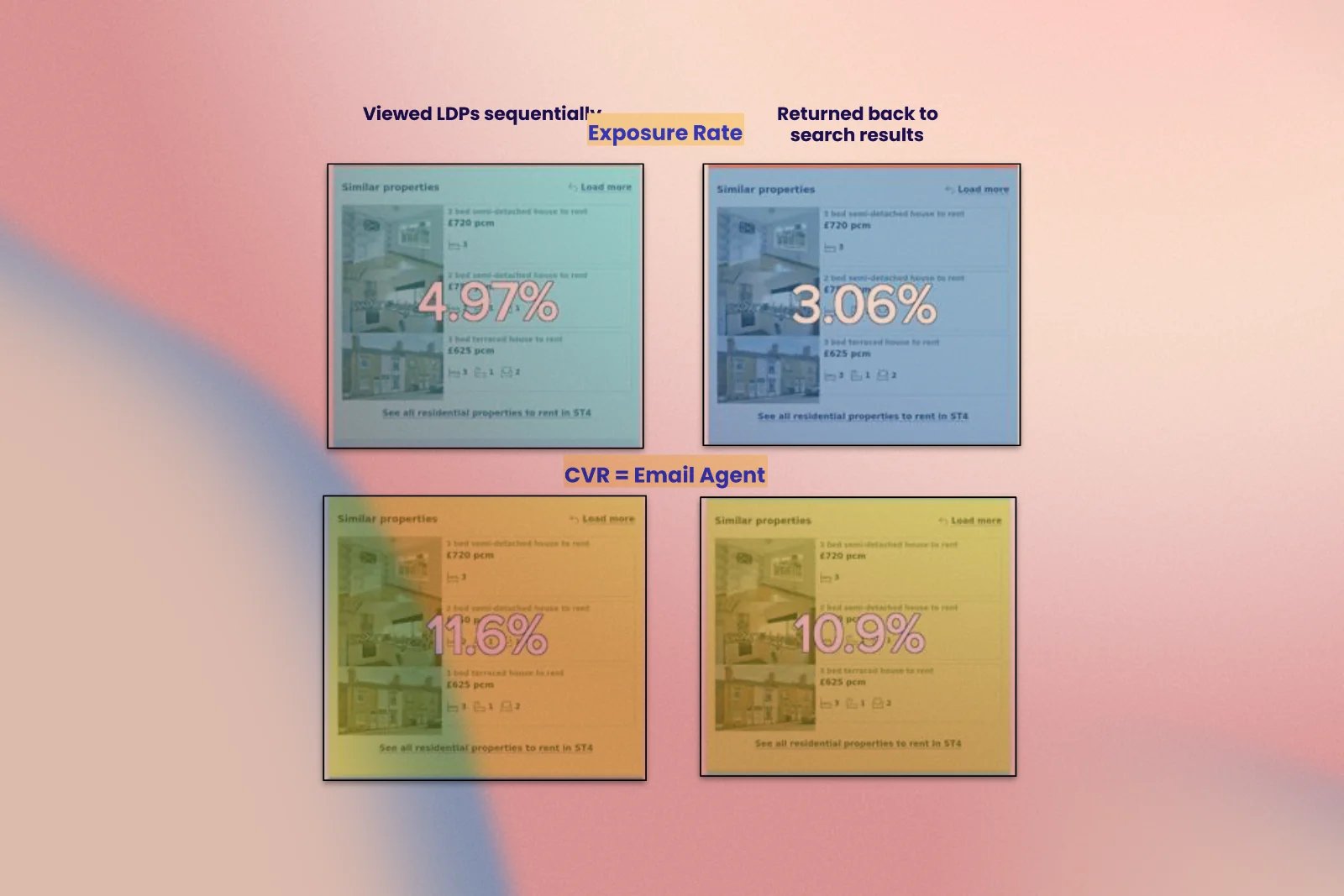
3. The best content sat where the fewest people scrolled
Conversion rate rose steadily the further down the page a user scrolled, which meant our highest-converting content was, ironically, positioned where the fewest people would ever reach it.The "similar properties" module, one of the most effective tools for keeping people engaged, was positioned far enough down the page that most mobile users scrolled past it without ever seeing it.Users who viewed listings in sequence, one after another, converted 12% more often than those who repeatedly returned to the search results in between, yet nothing on the page actively encouraged this browsing pattern.
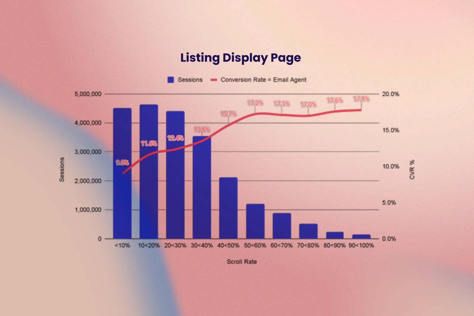
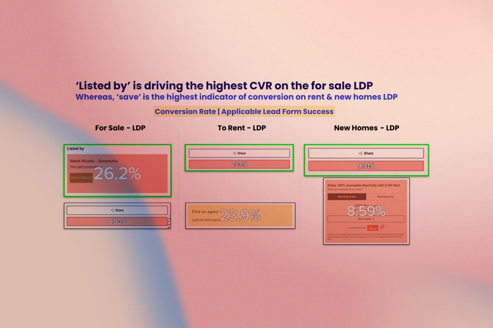
4. Top-converting elements were nearly invisible
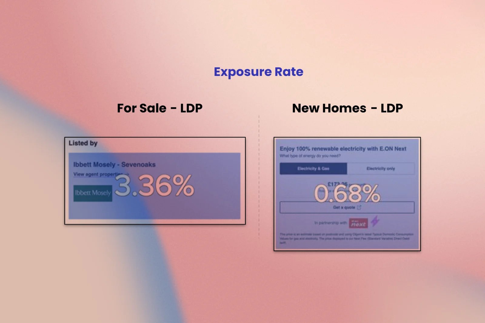
The "Listed by" agent panel achieved the highest conversion rate on For Sale listings, and the "Save" button achieved the highest on To Rent and New Homes, but both were so far down the page that the vast majority of visitors never saw them.
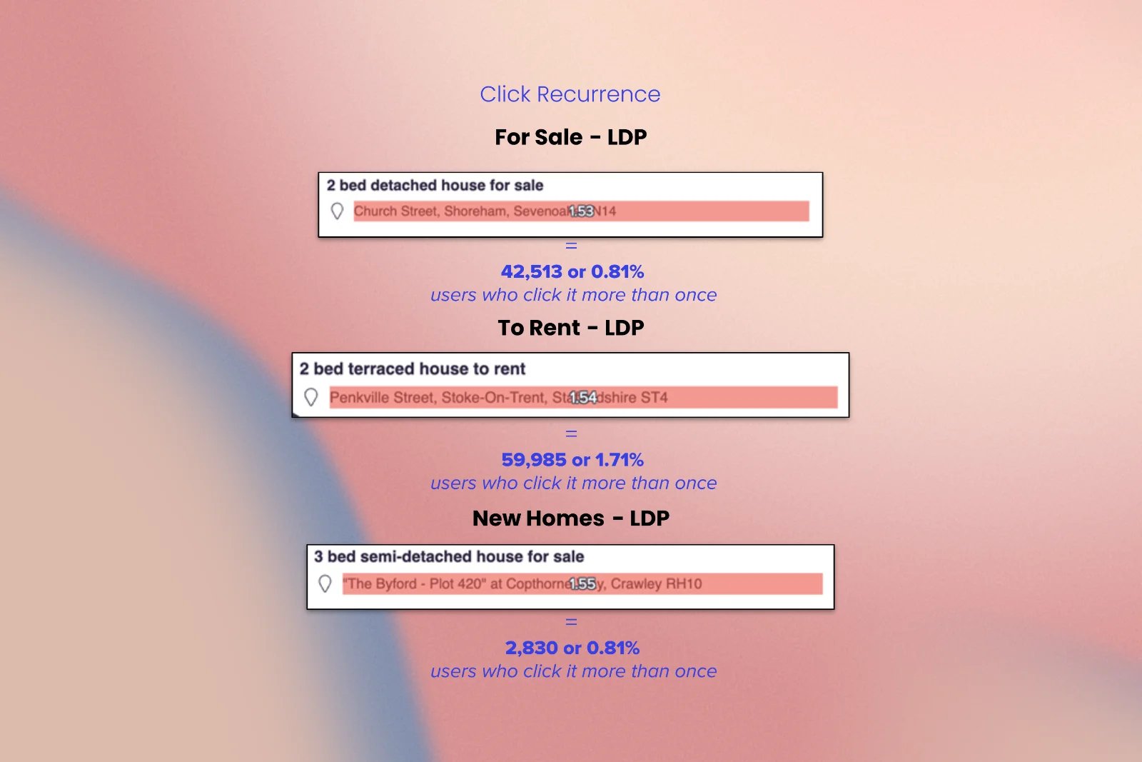
5. A non-clickable element behaving like the most-clicked one
The street address, plain, non-clickable text, was the most frequently tapped element on the entire page. Users kept trying to click it, clearly expecting it to open a map.
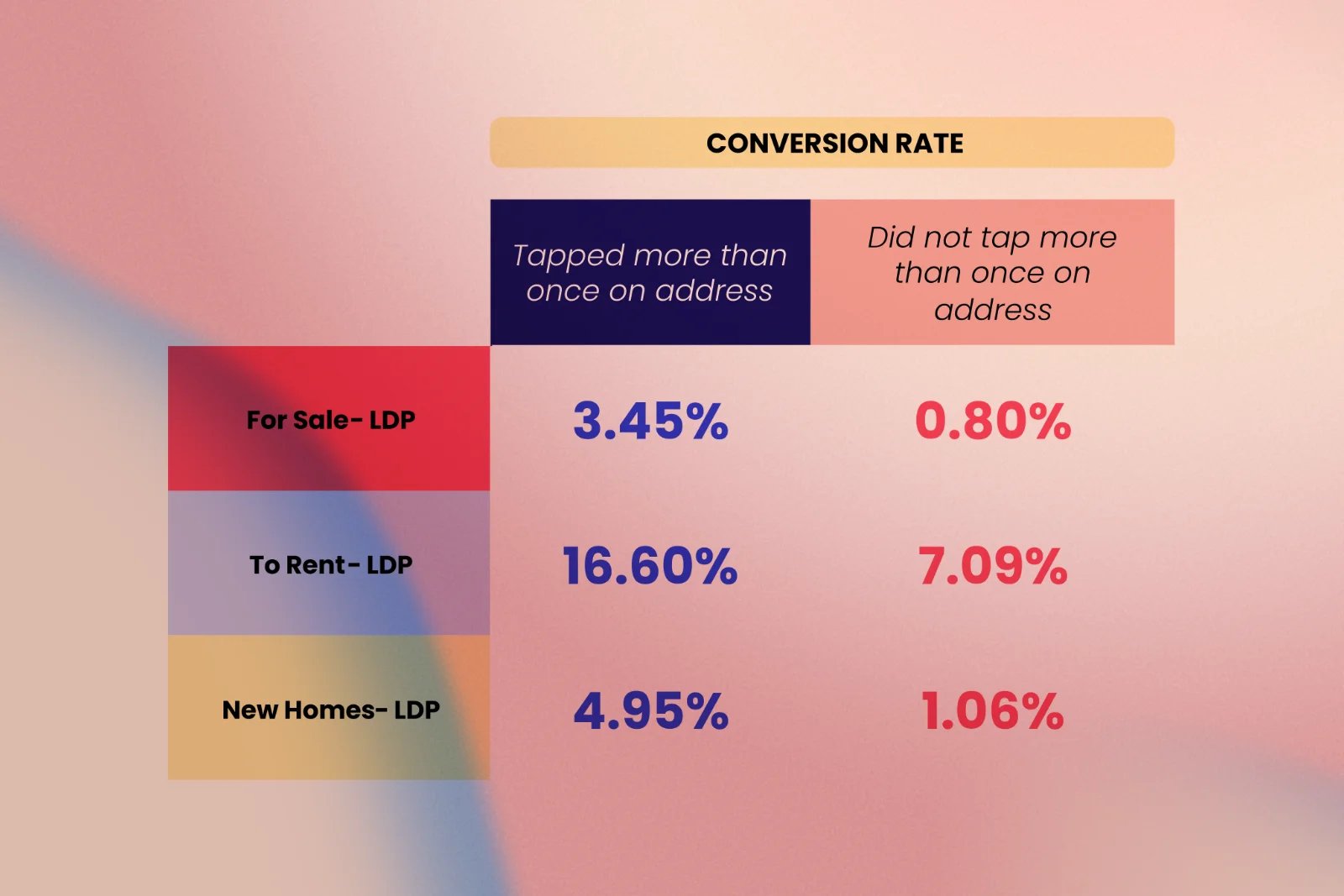
6. Repeated taps as a conversion signal
People who tapped the address more than once were up to 3.7 times more likely to convert than those who didn't, a strong, unmet signal of purchase intent that the design failed to capture.
7. A hidden gem inside "More information"
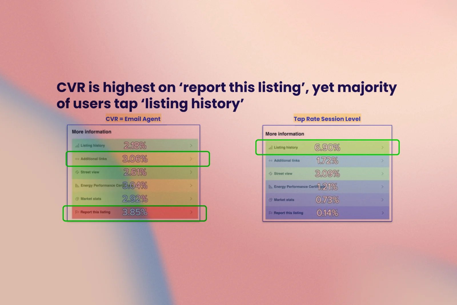
The "More information" accordion (listing history, EPC certificate, market stats, street view, report listing) was quietly one of our best-performing features: anyone who engaged with it was up to 3.2 times more likely to convert, yet it was tucked away and easy to miss.
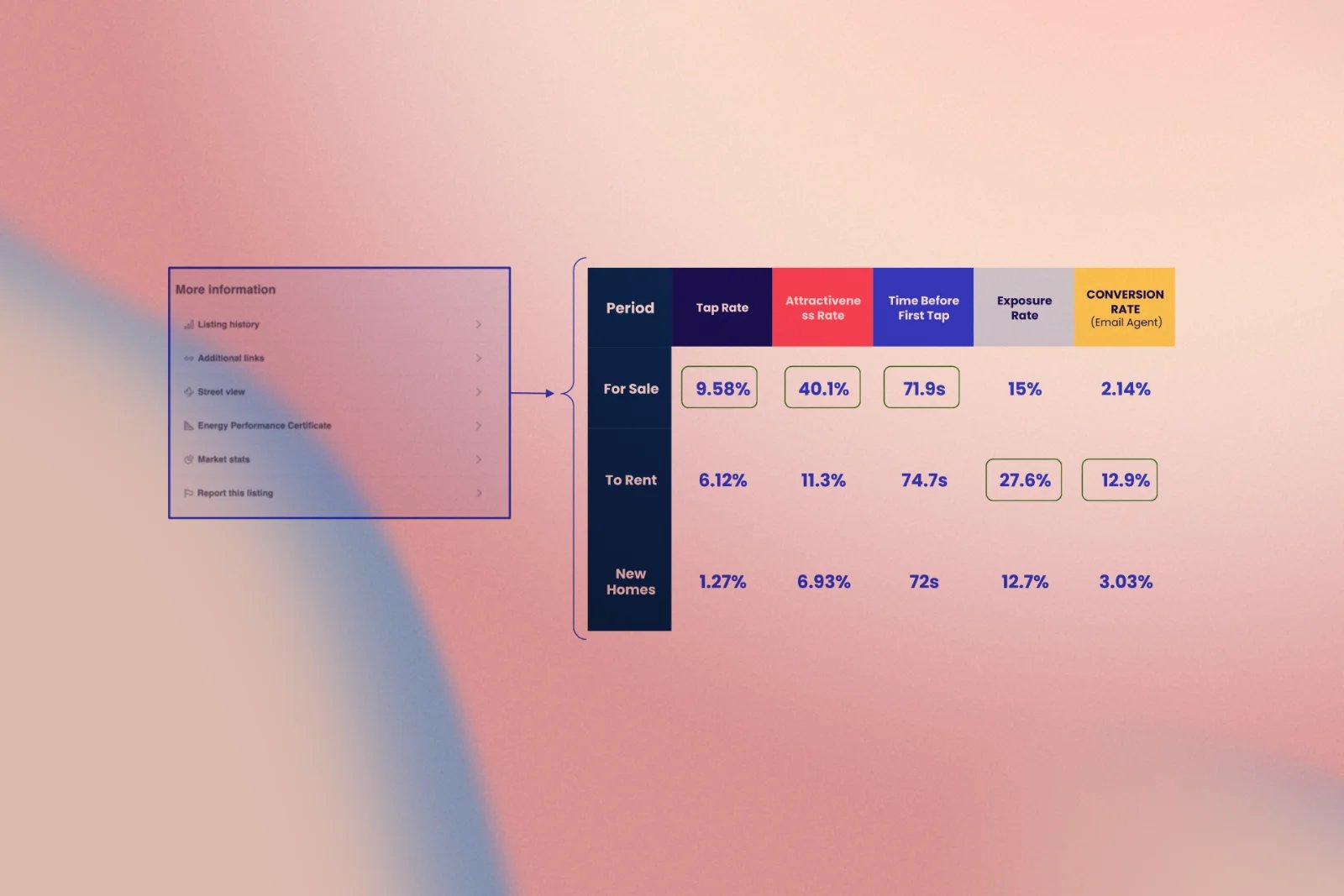
8. A mismatch between what's tapped and what converts
The "More information" accordion (listing history, EPC certificate, market stats, street view, report listing) was quietly one of our best-performing features: anyone who engaged with it was up to 3.2 times more likely to convert, yet it was tucked away and easy to miss.
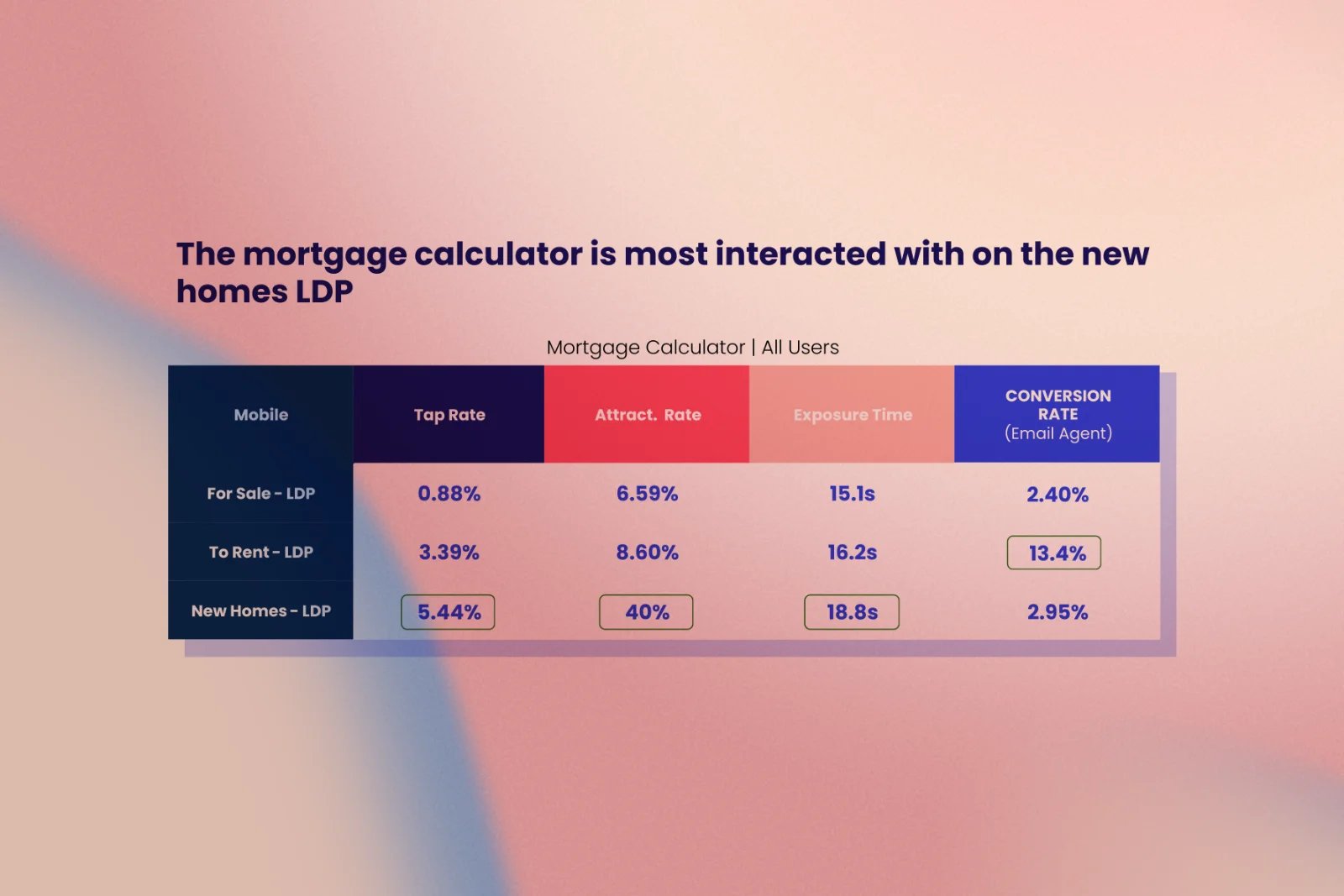
9. Running costs mattered more than financing
The "More information" accordion (listing history, EPC certificate, market stats, street view, report listing) was quietly one of our best-performing features: anyone who engaged with it was up to 3.2 times more likely to convert, yet it was tucked away and easy to miss.
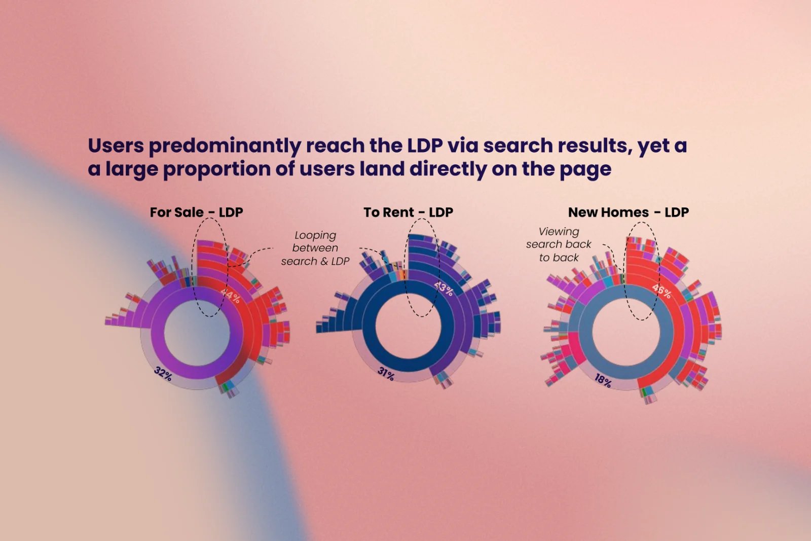
10. First impressions mattered more than we thought
Users frequently landed on the page directly rather than via search, and around half of those direct visits bounced immediately, indicating that the page itself needed to make a strong first impression, not just serve as a second step in a journey.
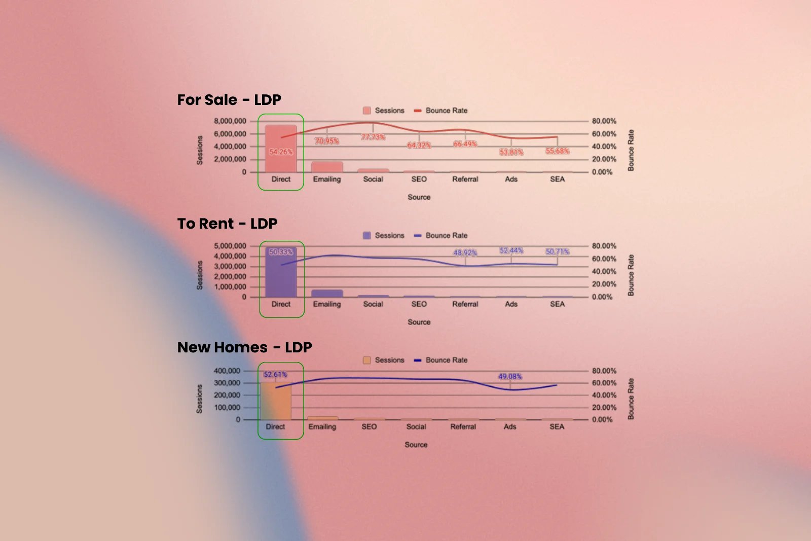
11. A structural weakness unique to "For Sale"
Users frequently landed on the page directly rather than via search, and around half of those direct visits bounced immediately, indicating that the page itself needed to make a strong first impression, not just serve as a second step in a journey.
On the Contact Agent lead form:
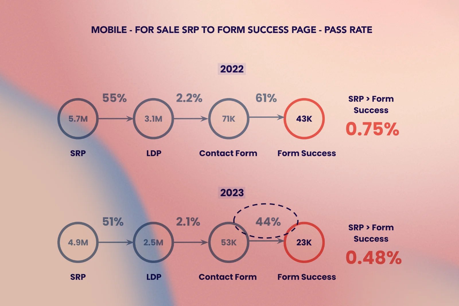
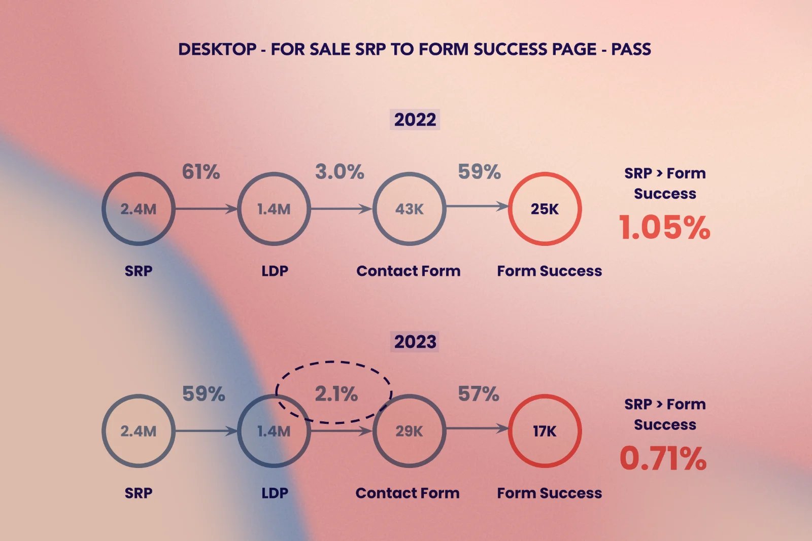
1. One decline, two very different root causes
Users who viewed listings in sequence, one after another, converted 12% more often than those who repeatedly returned to the search results in between, yet nothing on the page actively encouraged this browsing pattern.
2. Six in ten mobile visitors never touched the form
On mobile, a full 60% of people who opened the contact form left without touching a single field, not the name box, not the email box, not anything.
3. Disengagement showed up in seconds, not minutes
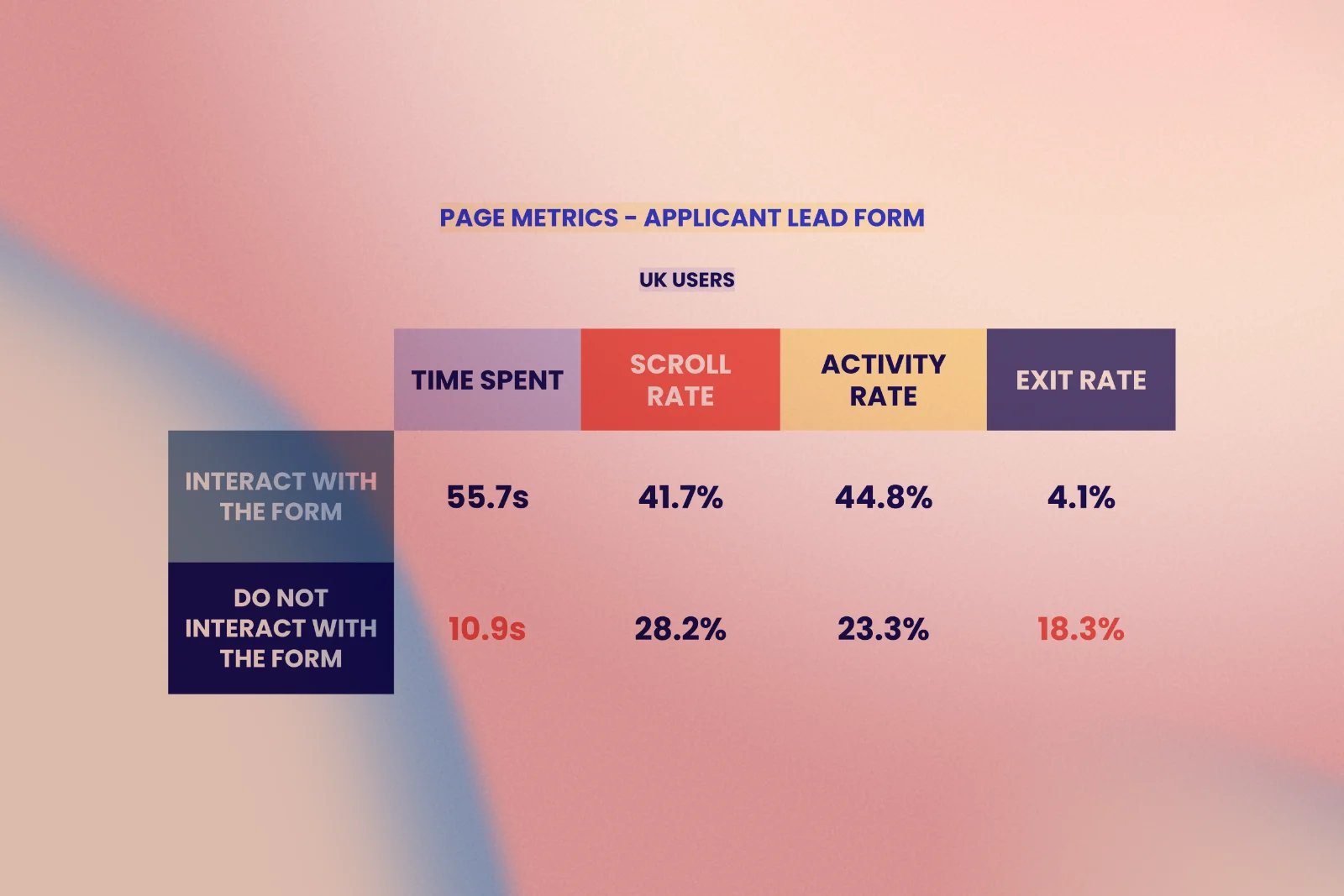
Those non-interacting visitors spent barely eleven seconds on the page and were four times more likely to exit than users who engaged, a clear sign that the page wasn't reassuring or motivating them to act.
4. An accidental exit door built into the form
Many people who abandoned the form tapped the embedded property photo to return to the listing rather than using the intended back arrow, meaning a piece of content meant to remind them of the property was unintentionally acting as an exit.
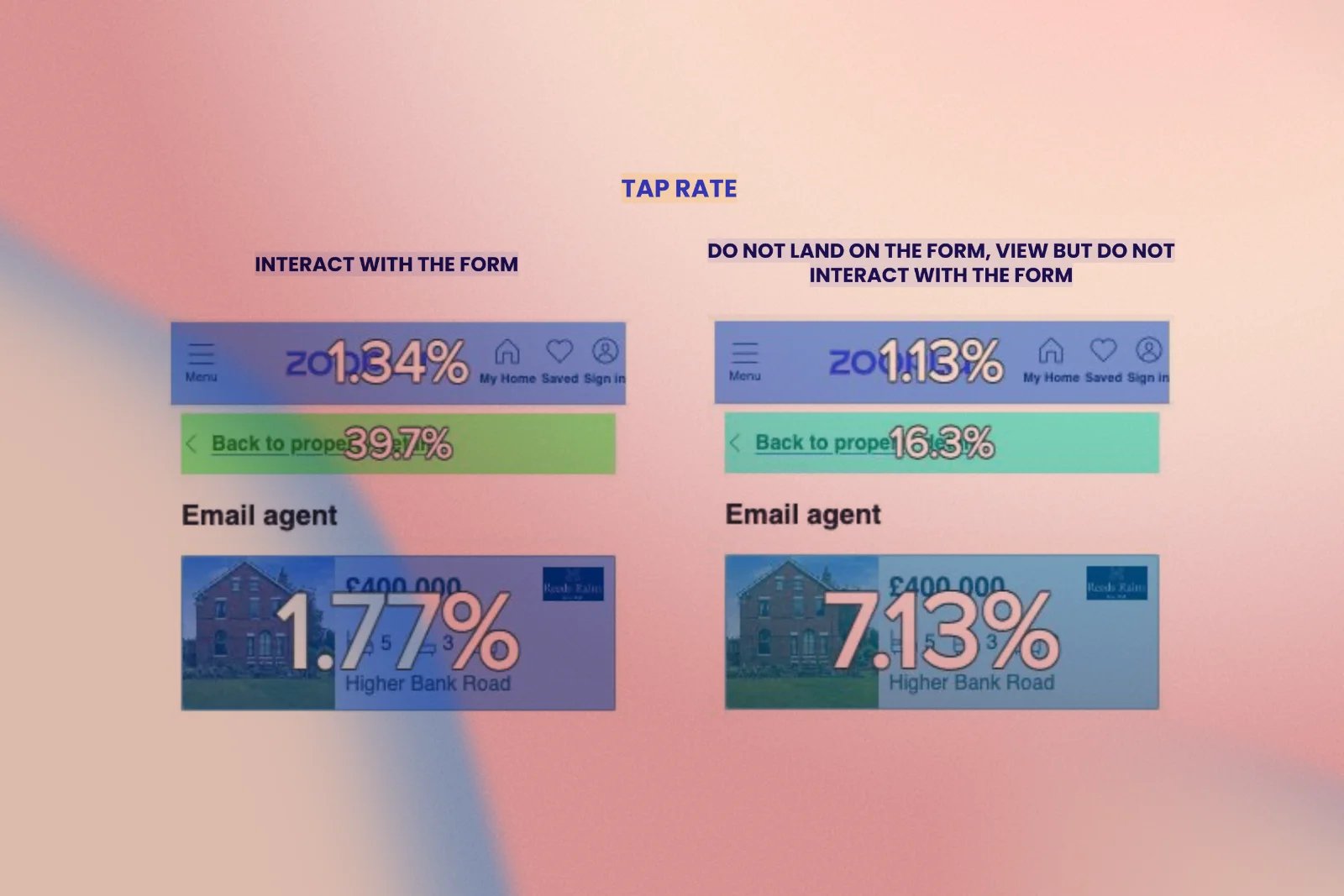
5. Drop-off at the edges, not the middle
Where users dropped off mid-form, the drop-off clustered at the first field (full name) and the last (message and viewing checkbox), not, as we expected, somewhere in the messy middle.
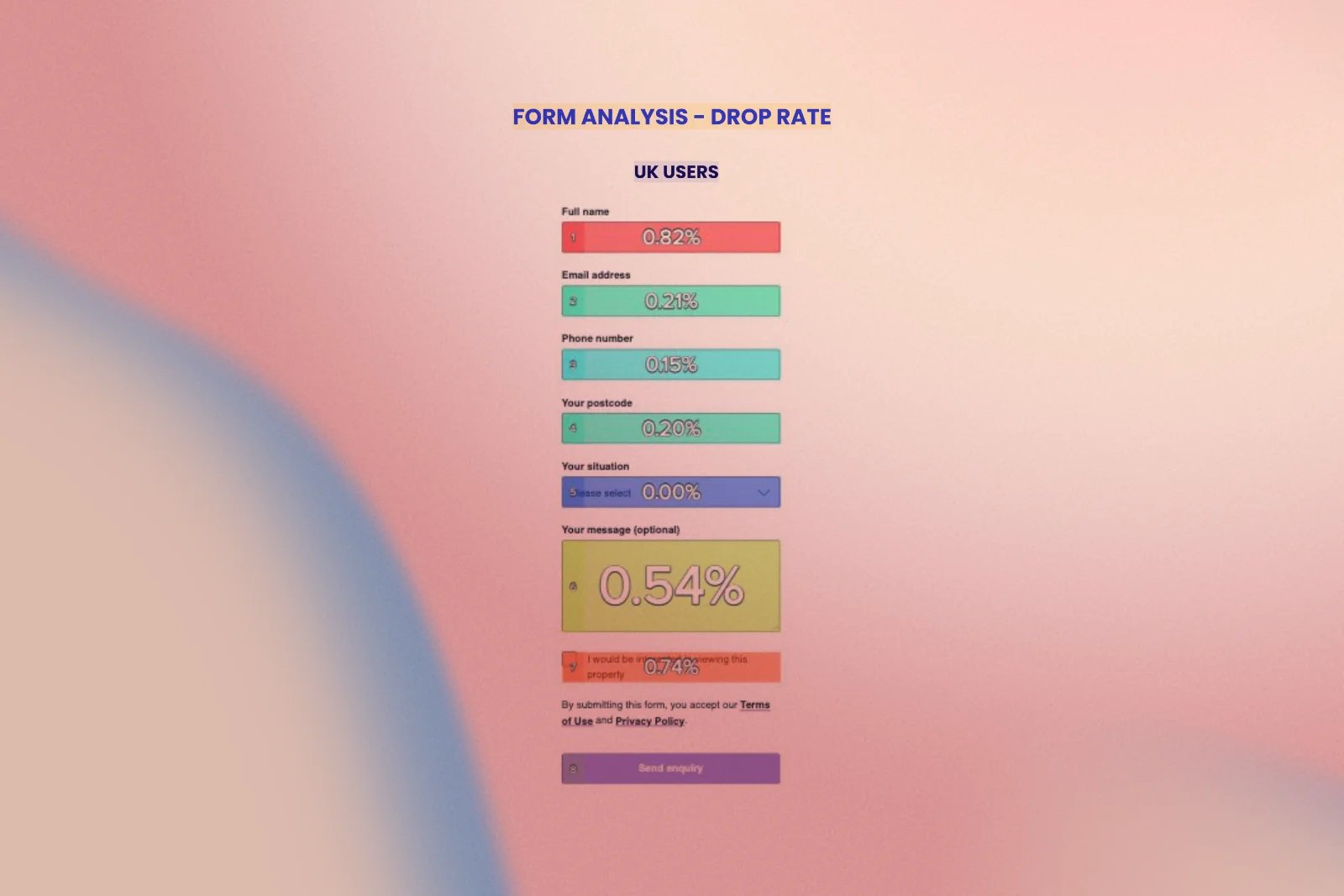
6. A checkbox that led nowhere
Roughly 95% of people who ticked the "interested in viewing" checkbox never went on to interact with the availability calendar that appeared directly beneath it, largely because it was rendered below the visible screen.
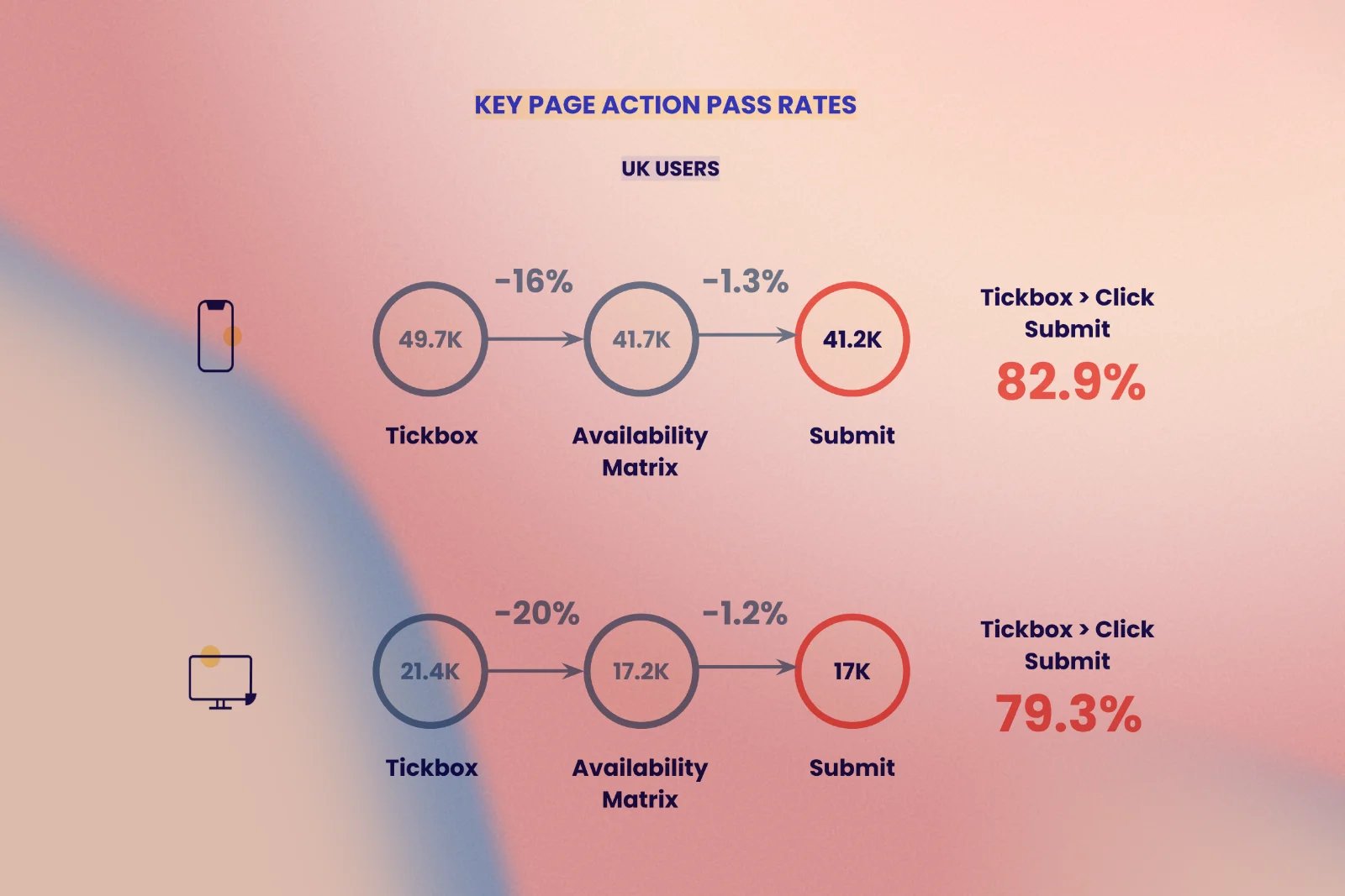
7. A missed opportunity for repeat leads
After successfully submitting an enquiry, only 16% of mobile users and 23% of desktop users went on to contact a second agent in the same session, representing a large, largely untapped opportunity to convert an already-engaged visitor into multiple leads.
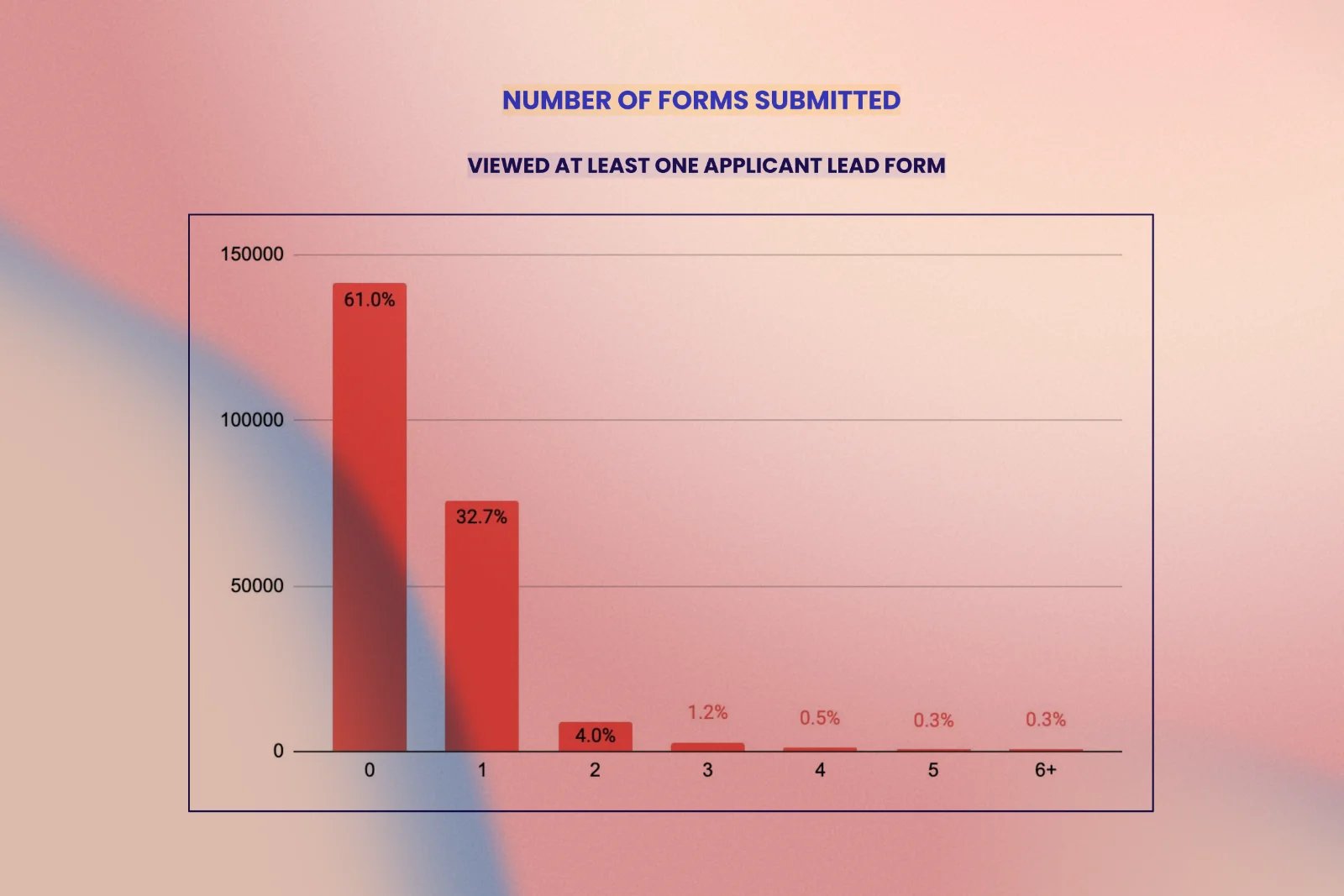
Each of these findings became a thread we could pull on, not a vague hypothesis but a specific, evidence-based user behaviour we could design directly against. Rather than guessing what to fix, the data told us precisely where attention, hesitation, and intent were being lost.
ideation
With a rich, evidence-based list of problems in hand, the next challenge was translating dozens of individual data points into a coherent design direction the whole team could rally around, and that meant getting everyone in the same room.
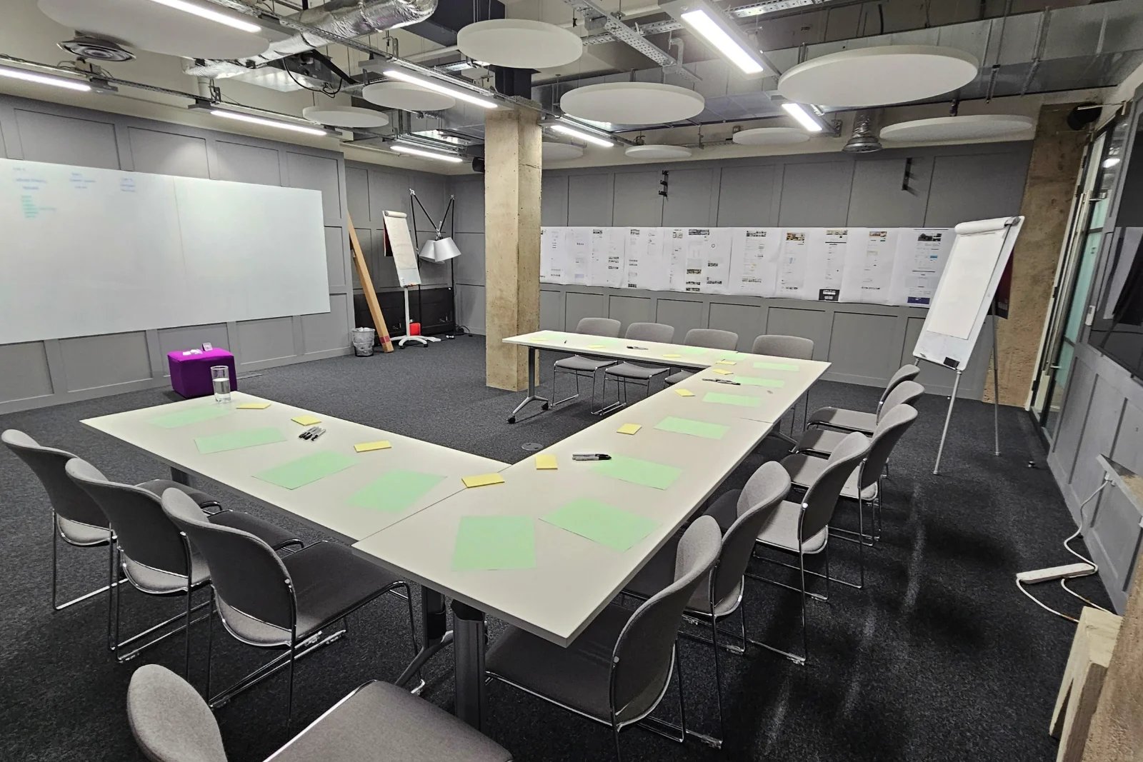
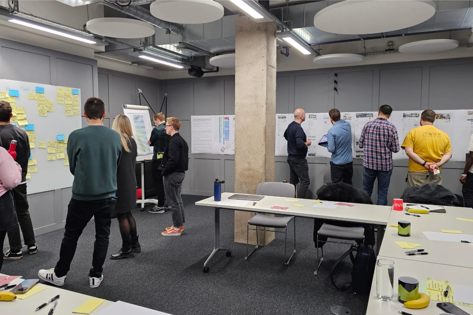
I hosted a full-day workshop and invited researchers, engineers, QA, product owners, and senior stakeholders who were either already involved or about to be involved in the redesign. The goal wasn't just to generate ideas; it was to give every discipline a seat at the table early, surface technical constraints and business expectations up front, and avoid the painful cycle of designing something that later turned out to be unbuildable or misaligned with commercial priorities.
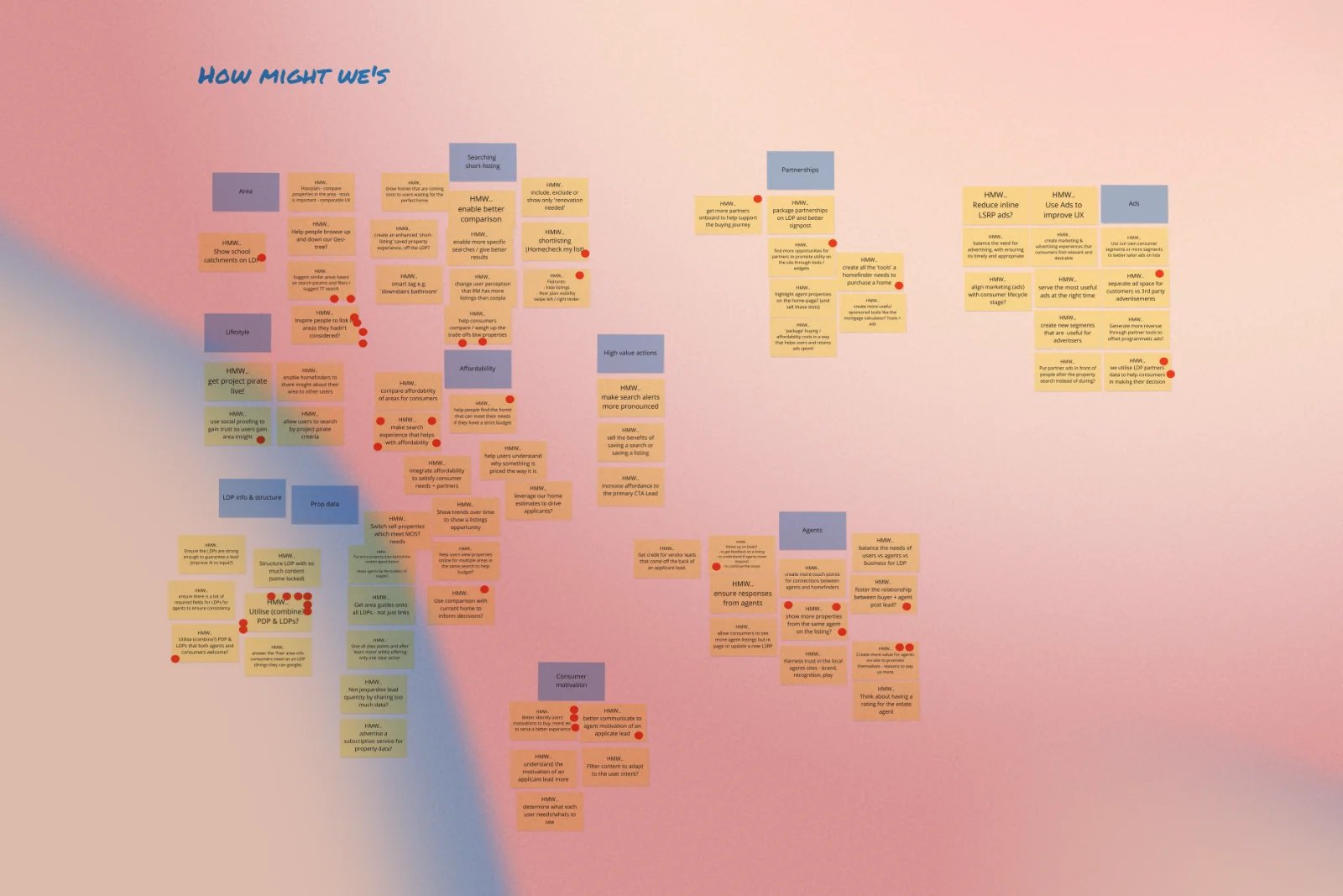
We opened with "How Might We" (HMW) framing. Whenever someone raised a pain point, for instance, "users can't easily see where the property actually is", we reframed it as a design question: "How might we help users understand a property's exact location without leaving the page?" Everyone in the room reviewed the existing Listing Detail Page together and wrote their own HMW questions independently, which we then grouped into a handful of themes and voted on as a group to surface what mattered most.
From there, working closely with the Product Manager, we split prioritisation into two clear stages:
- Stage one focused on breaking the roadmap into small, genuinely achievable pieces of work that the team could realistically ship, measure, and learn from within a sprint or two, rather than one enormous release.
- Stage two focused on sequencing those pieces by expected impact and technical dependency, so that quick, high-confidence wins (such as making the address feel clickable) could ship early, while more ambitious features (such as AI-assisted visualisation) had time to be properly scoped and tested.
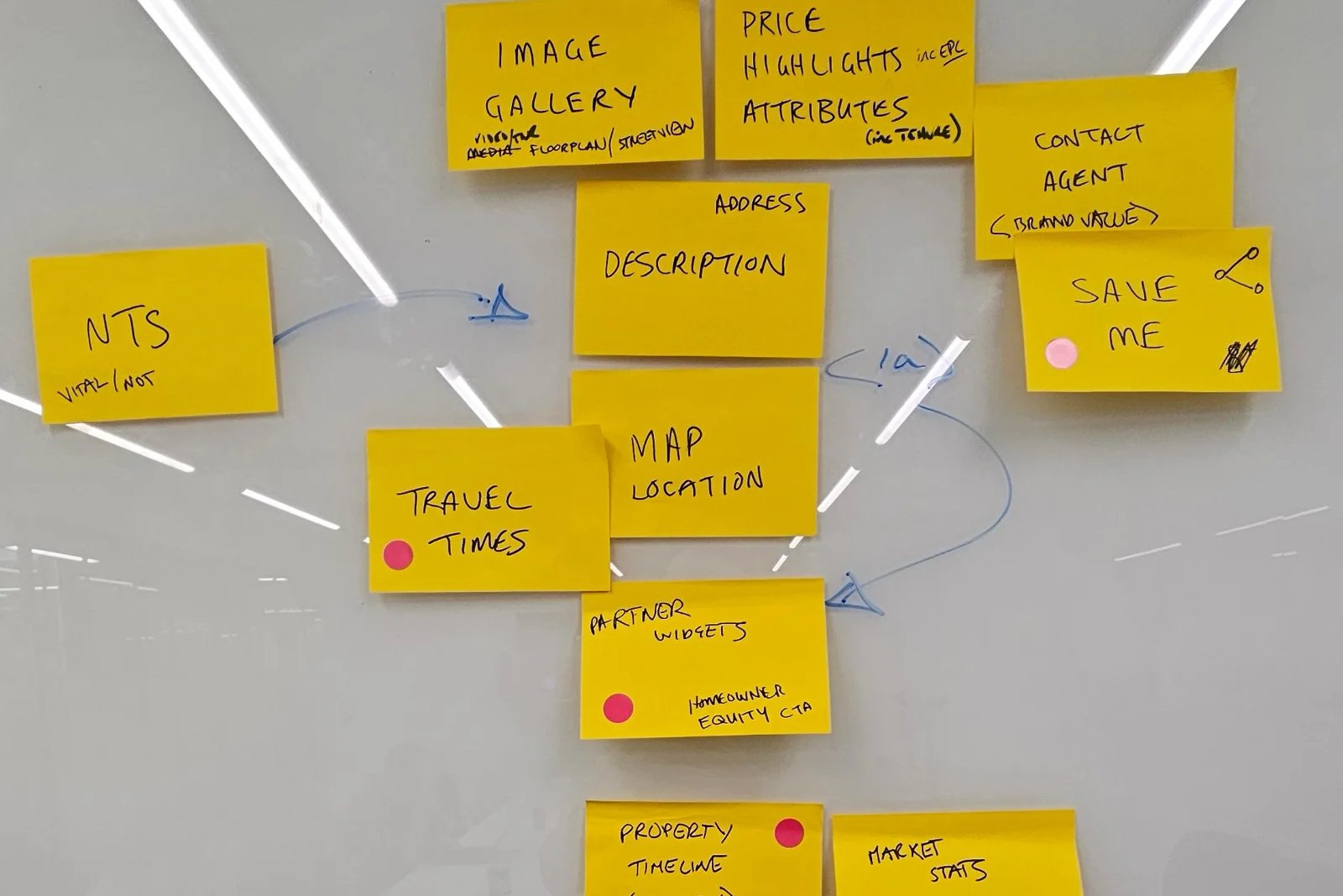
This structure meant that every idea that made it into the backlog could be traced directly back to a specific research finding. The clickable address concept came straight from the click-recurrence data; reordering the page came straight from the scroll-depth-versus-conversion curve; and the redesigned lead form flow came straight from the drop-off analysis of the contact form.
Design
Zoopla already had a mature design system in place, so rather than starting from a blank canvas, I worked within the existing pattern library and added new components only where a genuine gap existed. This kept delivery fast and preserved consistency across the website and app, rather than reinventing wheels that already worked well.
One of the biggest structural decisions in this project wasn't visual at all; it was architectural. The Zoopla website was responsive, but engineers still maintained separate codebases for desktop web, mobile web, and the native app. This meant every new feature had to be built and tested multiple times, and mobile users routinely received features months after desktop users. Since the mobile app was already built on React Native, I worked with engineering and stakeholders to make the case for converting the entire web experience to React as well, unifying the technology stack so that design and development could finally move at the same speed on every platform. Everyone aligned around this shift, which became a foundational enabler for everything that followed.
With that foundation agreed, the design work itself focused on directly addressing the problems research had surfaced:
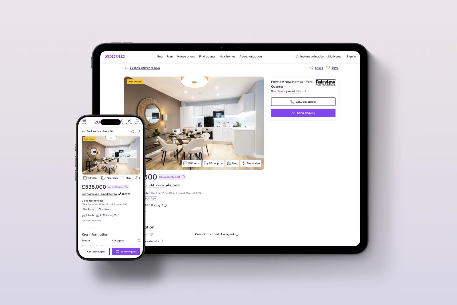
1. Bringing value above the fold
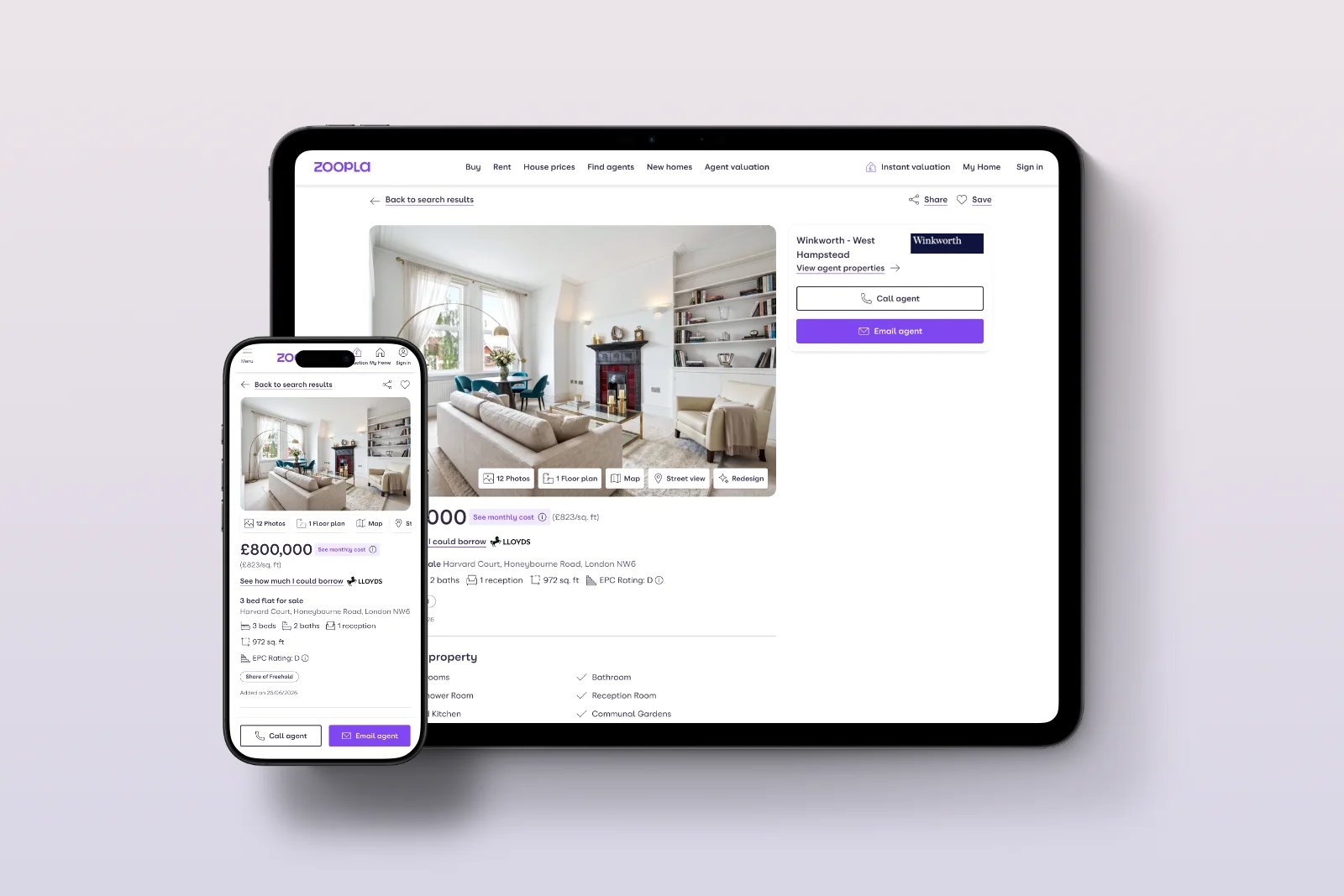
Reordering the page so that high-converting content, agent details, and the save button sit much closer to the top of the experience, rather than being buried below the fold.
2. Turning expectation into function
Turning the property address into a genuinely clickable element linked to an interactive map closes the gap between users' expectations and what the page actually does.
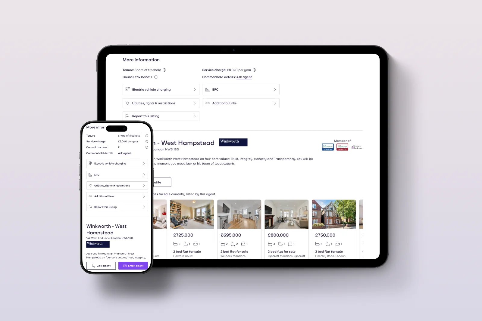
3. Prioritising value over habit
Rebuilding the "More information" accordion so its highest-converting elements (not just the most-tapped ones) were more visually prominent.
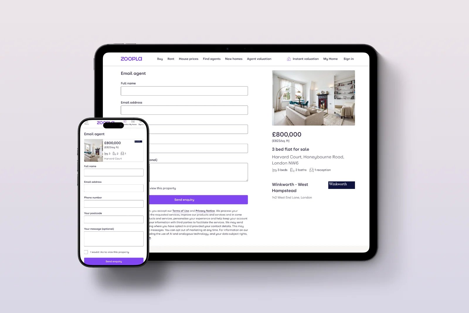
4. Rethinking the form's structure
Restructuring the contact agent form to reduce the amount of content hidden below the initial viewport, and rethinking how the availability calendar is revealed after a user expresses interest in viewing.
Features introduced in the redesign
With the support of AI and third-party data partnerships, we introduced a set of features that were, at the time, exclusive to Zoopla and unavailable elsewhere in the UK property market:
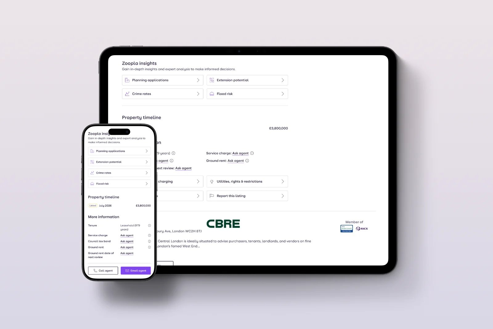
1. Local area intelligence
Crime rates, flood risk, and planning applications are available directly on for-sale listings for signed-in users, without ever leaving the page.
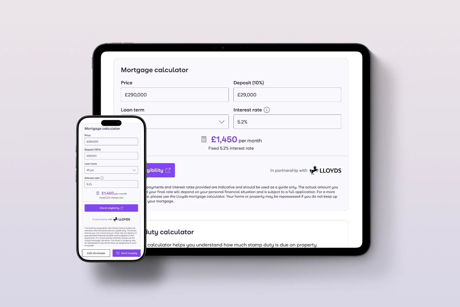
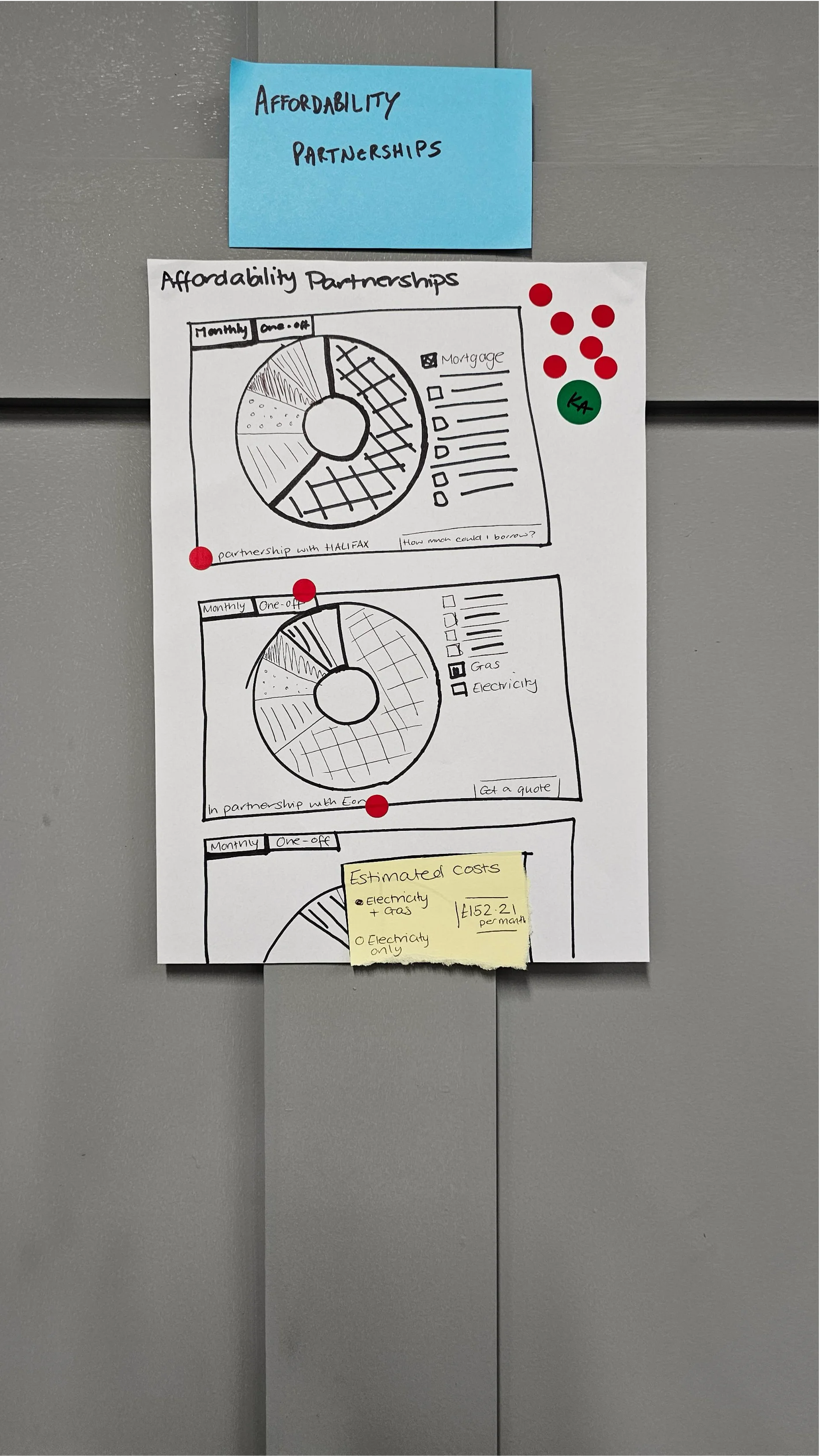
2. Built-in mortgage calculator
An instant affordability estimate available alongside the listing.
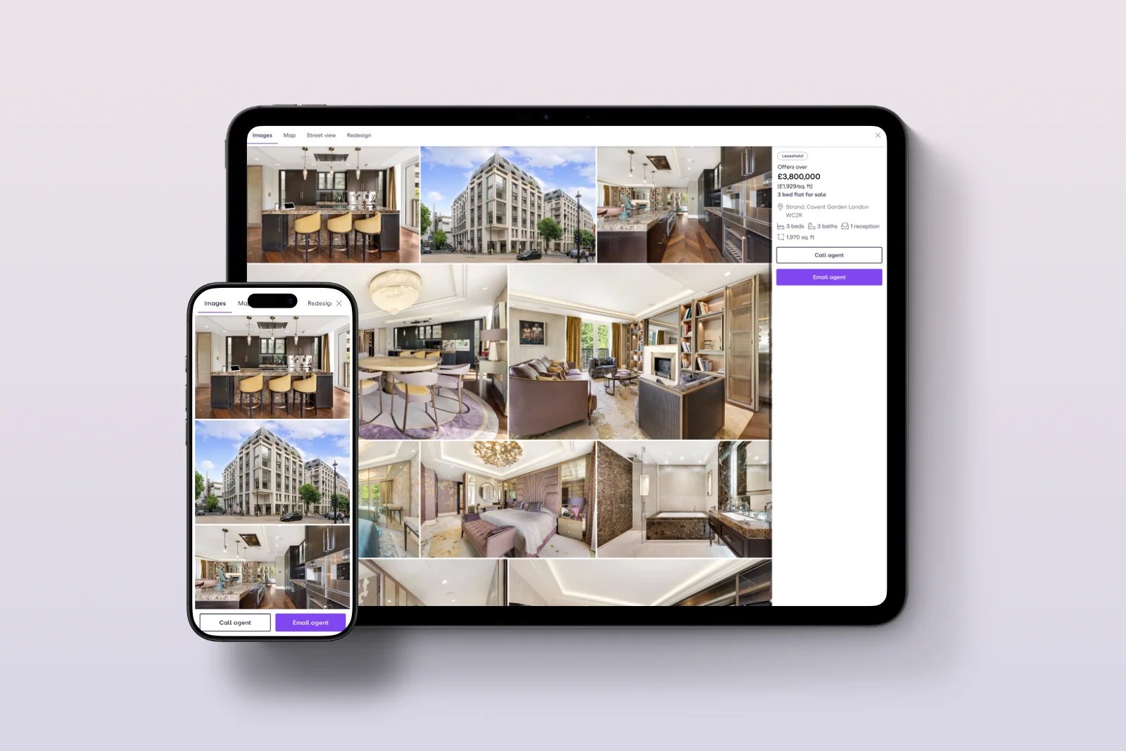
3. Enhanced photo gallery
A faster, smoother property photo browsing experience across devices.
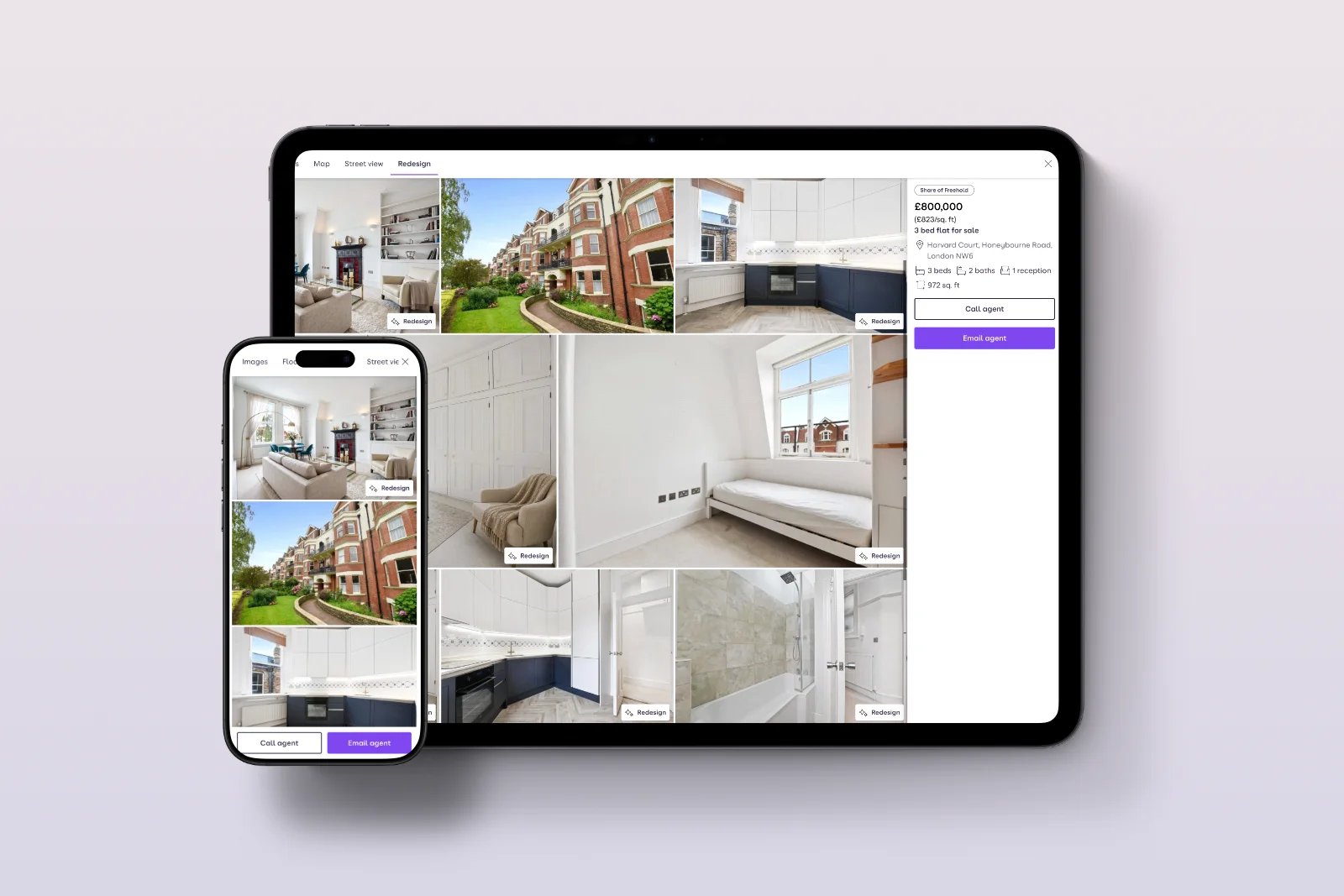
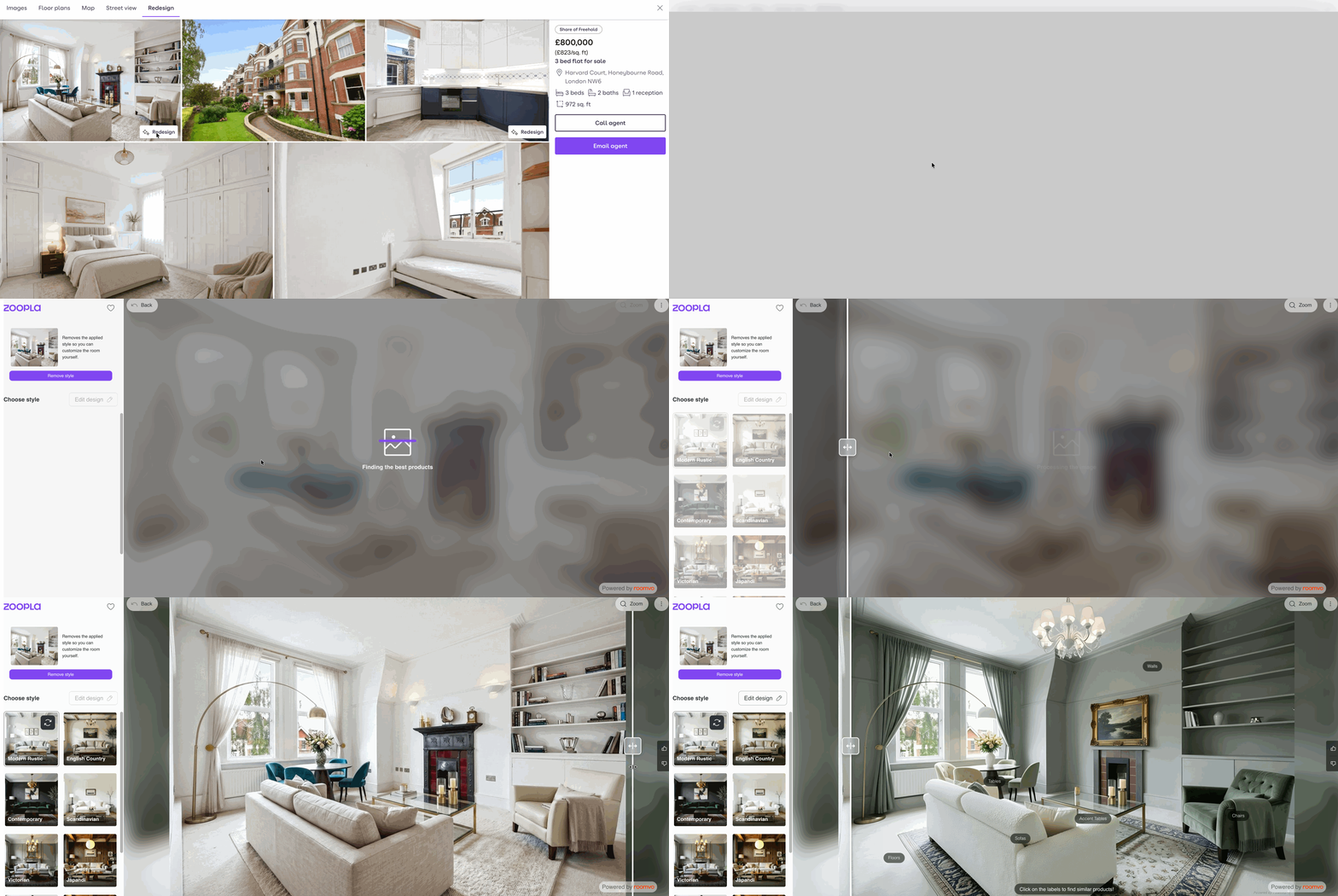
4. AI-powered visualisation
A tool that lets users reimagine a property's interior and exterior on the fly, helping them see a space's potential rather than just its current state.
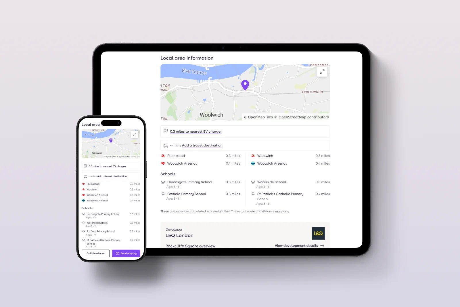
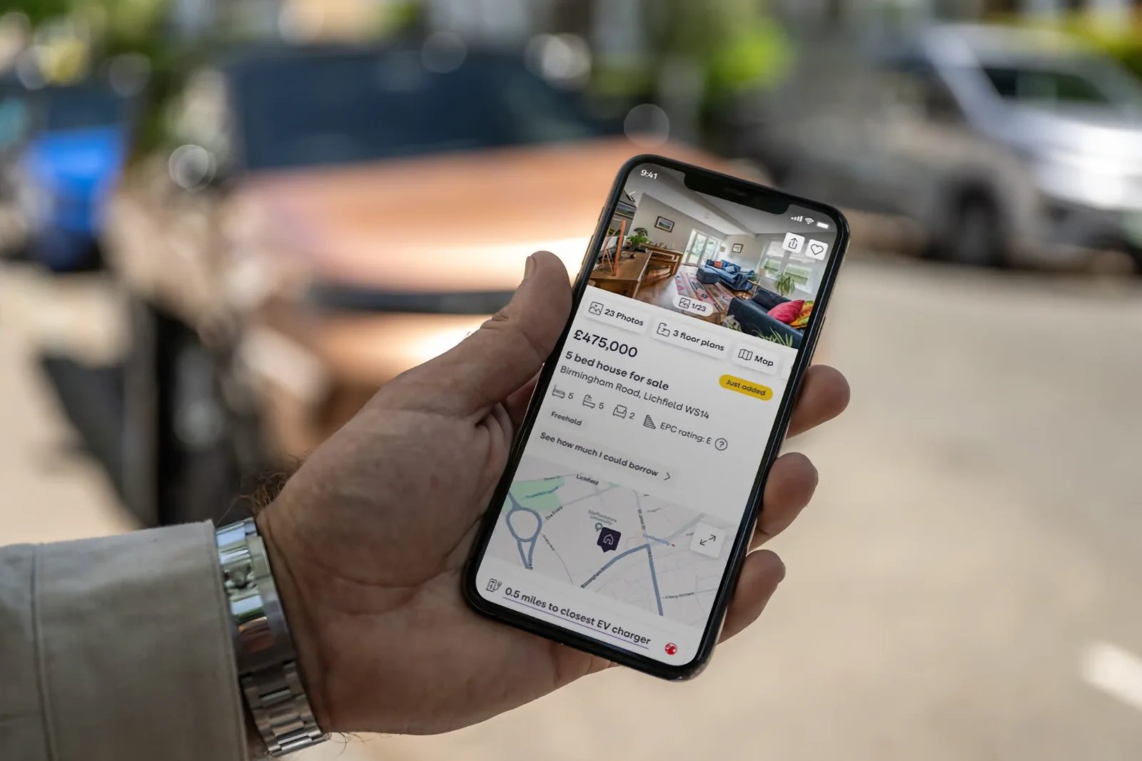
5. EV and travel-time data
Distance to the nearest EV charger, alongside travel time from the property to a chosen point of interest or workplace, calculated for multiple transport modes.
Usability Testing
Design decisions this significant deserved more than internal confidence; they needed to be tested with real people before we committed engineering time at scale. Alongside the broader research programme, I ran structured usability sessions with participants who were genuine home-movers: first-time buyers, renters, landlords, and people simply browsing to understand the market.
We tested prototypes at multiple fidelity levels as the design matured:
Early wireframes to validate whether reordering the page actually helped people find agent details, rather than simply relying on the scroll behaviour we'd already observed.
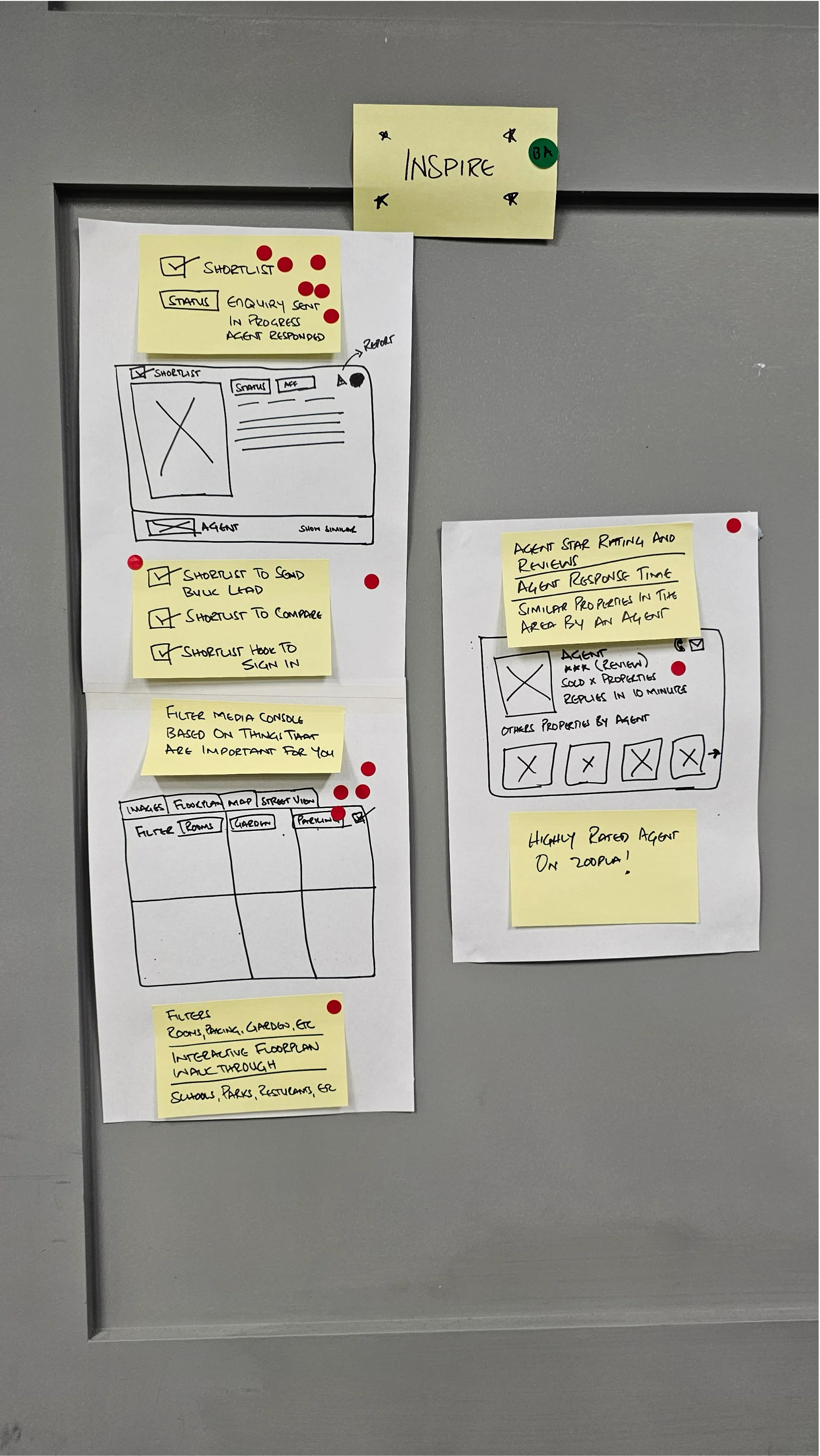
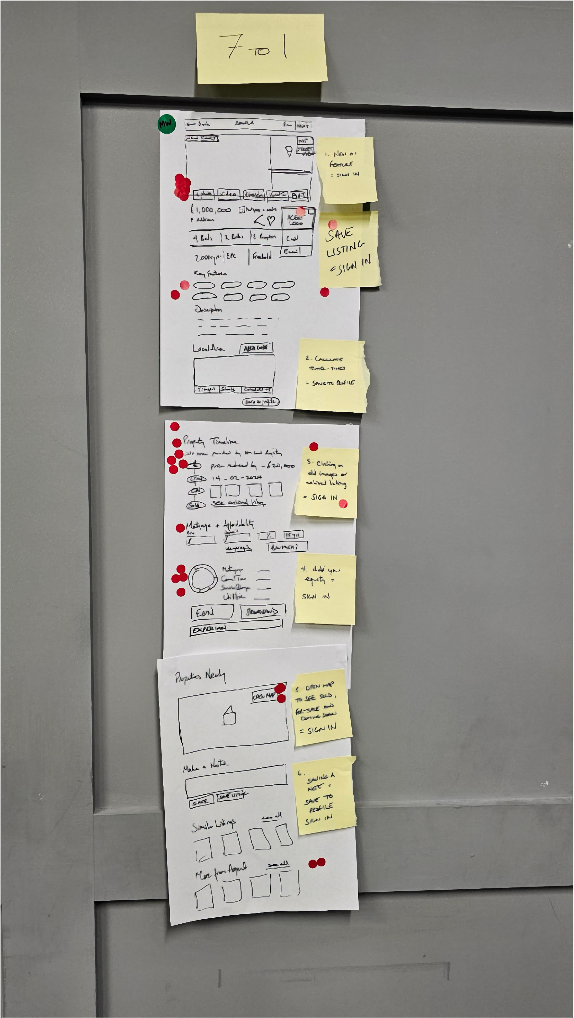
- Mid-fidelity prototypes of the redesigned contact form, watching in real time whether people noticed the "your situation" field and availability calendar once it was repositioned higher on the screen.
- Comparative tests of the clickable address-to-map concept against the original static text, to confirm the behaviour we'd inferred from click-recurrence data reflected genuine user intent rather than a data artefact.
- Tree testing and first-click testing on the "More information" accordion to understand whether reordering its contents by conversion value (rather than by tap frequency) actually made sense to real users, or simply confused them.
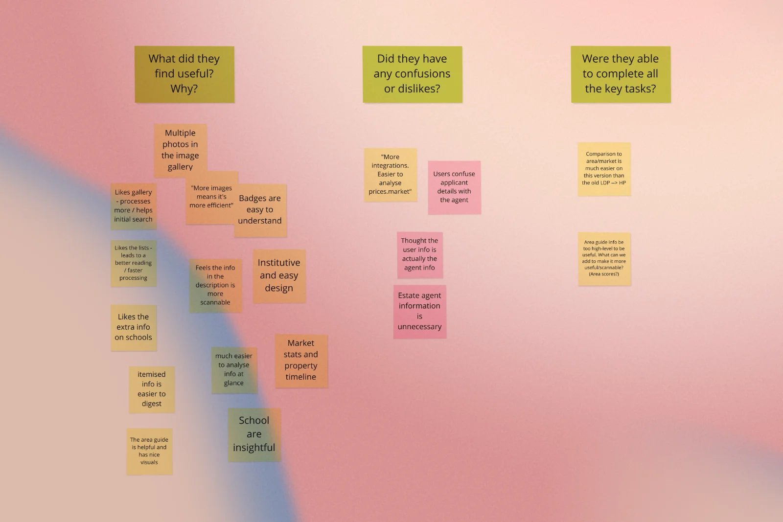
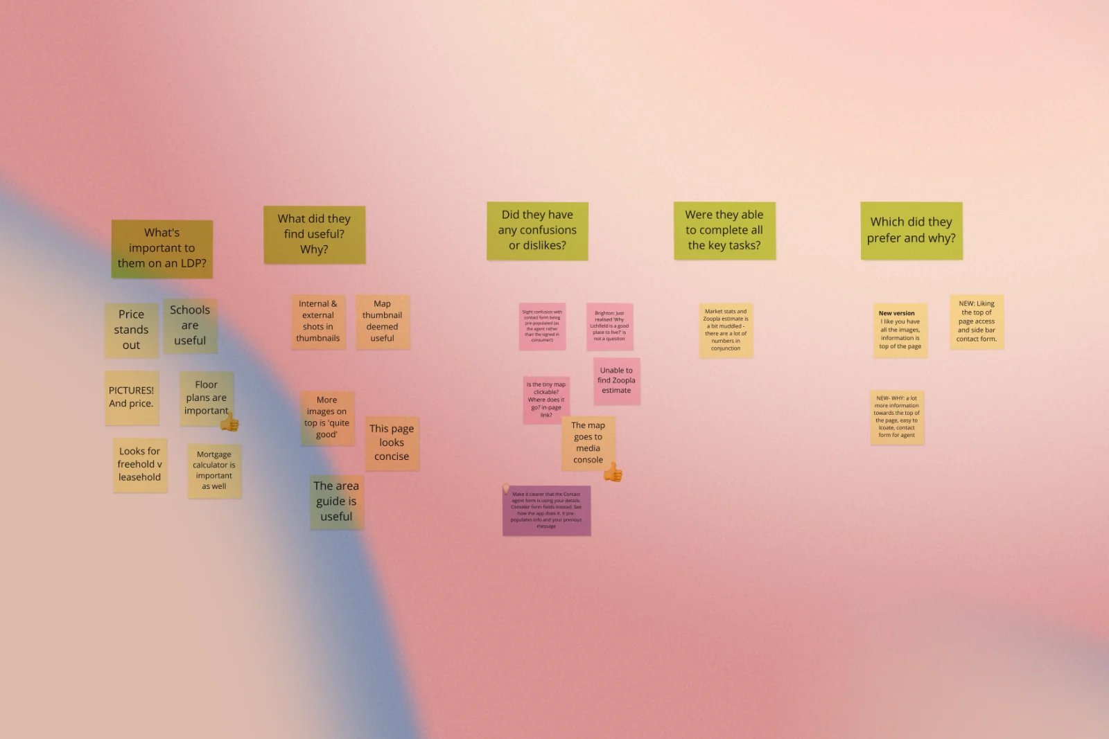
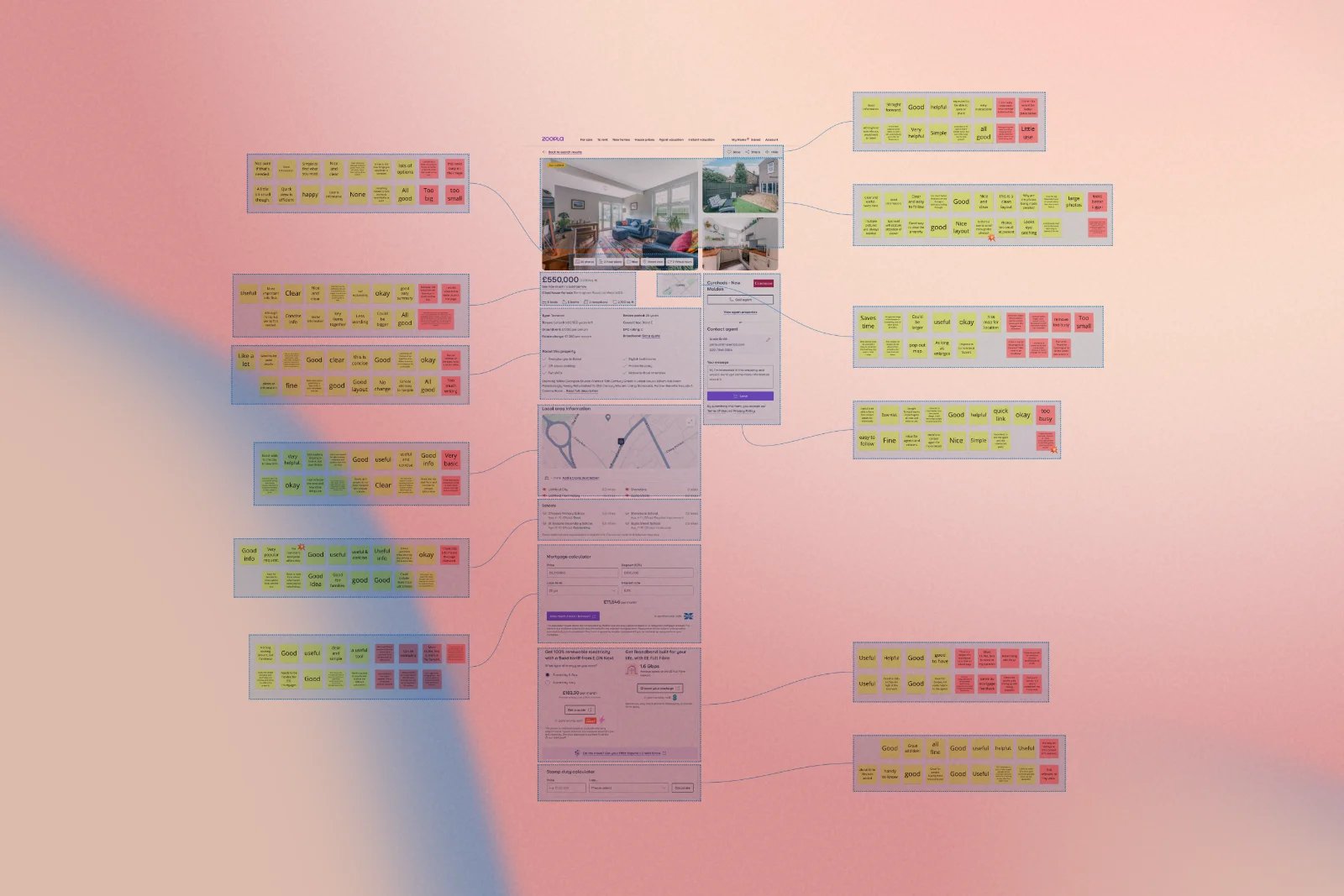
Sessions were moderated remotely and in person, recorded with consent, and reviewed collaboratively with researchers so findings could be triangulated against the original behavioural data rather than treated as standalone anecdotes. This combination of quantitative evidence from millions of real sessions, paired with qualitative confirmation from real people talking through their reasoning out loud, gave the team genuine confidence before anything went into a live experiment.
A/B Testing
Every significant change we shipped was validated through controlled experimentation rather than launched on instinct. Working with data scientists, we translated the research findings directly into testable hypotheses and, where the underlying analysis allowed, modelled the expected impact before we even began building, so the team knew what "success" looked like from day one.
A few of the experiments that came directly out of this process:
Prioritising exposure to underexposed, high-converting elements
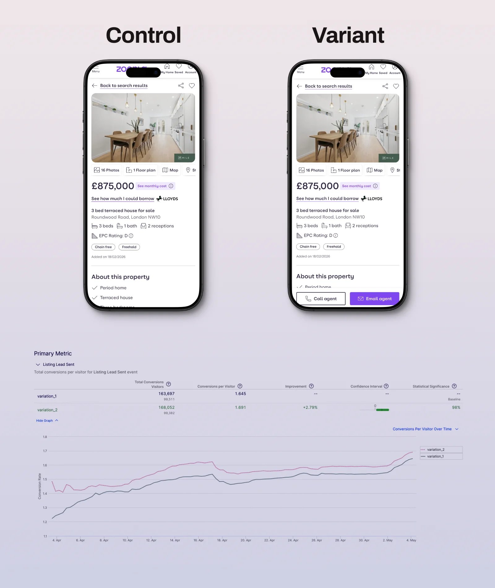
The "agent" contact actions were not visible on the page; however, research indicates they were among the high-value actions for users. We tested a variant to expose the contact agent CTAs and make them sticky, resulting in a 12% uplift in click-through rate and 2.79% in lead conversion.
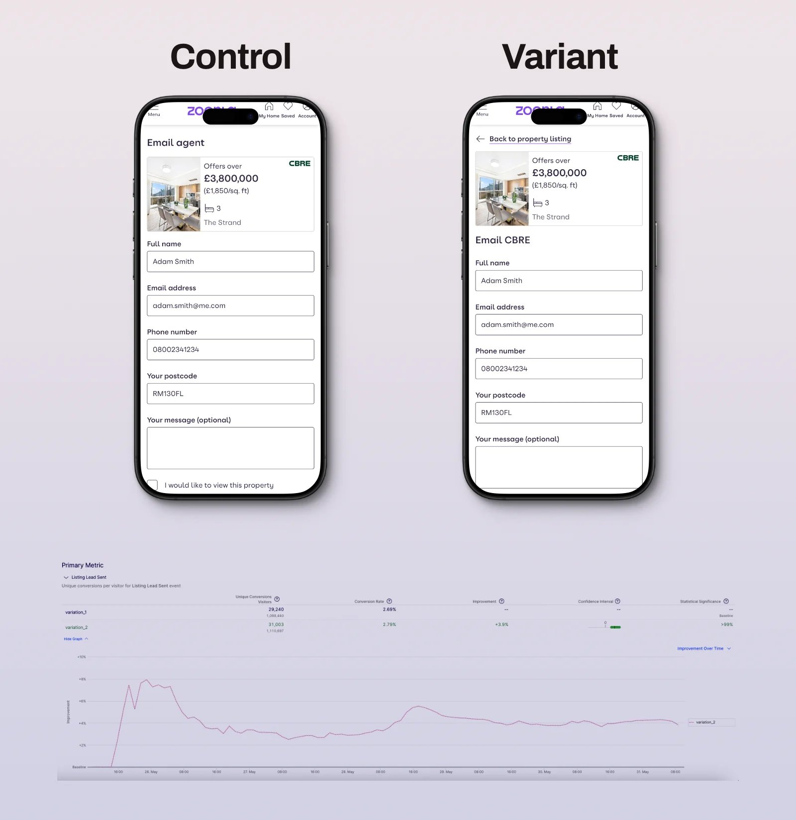
Reducing accidental exits from the contact form
Because many form abandoners were tapping the embedded property photo to leave the page, we tested making that image non-interactive on the form, while still allowing users to return to the listing via a clearly labelled navigation control, balancing the goal of keeping people on the form against the risk of trapping those who genuinely wanted to go back. This simple change to the lead form increased lead conversion by 3.9%.
Challenges
No project of this scale moves in a straight line, and being honest about where it got hard is as important as celebrating where it worked.
- Unifying two very different codebases without breaking a live, high-traffic funnel: Migrating from separate web and mobile stacks to a single React implementation was a significant technical undertaking, and it had to happen without disrupting the millions of live sessions passing through the LDP every single day.
- Balancing commercial features with pure user experience: Some of the highest-converting elements we found, such as the mortgage calculator and energy comparison tool, were also tied to commercially important partnerships, which meant design decisions about placement and prominence had to satisfy both user needs and business priorities.
- Technical constraints limited how precisely we could measure certain interactions: For example, the availability matrix on the contact form wasn't contained within a single HTML container, so we couldn't measure engagement across the whole grid as a single zone. We could only measure it as individual cells or as the form as a whole, which made some interaction data harder to interpret clearly.
- Aligning a large, cross-functional group around a shared set of priorities: With researchers, engineers, QA, product, and senior stakeholders all bringing different constraints to the table, the workshop format helped, but sustained alignment across subsequent sprints required continuous, active communication rather than a one-off session.
- Introducing genuinely new, AI-assisted features responsibly: Features such as AI-generated interior visualisation were exciting but represented new territory for the platform, requiring careful thought about accuracy, user trust, and setting the right expectations so the feature enhanced decision-making rather than creating false impressions of a property.
improvements
Grounding every decision in real behavioural data and validating every change through testing meant the redesign delivered measurable gains rather than a subjective "feels better" outcome:
- Clearer, evidence-backed placement of high-converting elements (agent details, save button, similar properties, energy comparison) meaningfully increased their exposure and, in turn, their contribution to overall lead volume.
- Making the address interactive and linking it to a map transformed one of the site's most common "failed clicks" into a genuinely useful, high-converting feature.
- Restructuring the contact form, reducing content hidden below the fold, and automatically surfacing the availability calendar reduced the number of users who abandoned the form after interacting with nothing at all.
- Removing the accidental exit door from the embedded property photo, while preserving an intentional way back to the listing, reduced unintentional drop-off from the form without harming the ability of genuinely undecided users to revisit the property.
- Unifying the technology stack around React meant new features could finally reach mobile and desktop simultaneously, closing the long-standing gap in which mobile users consistently received improvements months after desktop users.
- The suite of new, differentiated features, including local area data, the mortgage calculator, AI visualisation, and EV/travel-time information, gave Zoopla a genuinely distinctive position in a competitive market, turning the LDP from a page people passed by into one they actively wanted to explore.
Learnings
A few things from this project changed how I think about product design leadership more broadly:
- The most valuable insights often lie in things that "aren't even a feature." A link back to the property listing proved to be one of the strongest conversion signals on the contact lead form page, a reminder that user intent appears in unexpected places and that it's worth paying attention to what people try to do, not just what the interface allows.
- Cross-device parity is a leadership problem, not just an engineering one. Fragmented codebases don't just slow delivery; they quietly erode trust and consistency for users who move between devices. Fixing this requires design, product, and engineering leadership to align on a shared, unglamorous but foundational investment.
- Small friction points compound into large business outcomes. No single data point in this research was dramatic on its own, with a few seconds of hesitation here and a missed scroll there. Together, they explained a genuine, sustained decline in leads, and the redesign's cumulative gains came from resolving many small things well, not from one dramatic overhaul.
- New technology, such as AI-assisted visualisation, earns its place through trust, not novelty. Introducing capabilities like this responsibly meant thinking as much about how confident users felt in the output as about how impressive the feature looked in a demo.
- Data and empathy work best together, not in competition. Quantitative research told us where people were struggling; usability sessions told us why. Neither, on its own, would have been enough to design with real confidence.

Looking ahead, Zoopla plans to introduce an AI-powered assistant directly on the Listing Detail Page, allowing consumers to ask natural-language questions and receive instant, accurate answers about a property, powered by large language models and natural language processing. It's the next logical step in the redesign, helping people find exactly the information they need with minimal effort and maximum confidence, and decide whether a place could be home.
Projects
 Search optimisation reduced the exit rate and increased agent lead conversion by 8.76%.Read case studynorth_east
 Designed TSB's unified design system, enabling the business to deliver features 35% faster.Read case studynorth_east
 Brand refresh delivered 4% conversion uplift on mobile and 3.8% on desktop.Read case studynorth_eastSearch UX improved. Reduced zero results by 86% and increased seller leads by 6.33%.Read case studynorth_east
 Checkout optimisation drove a 5.22% increase in conversion YoY by enhancing clarity.Read case studynorth_east
 Delivered Bespoke Offers platform upgrade (zero downtime) & developed the innovative 'Beat My Price' tool.Read case studynorth_eastRefactored complex B2B Portal to mobile-first experience, delivered with zero downtime.Read case studynorth_east
Contact
Please feel free to reach out if you have any ideas, projects, or opportunities you would like to discuss. I am always open to hearing new ideas and collaborating together.
You can contact me through LinkedIn, email, or phone. Alternatively, please complete the form below, and I will do my utmost to respond within 24 hours.